CONCEPT
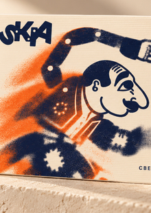
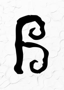
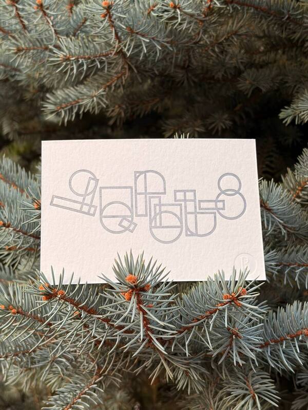
The postcard series was created using foam imprints. The core idea of the project is to explore the material’s texture, its uneven surface, and the random shapes that arise during the printing process. The heterogeneous imprints lend expressiveness to the composition and emphasize the handmade nature of the work.
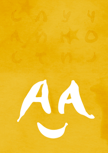
The foundation of the postcard design is the original lettering, which was created with the foam imprints.


Colored Postcards
LETTERPRESS
This is a high-relief printing technique where ink is transferred onto the paper from a raised matrix, leaving a characteristic indented impression. The unique aspect of the technique lies in the combination of color, relief, and paper texture, which lends expressiveness to the image while preserving the feeling of handmade craftsmanship.
PROCESS
The work began by creating a composition, which I then converted into a vector format and checked for print readiness (1). In the next stage, a physical block was manufactured from the finished file, which is used to transfer the image onto paper (2).
The vector is imported into Rhino, where a volumetric model with relief printing elements is created based on it. The model accounts for the technical requirements for subsequent printing.
3D Cliché Model
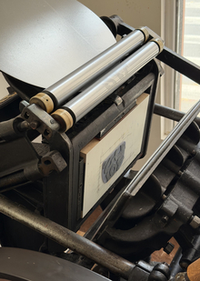
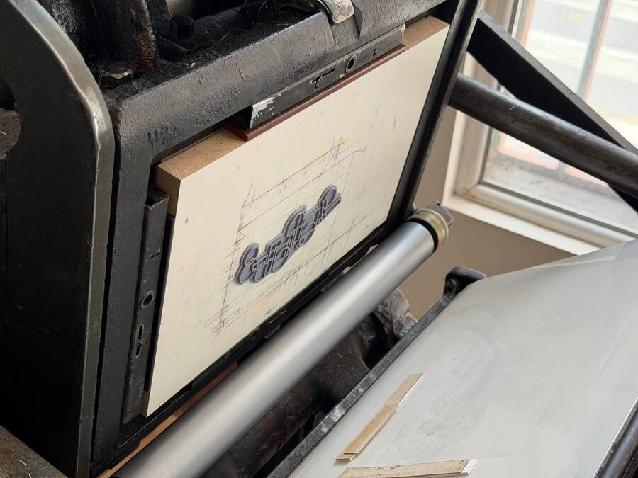
Then I went to the print shop itself to personally participate in the printing process. First, we rolled out the PANTONE 877 silver ink (1), after which we set up the cliché and adjusted the press—setting the registration and pressure (2). Each shade uses its own cliché (3).
The rollers spread the ink across the raised elements of the cliché, and the press transfers it onto the paper under pressure. First, the entire run is printed in the first color, then in the next.
Printing Process
Postcards
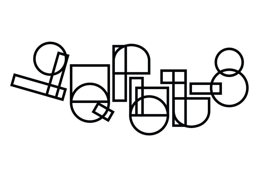
Since my typeface is dedicated to the renowned Armenian writer Yeghishe Charents, the postcard is inscribed with «Charents» (Չարենց) in Armenian.
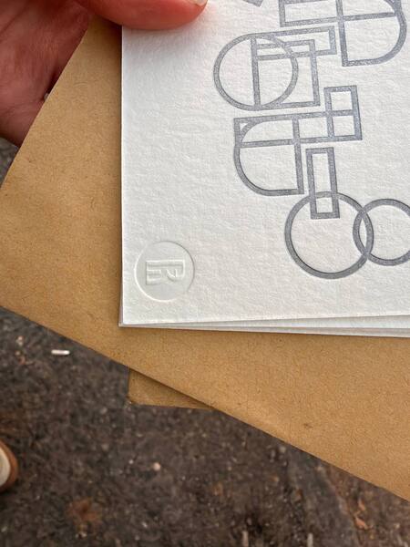
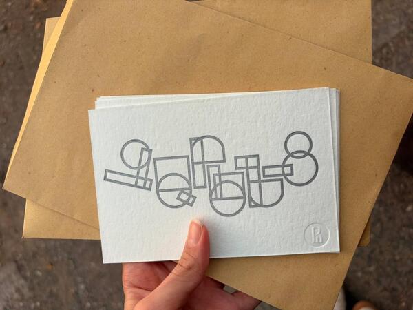
Blind embossing of the HSE logo