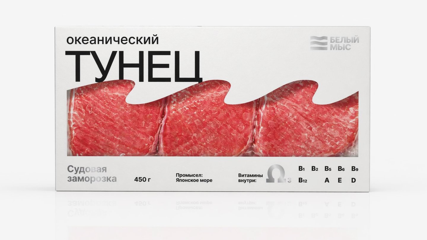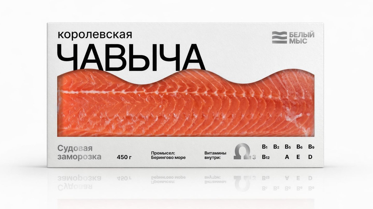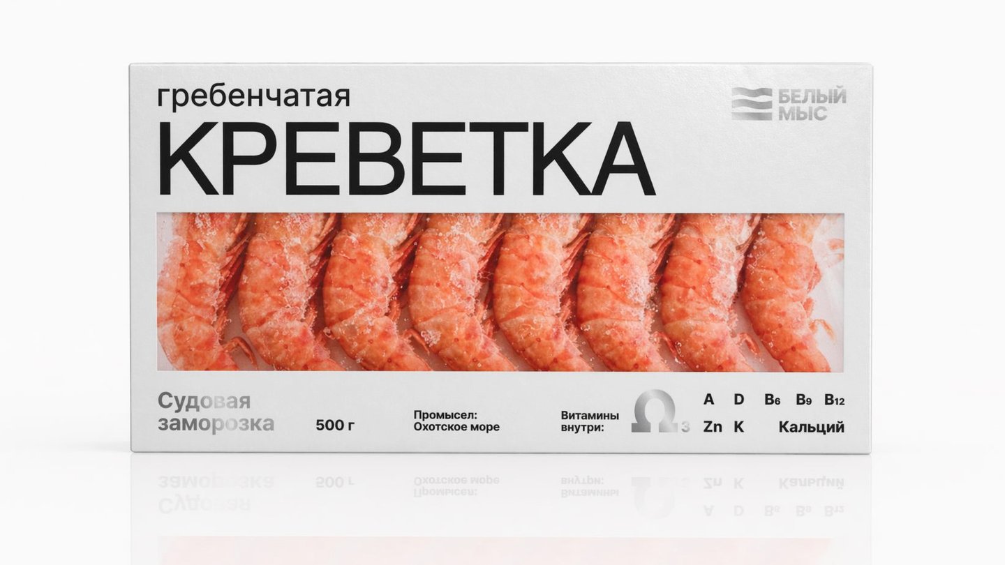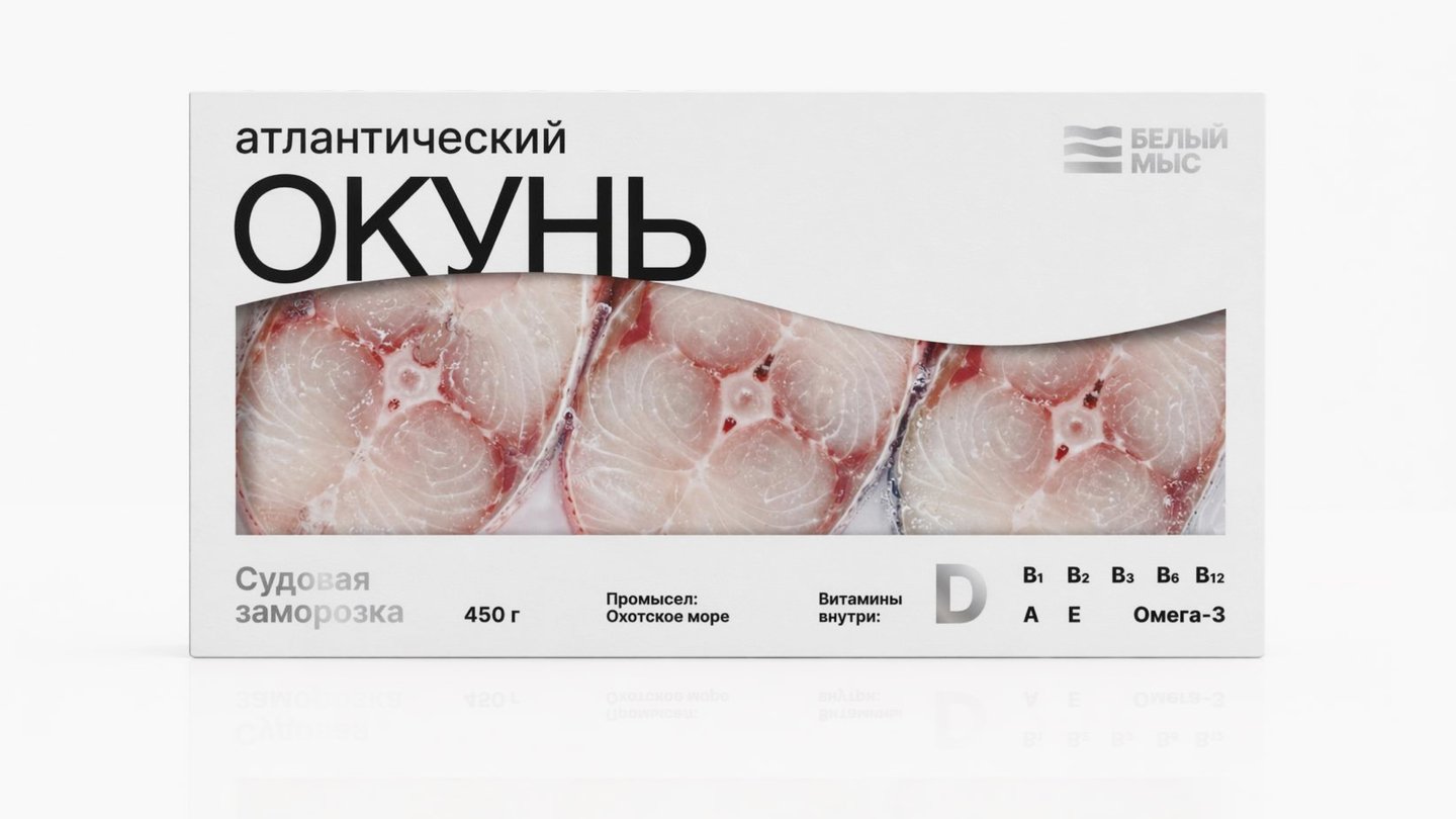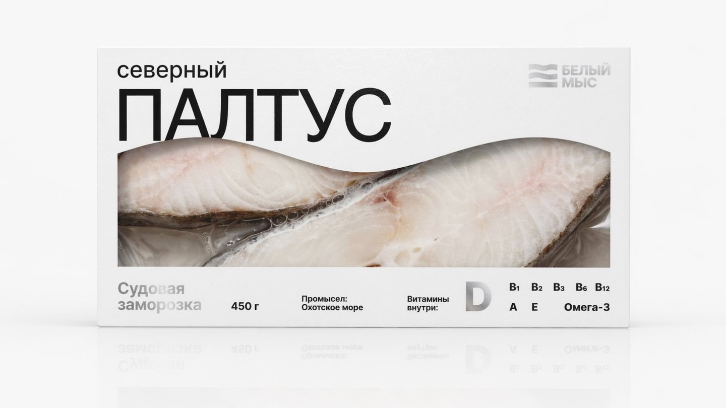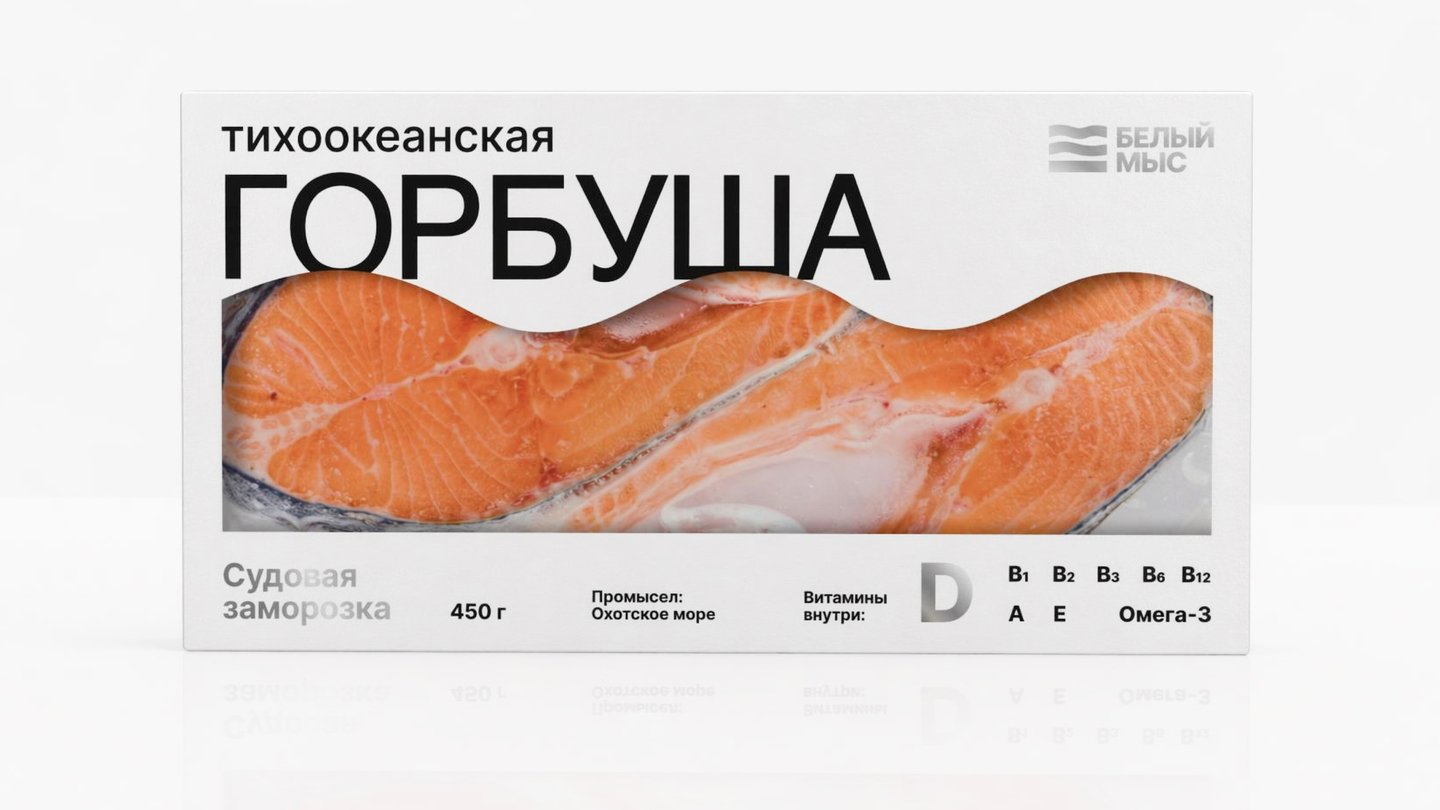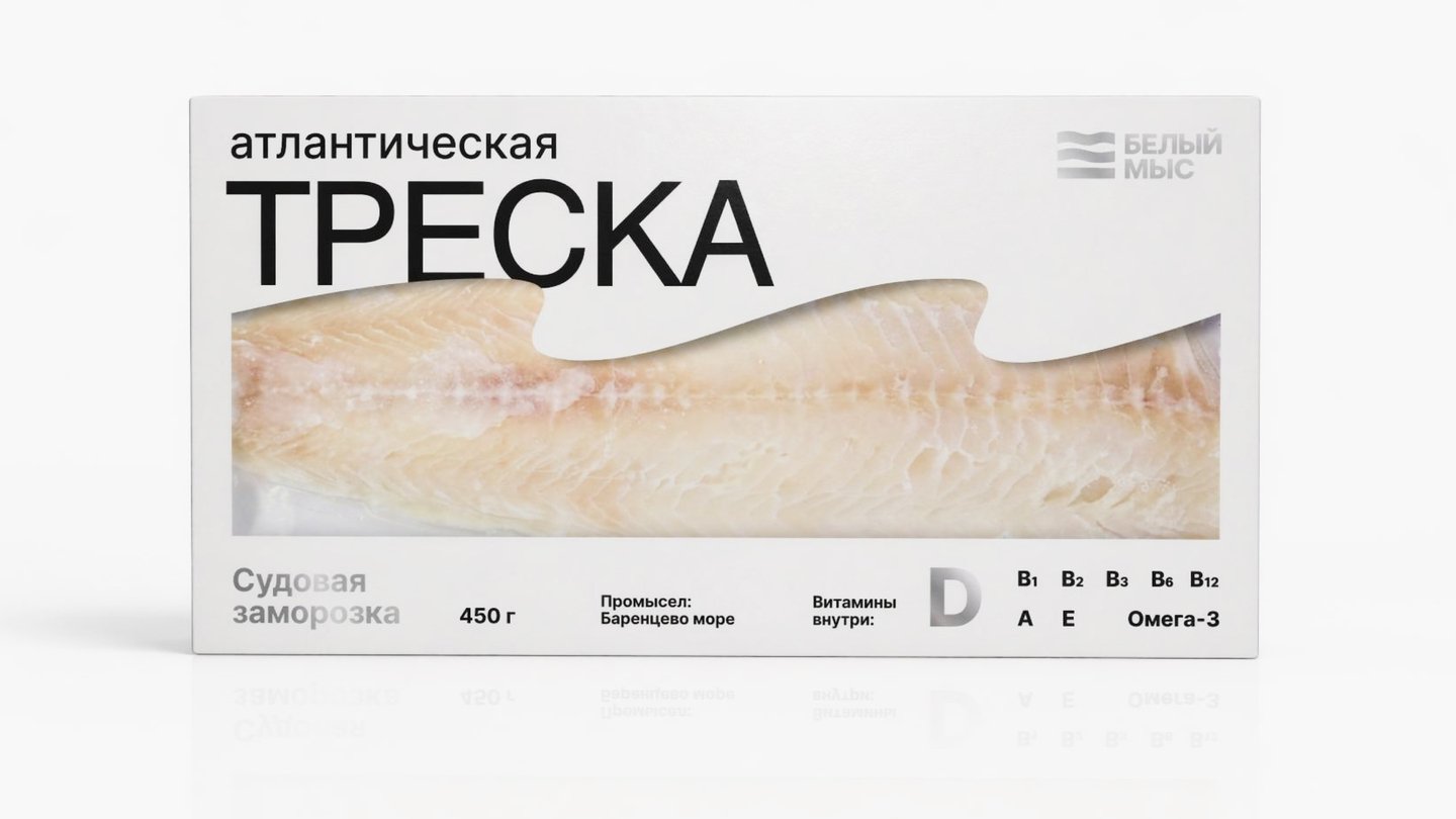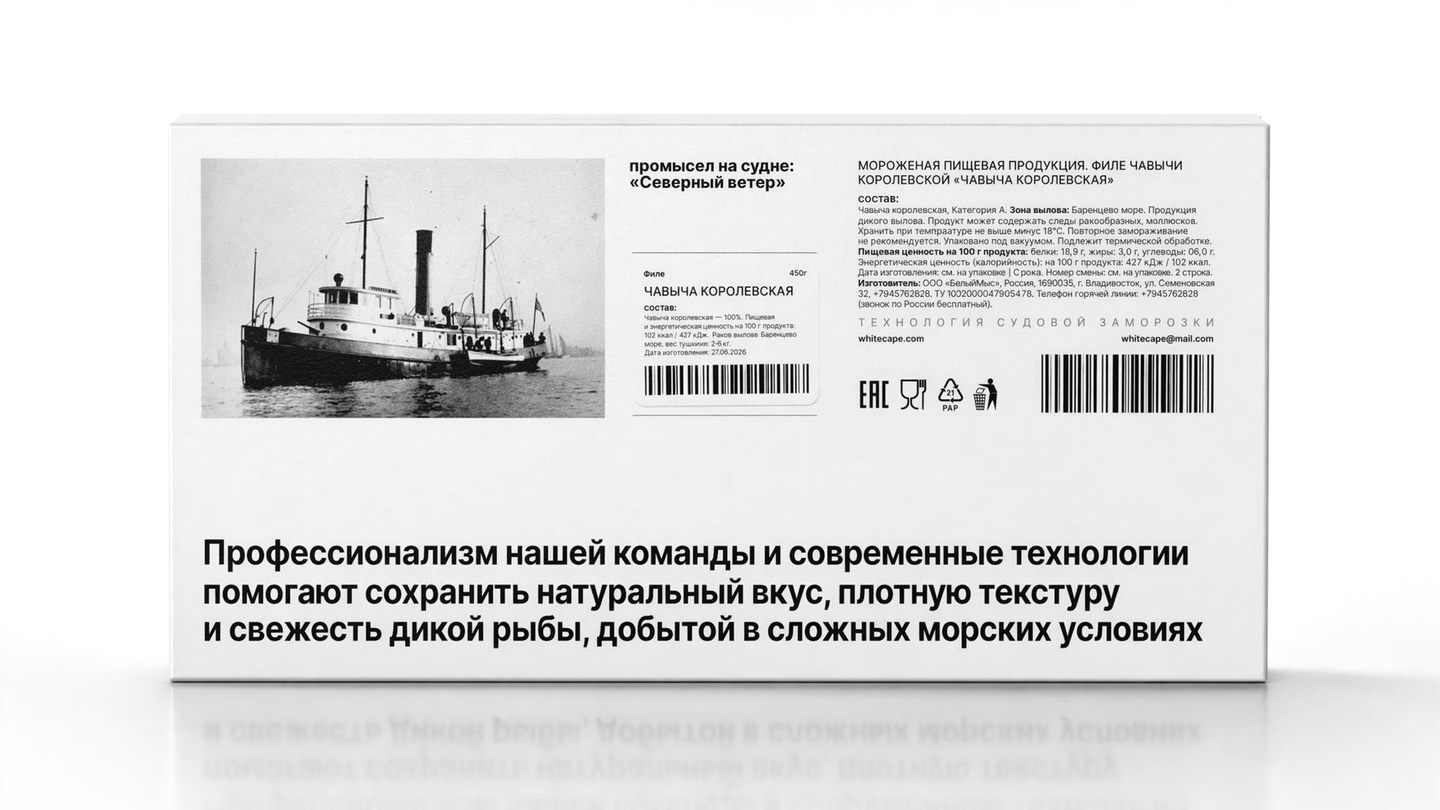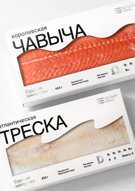
«White Cape» is a brand of wild, premium fish and seafood designed for a balanced lifestyle in the metropolis. Its positioning emphasizes technological sophistication, honest harvesting, and complete product traceability. The visual concept of the packaging is built around the imagery of the wave and the elements: for each species of fish, a unique graphic character representing the catch—from calm waters to storms—has been developed to convey the fishing conditions and also serves as a semantic marker of the seafood’s habitat.
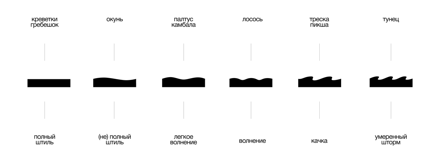
Based on the analysis of fishing conditions, the design system’s logic was developed: the graphics on the shrimp packaging visualize calm and still water, light waves are used for monkfish, and the image of a moderate storm is used for tuna. When products are arranged in a single line, the graphic waves transition into one another, creating a unified, large-scale wave.