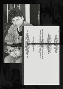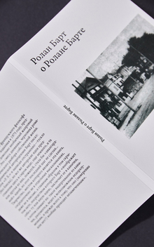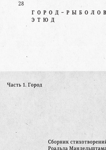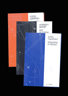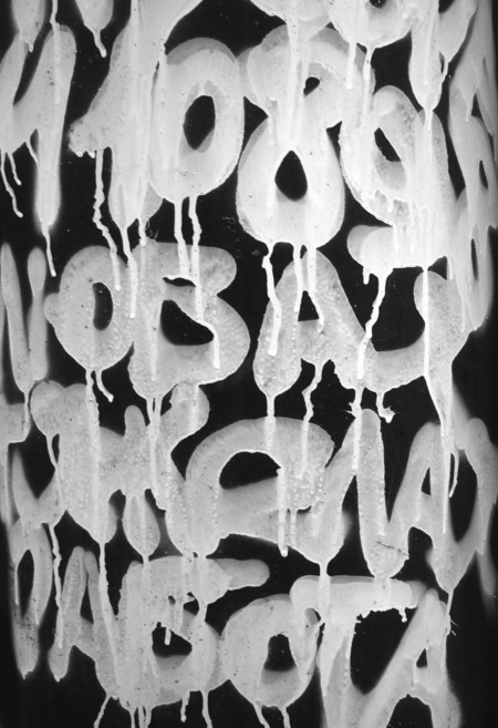
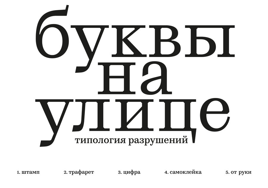
3-part series based on the artist’s photographs, showcasing the rich and not always fortunate «life» of letters in the street. The publication consists of 5 sections: adhesive film, stencil, stamp, numeral, and handwritten letters. All of these compositions have been weathered by time, people, and nature…
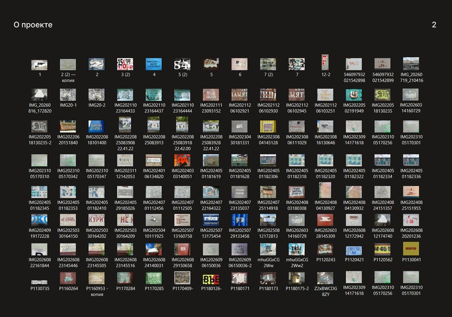
Screenshot of the contents of a folder with photos of various typographic distortions
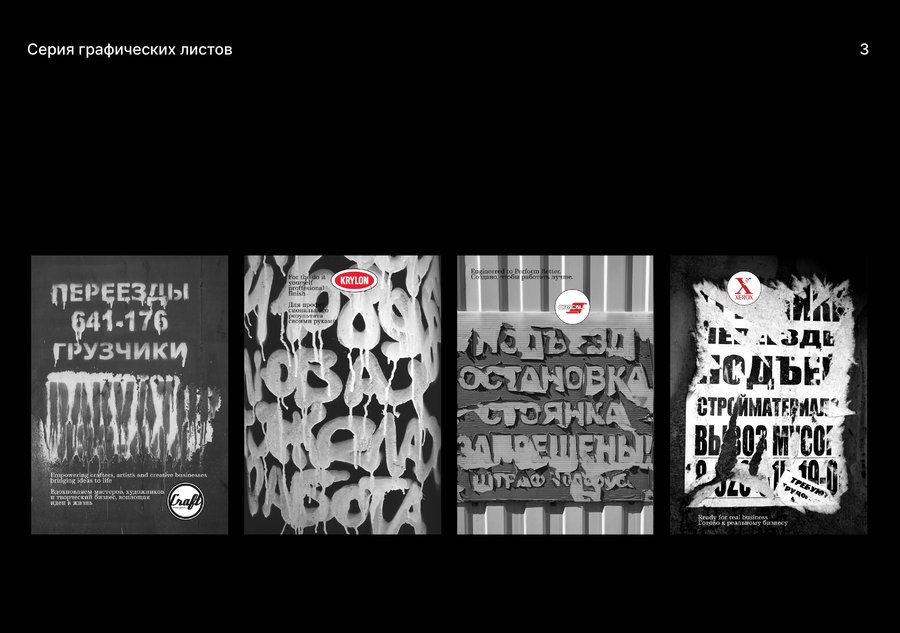
A sticker as the final touch in poster design
The textual content is adapted from the official documentation (manuals and instructions) of industry leaders—and often monopolists—such as Photocentric Craft (stamps), BRAUBERG (markers, paints), Krylon / Sherwin-Williams (aerosol paints), ORAFOL (adhesive films), and Xerox Holdings Corporation (printers and copiers).