
ис[к]ра — медицинский центр, где с помощью нейроимплантов и нейростимуляции восстанавливают память у людей с её нарушениями.
В ходе работы над проектом, было разработано три айдентики с разными концепциями.
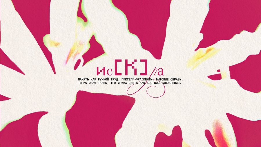
[Память как ручной труд]
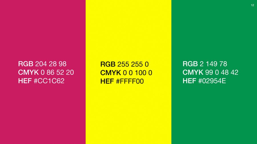
Эта версия айдентики обращается к памяти как к ручному труду — бережному, собранному, сделанному руками. Палитра намеренно яркая: малиновый, зелёный и жёлтый возвращают воспоминаниям телесность и энергию, напоминая о красках повседневности.
Главный символ — чип-узор, похожий одновременно на вышивку и микросхему, соединяет идею «рукотворного» и «собранного». В основе визуального языка — контраст шрифтов: строгая геометрия соседствует с плавными каллиграфическими линиями, соединяя холодную точность с живым теплом человеческого жеста.
[Память как вышивка]
В этой версии айдентики «искра» обращается к телесной и чувственной памяти — к тому, что хранится не в архивах, а в коже, взглядах и жестах.
Ключевой графический элемент — крест-узор, похожий на вышивку. Он несёт в себе ощущение ручного прикосновения и бережного восстановления, будто память аккуратно зашивается в ткань тела. Кресты рассеиваются по телу, образуя узор-след, в котором сохраняется прошлое.
[Память как расцвет]
Итоговая айдентика строится на контрасте машинности и хрупкости: память представлена как живое, но заархивированное явление.
Halftone передает идею фрагментированной памяти, собранной из следов и пикселей. Световые градации превращаются в искры — метафору вспышек воспоминаний, рождающихся на грани распада и возрождения.


