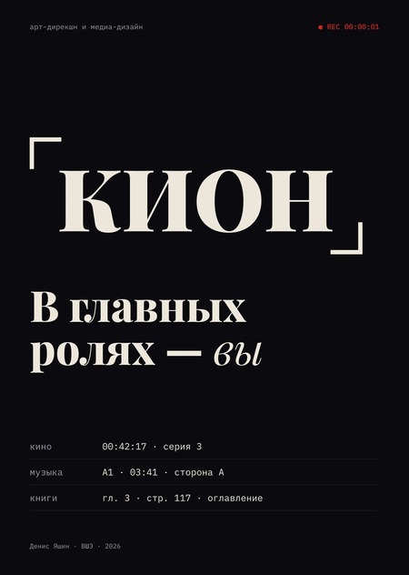
Art Direction for the KION Media Service after its renaming in 2025. Film, music, and books are now in one subscription, yet they speak different languages. I propose a system where the platform speaks through subtitles, and the viewer takes the lead role.
The name has changed—the system remains the same
In 2021, MTS launched the online cinema KION with the BBDO Branding identity: «O» as a screen and purple gradients. In December 2025, MTS Media became ON Media, and KION transformed into «KION"—an umbrella brand for KION Music, KION Tracks, and the general «KION Top» subscription. The audience is large, with 15.9 million people across all media, but the market share is around 5%, and revenue is growing slower than the market.
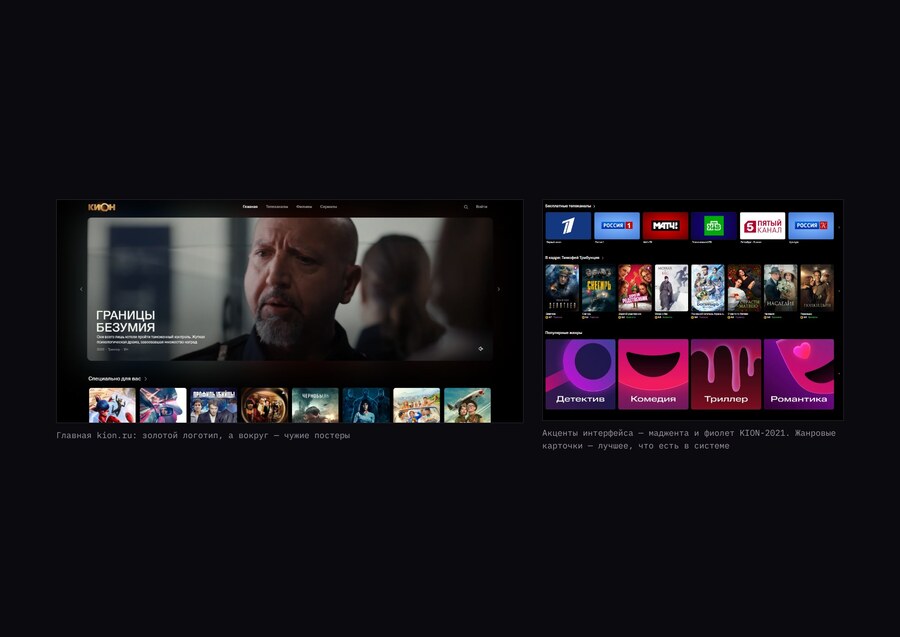
homepage kion.ru — a golden logo, and around it are other people’s posters
The website audit revealed five issues. The logo is gold, while the interface is magenta-purple—the rebranding has not permeated the system. Collection titles are entered in five different ways on a single page. Music, Strings, and «KION Top» are not visible on the homepage. The platform is lost among the posters, and the viewer remembers the series, not the service. One card features three different «Ks.»
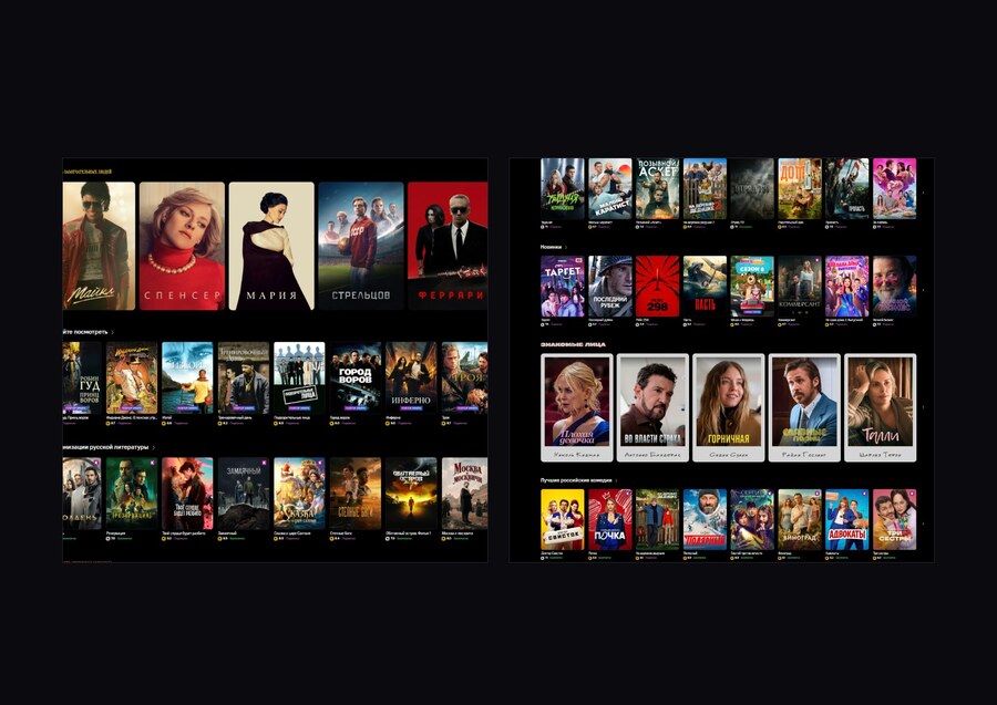
antiques, chromed accident, handwritten, pink placard, and grotesque—on a single page
Objective and Goals
To transform the online cinema’s identity into a visual system for a media service, where film, music, and books speak the same language—from the app to broadcasting and out-of-home advertising.
We have three goals: for KION to be recognizable without the logo, through voice and graphics; for Film, Music, Scripts, and «KION Top» to be cohesive elements; and for the subscription to read as a single narrative across three formats, rather than a collection of add-on services.
Classroom
City dwellers aged 20–40, MTS subscribers. During the commute, they listen to music and audiobooks; in the evening, they watch a series; on weekends, they watch movies with their family on a TV set-top box. Three personas for design consideration: Anya watches a season over the weekend and doesn’t know what to watch next; Timur spends an hour and a half on the subway with music and audiobooks; Olga watches TV with her family, and the overloaded interface disrupts her experience.
three heroes and a design task for each
Market: everything is a storefront
The market is slowing down, and competition is shifting toward ecosystems. Kinopoisk, Okko, Wink, Ivi, Start, and Premier all look similar: a dark background, a grid of posters, and gradients. The niche for an author-led platform—one that tells stories rather than just hosts content—is open.
positioning map — storefront or author, cool or warm
Message
Film, album, and book—they are one story in different forms. KION helps you experience it in its entirety. The tone is that of a narrator, not a salesperson.
You are the main character.
Three options
Before finalizing, I developed three directions. «The Changing State»: the logo ring transforms into a screen, a vinyl record, and a lamp circle. Rejected: the metaphor of light was too generic for the category.
Option 1, «Changes State»
«Three Modes»: custom color for each service and a global toggle. Rejected: It reads like «recolored the icons» and fails to capture the intended meaning.
Option 2, «Three Modes»
Third choice: KION speaks through titles. It gives the platform a voice of the author and works equally well for film, music, and books.
Option 3, titles — selected
Identity
Credits—the only place in a film where it is not the plot speaking, but the creators. I give this voice to KION. Every narrative form has its own «credits»: cinema has the timecode and «starring, ” an album has the tracklist, and a book has the table of contents. The title remains, but the corners of the frame become the main element, and the service name is rendered in italics.
frame icon and sub-brands
The frame border consists of two diagonal corners. The length of each corner is 1/8 of the short side, and the thickness is 1/10 of the length. Inside, there can be a poster, a track, a page, or a face.
Frame Rules