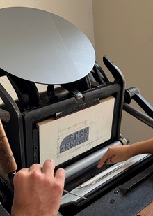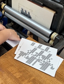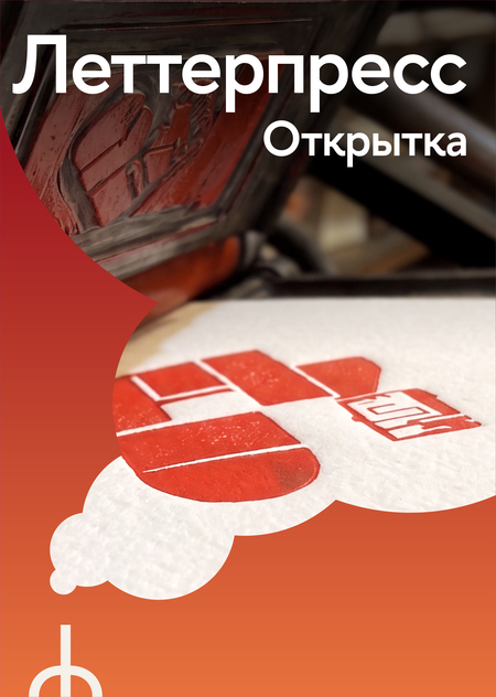
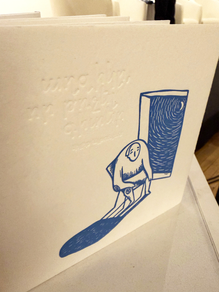
Letterpress is a high-print technology in which the image is transferred onto paper from a raised cliché. The ink sits on the surface, and the printing elements press the paper, creating a distinctive impression.
In this technique, not only the image and color are important, but also the texture of the paper, the depth of the impression, the expressiveness of the lines, and the typography.
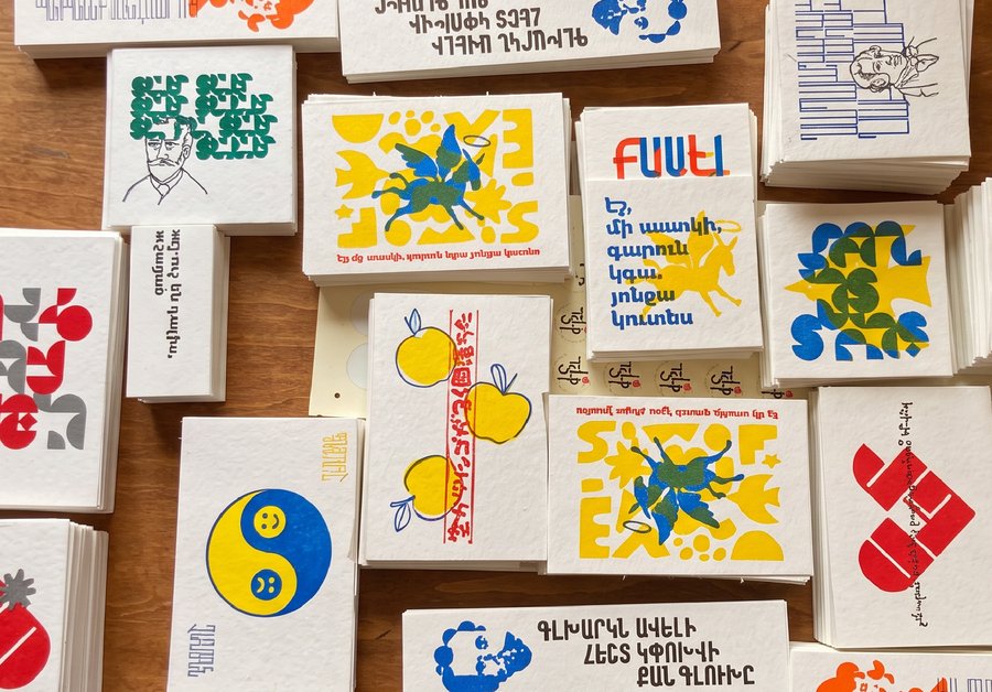
You must create an original series of three postcards, united by a common idea and visual language. Each one must be a self-contained composition while maintaining a connection to the others.
Student Assignment
The student will develop an original series of three postcards, considering the technical constraints of letterpress printing. This requires thinking beyond the visual concept to encompass the feasibility of its execution in material form.The deliverable must include:
- A cohesive concept for the series;
- Three independent compositions united by a single visual system;
- A color palette designed around a limited number of inks;
- Mockups of the front sides of all three postcards;
- Color separations and vector files for manufacturing printing plates;
- A final visualization of the completed series.
If desired, you can further develop the design for the back side.
The final outcome must be a complete series ready for production, not isolated sketches or visualizations. The creation of physical postcards is not a mandatory requirement for final submission.
Series Structure
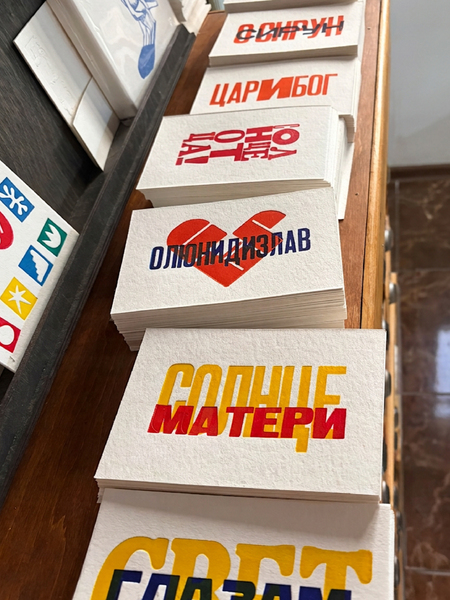
The series consists of three A6-sized postcards—105 × 148 mm. All three pieces must be connected by a common theme, artistic technique, color palette, typography, or another authorial principle.These could include:
- three illustrations;
- a character series;
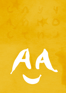
- lettering or typographic compositions;
- a typographic experiment;
- ornaments and patterns;
- abstract compositions;
- a series of symbols or visual motifs.
The images do not necessarily have to adhere to the same principle: each postcard can have its own distinct character, yet it must harmonize with the others and be perceived as part of a unified whole.
Design Submission Guidelines
Front Side
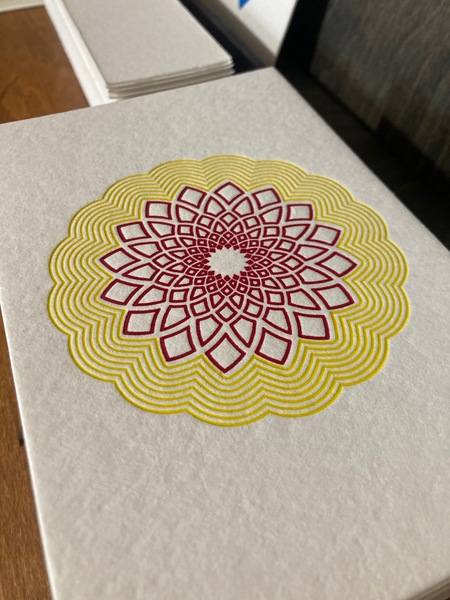
For each of the three postcards, you must develop a unique composition, taking into account the chosen colors, paper texture, and the intended depth of the impression.
The image may occupy a significant portion of the postcard, or it may be constructed from distinct elements, leaving the blank space of the paper as part of the composition.
Back Side
Designing the back side is optional.
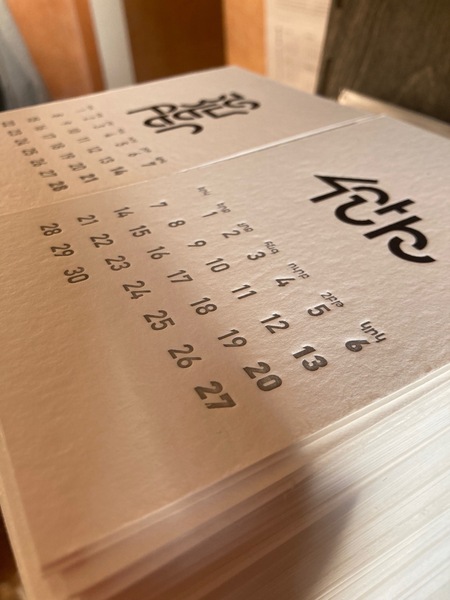
If desired, you can develop a supplementary design for the back: place the series title, author’s name, the School’s logo, or other elements.
For printing, the back side can be one color or a blind impression without ink. Both options require a separate cliché and an additional printing pass.
When printing double-sided, it is recommended to use paper with a density of 850 g/m². However, please note that a deep impression on the front side may show through on the back.
The back side can be consistent across the entire series or designed separately for each postcard.
Technical Specifications
Format
The fixed postcard format is 105 × 148 mm (A6).
In the layout, you must specify the exact size and placement of the image relative to the edges of the sheet.
Direct printing on a letterpress is technically complex, so it is recommended that significant elements be placed no closer than 5 mm from the trim line.
The printing uses equipment with a working area of up to 200 × 290 mm.
Paper
For letterpress, thick, relatively soft paper that can retain the impression’s relief is suitable. The workshop uses Cordenons cotton paper with densities of 450 and 850 g/m². Other paper suitable for this technology may be used.When developing a project, you must consider the paper’s color, density, and texture—as these affect the image’s appearance, the depth of the print, and color perception.
If the design requires printing on the reverse side, we recommend using 850 g/m² paper. It is better suited for double-sided printing because a deep impression might show through the back of the sheet.
The final paper selection is confirmed when preparing for production.
Color
One print color equals one cliché—one press run. On the front side of each postcard, you can use up to three printed colors plus a blind impression.
A blind impression is a raised image without ink application. To create one, you must prepare a separate printing plate and cliché. Thus, for the front of a single postcard, you can use up to four clichés: three for ink printing and one for the blind impression. Using all four is optional.
If the back side is designed, it is permitted one printed color or a blind impression. In either case, an additional cliché and a separate printing run will be required.
The workshop uses Van Son printing inks, which are selected according to the Pantone catalog. Colors in layouts must be specified as spot colors, with the corresponding Pantone numbers.
Full-color CMYK printing is not provided as part of this assignment.
The registration tolerance between printing layers is approximately 0.5 mm. Therefore, it is not recommended to build a composition on elements that require absolutely precise contour alignment.
It is better to employ intentional overlays, minor color overlaps, and compositional solutions that allow for the natural variations of hand printing.
Imagery
For letterpress, images originally designed with the specifications of high printing are best suited:
• line art;
• lettering and typography;
• characters;
• ornaments;
• large color blocks;
• combinations of lines and fills;
• blind impression.
The image can be created by hand using ink, a brush, or a liner, and then digitized and converted to vector format.
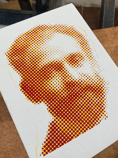
Vector images without raster effects, gradients, halftones, or transparency must be used to create the clichés.
Minimum line thickness is 0.4 mm.
Too fine details may print poorly and wear out more quickly on the cliché.
Large fills may exhibit characteristic unevenness. This is a natural aspect of the technology that should be taken into account when developing the image.
Print Preparation
For each postcard, you must prepare an editable vector layout in Adobe Illustrator.
Key Requirements:
- Document size — 105 × 148 mm;
- Each print color must be placed on a separate layer;
- Die-cuts, if used, must be placed on a separate layer;
- All layers must match the document size and retain the exact relative positioning of elements;
- Colors must be designated using Pantone numbers;
- Fonts must be converted to outlines;
- Raster effects, gradients, halftones, and transparency are not permitted;
- Minimum line thickness — 0.4 mm;
- The source file must remain editable.
If double-sided design is required, the layout for the back side must be prepared separately from the front side, including a dedicated layer for the printing color or blind emboss.
For final submission, Adobe Illustrator files with separate layers for each printing color and blind emboss are sufficient.
You do not need to create additional production files in other formats yourself.
Cliché Plates
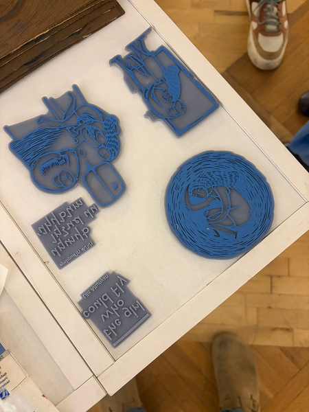
For transferring an image onto paper, a relief printing cliché is used.
A three-dimensional model of the cliché is created based on the prepared vector image and then printed using a 3D printer with photopolymer resin.
Each printed color and blind impression requires a separate cliché.
The student does not need to create the 3D model independently. The workshop prepares the models and manufactures the printing clichés based on Adobe Illustrator files.
If technical requirements are met, the cliché can be reused multiple times. This allows for the reprinting of postcards without having to develop the image and cliché from scratch.
Fonts and External Materials
Only free fonts with a license permitting free use and printing may be used.For external texts, illustrations, and other materials, you must possess the rights to use them.
All texts and images must be fully prepared and proofread before final submission.
Production and Print Run
After selection, the best projects may proceed to production.
At this stage, the workshop reviews the files, specifies paper, paints, print element sizes, color registration, and printing sequence. If necessary, the layouts are refined collaboratively with the author.
Production Process:
File checking → creation of cliché 3D models → cliché printing on a 3D printer → press setup and test prints → sequential color printing and blind impression → drying → cutting → quality control → delivery of finished postcards.
If the back design is included, it is printed in a separate pass.
A new press run is performed for each of the following colors. During production, the color registration, paint uniformity, print depth, and field cleanliness are monitored.
After printing, the postcards may require up to two days to dry completely. Test prints are not included in the final run.
Since the clichés can be reused, the selected postcards may be produced in subsequent editions. The possibility, volume, and terms of future production are determined separately for each project.
Studio Workshop Access
Students at the Yerevan campus of the Art and Design School have the opportunity to work with letterpress in a local studio as part of a relevant elective or art practice.
During their sessions, they can familiarize themselves with the equipment, prepare a three-dimensional model of a cliché, print it using a 3D printer, set up the press, and create a physical copy of one of the postcards in the series. Studio work is organized according to the academic schedule and equipment availability.
Physical greeting cards are not required for students from other campuses. Instead, they develop a series and prepare a complete set of production files, which can subsequently be submitted to the workshop for printing.
The submission requirements are the same for all campuses. The availability of equipment does not alter the mandatory scope of the project.
What to submit