Marginal Typography—an essay by Mikhail Kapanagi in the design for Sofia Eristavi, reflecting the perspective of a designer weary of imposed rules, rigid frameworks, and the cargo cult that grew from misconceptions, outdated standards, and the recommendations of random, yet loud, figures.
(0) Introduction


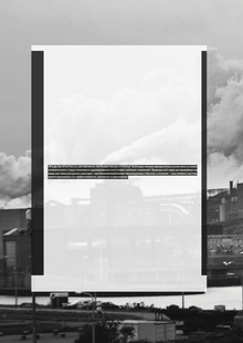
The publication is compiled as a zine, featuring several different formats that complement the text’s meaning and highlight the unique construction of each chapter.
The perspective on typography shifts with every chapter—a change reflected in the unique insert-title pages with the chapter names.
(1) Point of Origin and Acceptance of Global Diversity
exploring the nature of rules: how they are formed and why they might exclude one another while remaining simultaneously valid—a renunciation of a single, definitive answer when viewing the whole


quotes are placed in horizontal blue-tinted insets
In the first chapter, the images literally illustrate what is written in the text and serve as visual examples—they are placed at the bottom of the strip.


(2) Zeitgeist in drawers and containers
Style as a trap for the living process: unpacking the signs of the times and sensing the form of chaos. The life of the present at the edge of the moment, where reality must evade categorization to remain alive.


In the second chapter, the images are more abstract and possess a more metaphysical quality—they occupy a separate band, not illustrating the text, but rather creating independent visual statements on equal footing.


(3) Grounding using the example of containment in my own work
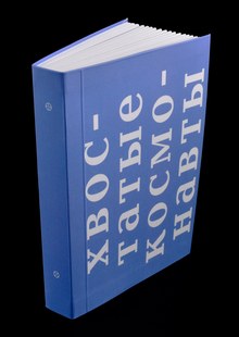
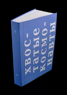
Transitioning from theory to the physical realization of an idea at the boundaries of personal experience, as seen in Mikhail Kapanadze’s book, «What is Beauty?» Entering a space where form ceases to be decoration and becomes an event that can only be lived.