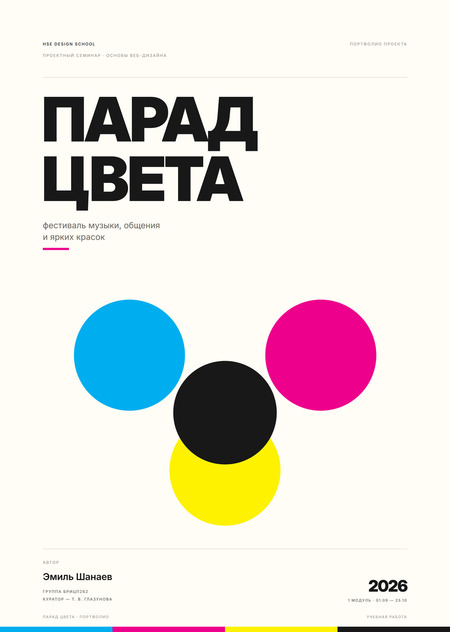
Color is a reason to come together
«Color Parade”—a Holi-inspired festival where music, community, and clouds of pigment bring people together. One day, one venue, one reason to get covered in color.
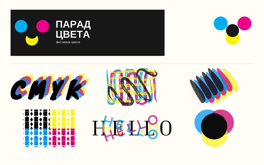
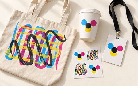
The core of the identity is built upon four printing inks: cyan, magenta, yellow, and black. These elements comprise the logo, six flags, and graphics. The print error became a technique: the color doesn’t fill, it overlaps.
Four colors, one symbol
The logo is four circles converging in a cloud of paint. The flags continue this system: a flourish, a grid, arcs, and typography.
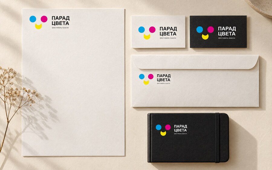
Media System
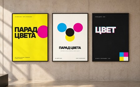
Forms, business cards, envelopes, posters, and merchandise are assembled from a singular set of elements—symbols, flags, and bold typography.
The identity transitions to the screen
Festival website—a single screen featuring three colored blocks, bold typography, and a flag flourish. No JavaScript, with responsive design starting at 360 px.
How the Image Was Found
Three concepts: a color exhibition, Holi, and an interactive room. We chose Holi: color becomes action, not background.
Next, we compared the three directions for the homepage. The «Color Poster» concept was chosen for development because it better connects the website with the print identity.
Page in working size
First screen in the browser: 1440 px, no scaling.
Elements of a System
Palette, typography, buttons, and graphics. One neutral framework, one accent, and no superfluous effects.
Project
Mockup, published page, and source code.