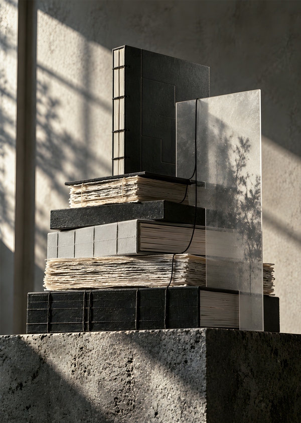
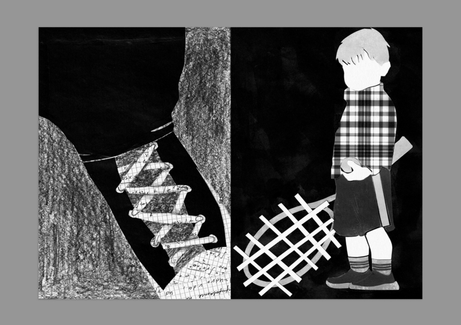
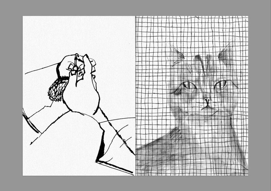
Оригинальный проект «Переплетено» — это чёрно-белый зин, исследующий невидимые связи между человеком, природой, городом и технологиями. Через иллюстрации, коллажи и сопоставление повседневных явлений он раскрывает идею непрерывного взаимодействия всего окружающего мира.
Издательство «Переплетено»
Imagine you are a professional graphic designer and brand strategist. We are developing the visual identity for «ПЕРЕПЛЕТЕНО», an independent creative publishing house focused on exploring invisible connections between people, cities, nature, architecture, infrastructure, and the surrounding world. The main philosophy of the brand is «two worlds — one connection.» We want to show how seemingly independent systems constantly interact with each other.
Develop a visual identity concept based on the contrast between strict geometric structures and free, organic lines. Use a restrained monochrome color palette, avoid bright colors. The visual identity should feel intellectual, contemporary, minimalistic, and suitable for an independent publishing house. Explain how these graphic elements reflect the brand’s philosophy and why the absence of bright colors helps focus attention on form, meaning, and the relationships between elements.Imagine you are a professional graphic designer specializing in visual identities for independent publishing houses and contemporary cultural institutions. Create a series of 4 separate graphic images presenting the visual identity of the creative publishing house «ПЕРЕПЛЕТЕНО». All images should follow the same minimalist, intellectual, editorial design style. Use thin lines, geometric grids, abstract compositions, precise proportions, and plenty of negative space.
1. Create a primary brand logo that clearly reflects the concept of combining opposites. Draw inspiration from the provided illustrations.
2. Create a clear, visual representation that combines a rigid grid with fluid lines, while highlighting the contrast between black and white.
3. Develop symbols that align with the brand identity principles. Create a symbol representing freedom and travel, as well as a scaled-down version of the primary logo.
4. Devise a restrained color palette for a minimalist, concept-driven publishing house. Avoid bright, vivid colors.
5. Propose a combination of primary and secondary typefaces for the brand’s typographic system.
«Переплетено» превращается в издательский и культурно-исследовательский бренд, создающий альтернативные путеводители, артбуки и городские маршруты.
В отличие от традиционных путеводителей, бренд рассказывает не столько о достопримечательностях, сколько о скрытых отношениях между пространством, природой, инфраструктурой и человеком.
Айдентика
Айдентика основана на сочетании строгой графической структуры и свободной органической линии. Эти противоположные элементы воплощают центральную идею издательства: окружающий мир состоит из множества самостоятельных систем, непрерывно взаимодействующих друг с другом.
Чёрно-белая эстетика дополнена бумажным и серыми оттенками. Отсутствие ярких цветов позволяет сосредоточить внимание на форме, содержании и взаимодействии элементов.
Коллекция 001 / Москва
I want the publishing house to create alternative city guides, art books, visual research publications, and thematic urban routes. In the future, the brand could also organize exhibitions, cultural events, and other creative projects. Unlike traditional travel guides, «ПЕРЕПЛЕТЕНО» should not focus primarily on famous landmarks or tourist attractions. Instead, it should reveal hidden relationships between urban spaces, nature, infrastructure, history, and human activity. The brand should feel like a cultural research project that encourages people to observe familiar surroundings from a completely different perspective. Develop a clear and meaningful brand concept based on these ideas.Imagine you are a professional graphic designer specializing in typography and visual identities for independent publishing houses and contemporary cultural institutions. Create covers for 3 guidebooks about Moscow. Each book should explore a different facet of how various aspects of the city are interconnected.
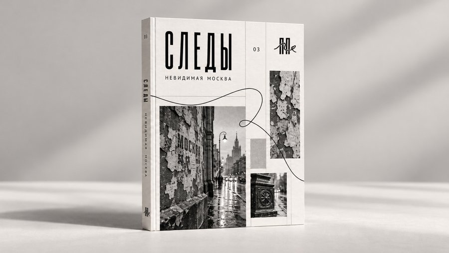
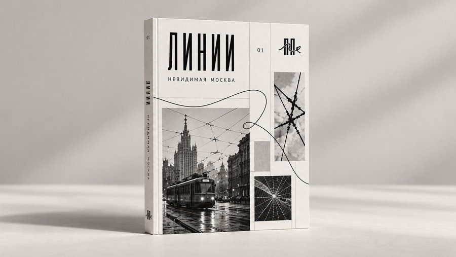
Линии. Как железнодорожные пути, маршруты метро, транспортные узлы соединяют отдельные части мегаполиса.
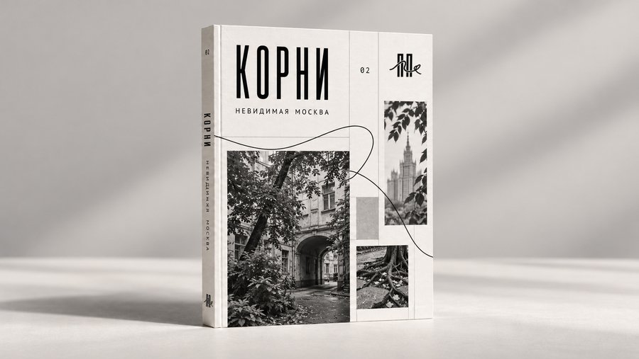
Корни. Как живая природа приспосабливается к искусственной городской среде и изменяет её.
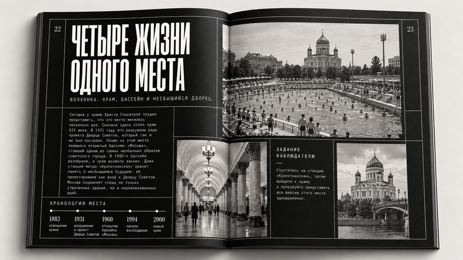
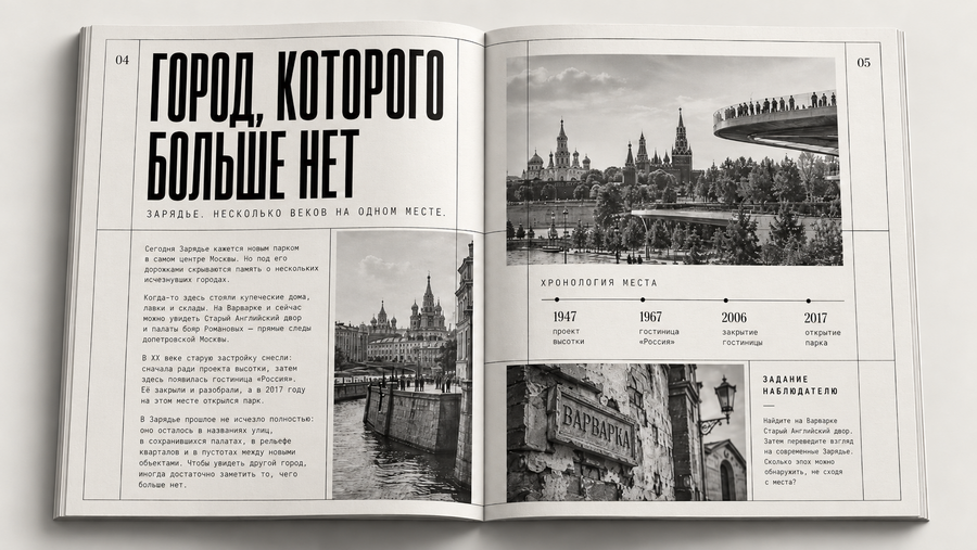
Следы. Как разные исторические периоды продолжают существовать одновременно в одном городе.
Издание «Следы»
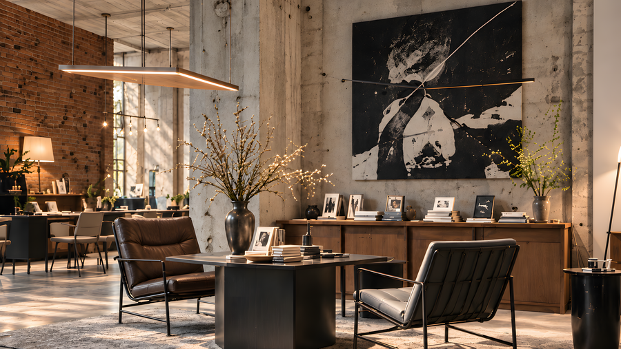
Imagine you are a professional architect, spatial designer, and writer. We are developing a multifunctional cultural center for the independent publishing house «ПЕРЕПЛЕТЕНО». The space combines a bookstore, exhibition gallery, production workshop, library, meeting rooms, and a small café. Its architecture follows an industrial loft aesthetic, with concrete, black metal, large windows, exposed engineering systems, and natural wood. Balance expansive public areas with intimate spaces for reading, working, and conversation.Create a series of separate photorealistic images of the cultural center of «ПЕРЕПЛЕТЕНО». Maintain a consistent industrial loft aesthetic: high ceilings, raw light-gray concrete, black metal, large windows, exposed pipes, natural wood, plants, and warm daylight. The interiors should feel spacious, contemporary, and welcoming, combining public cultural spaces with intimate working areas. Use realistic materials, natural shadows, and professional architectural photography rather than CGI.
Пространство издательства — это многофункциональная среда, объединяющая издательскую деятельность, современное искусство и культурное взаимодействие.
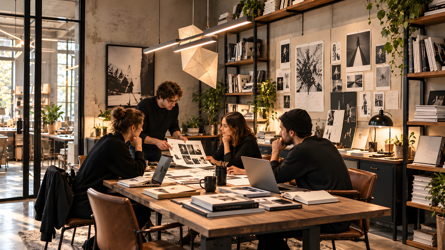
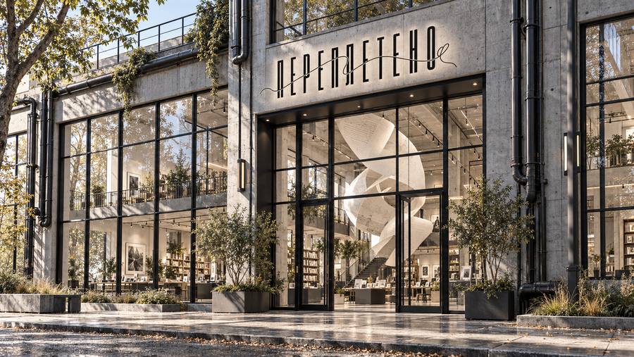
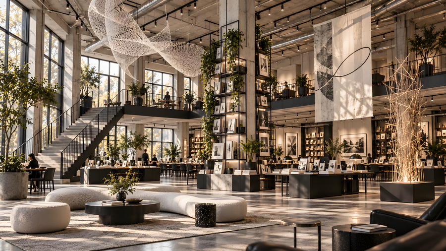
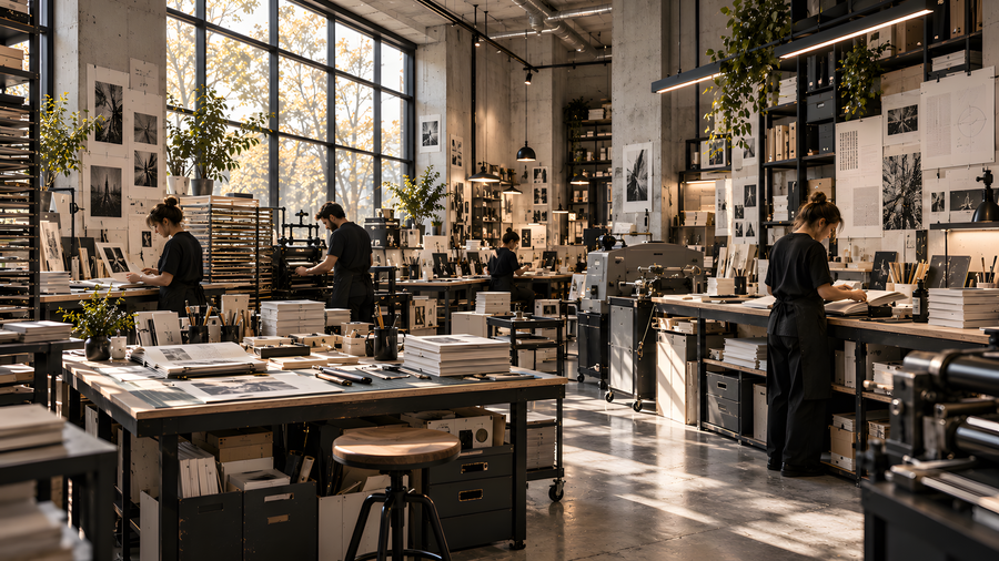
Входная группа / Главный холл / Мастерская / Переговорная
Просторная культурная зона с высокими потолками, книжными стеллажами, концептуальными арт-объектами и местами для отдыха соседствует с небольшими библиотеками, переговорными, рабочими кабинетами и уютным кафе. Такое чередование масштабов создаёт живую среду, в которой уединение, творчество и общение естественно дополняют друг друга.
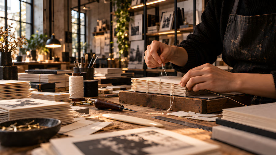
Also, create intimate, small, and cozy spaces — a library, a cafe, a reading room, and a stairwell. These settings should be as different as possible in scale from the images mentioned previously. Additionally, produce a couple of realistic shots showing the process of bookbinding in a workshop, as well as the packaging of a finished book ready for shipment.
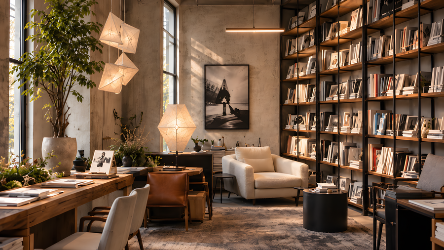
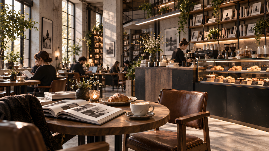
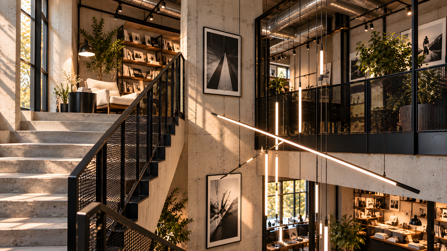
Зона отдыха / Кафе / Лестничный пролет / Библиотека
Открытые трубы, провода и инженерные коммуникации делают видимыми связи, которые обычно скрыты внутри здания. Так пространство издательства превращается в физическое воплощение его философии: здесь переплетаются люди, идеи, искусство и производственные процессы.
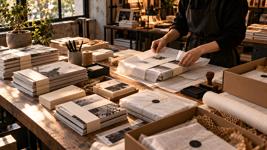
Носители
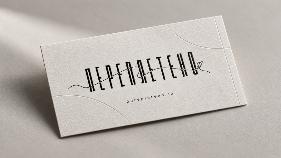
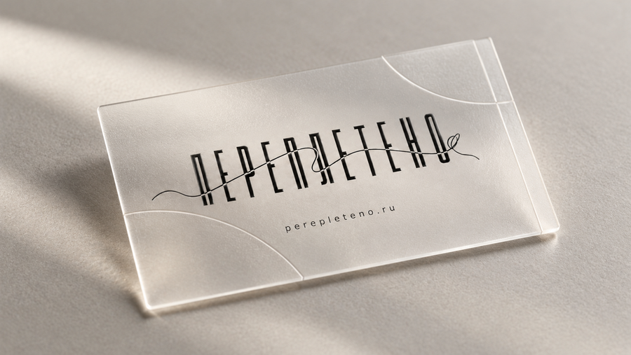
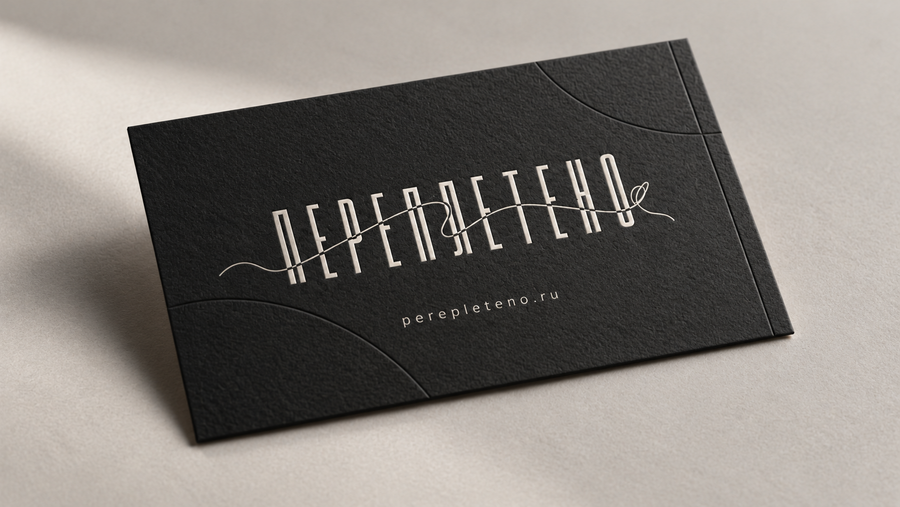
Imagine you are a professional graphic designer, marketer, and art director. Your task is to create promotional materials for the publishing house «ПЕРЕПЛЕТЕНО». Apply core brand identity principles while highlighting various facets of the publishing house. Ensure that the materials do not all look the same — some should be simple and concise, while others should be more detailed. Create a series of photorealistic images featuring banners, posters, and business cards to promote the project.