About me
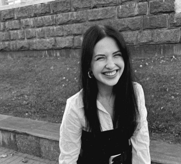
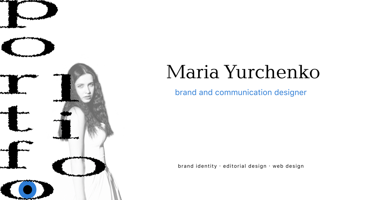
Hi, I’m Masha, a brand and communication designer who loves literature, art, cinema, and getting dressed up. I look for beauty in the world around me and within myself, turning the things I notice and feel into thoughtful, expressive design.
How I work on projects
01 / RESEARCH I explore the brief, context, and audience. I look for visual references and insights that can form the foundation of the project.02 / EXPLORATION I test different approaches, experimenting with typography, graphics, and composition. I choose the direction that best expresses the idea and meets the brief.03 / DEVELOPMENT I develop the chosen concept into a cohesive visual system. I test how it works across different applications and refine the details.
case 1
Facets of Time
A calendar inspired by gemstone cuts
THE BRIEF Create a calendar exploring a form of handcraft. I chose the craft of gemstone cutting.THE CONCEPT Facets of Time is a calendar featuring twelve double-sided cards, each dedicated to a different gemstone cut. The dates follow the lines of technical cutting diagrams, turning the geometry of the facets into calendar grids. The reverse of each card introduces the featured cut and explains key jewellery terms.
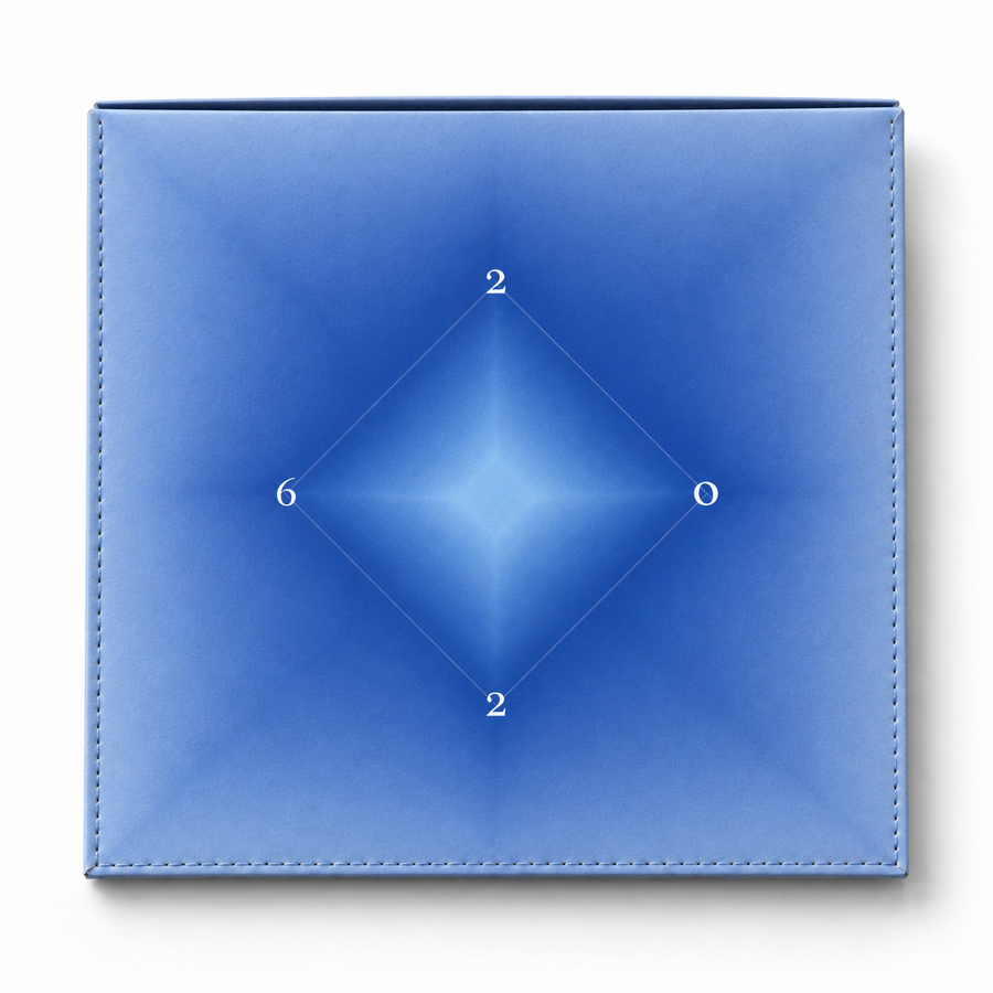
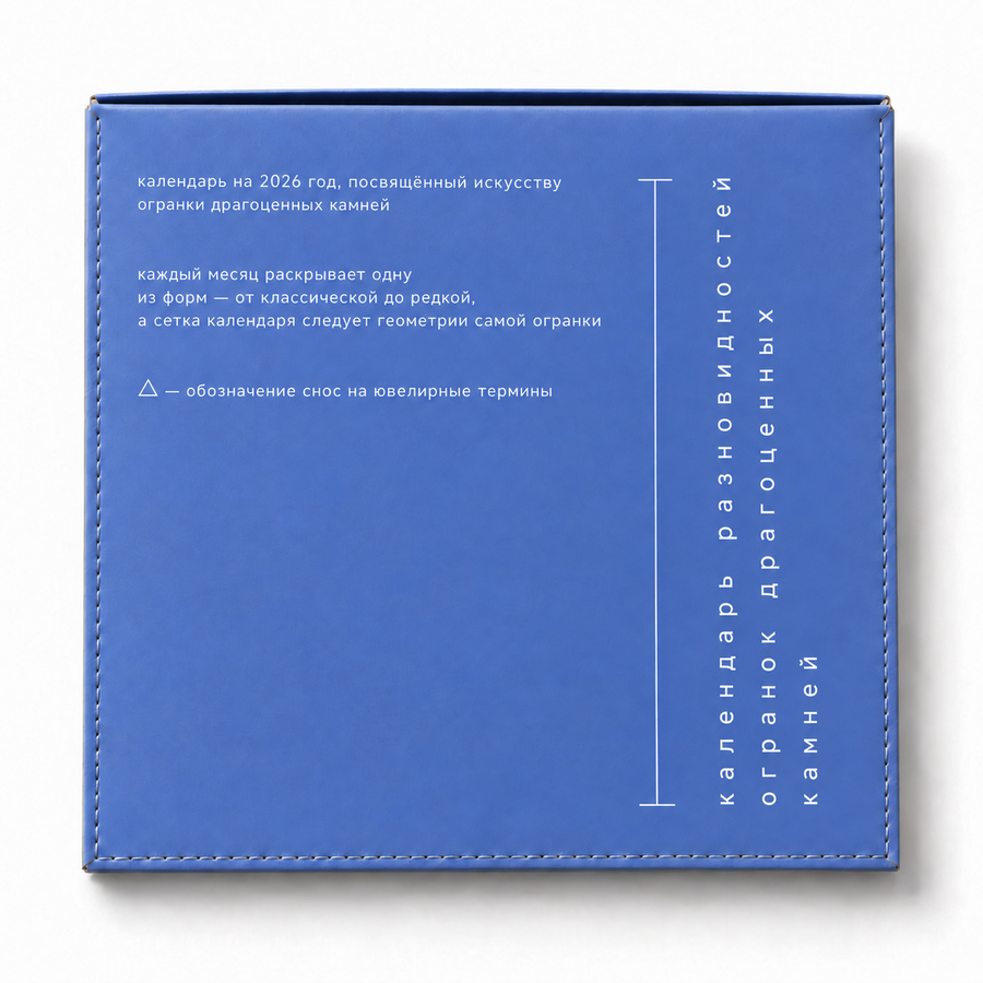
envelope-style cover
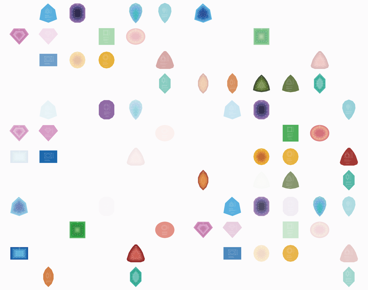
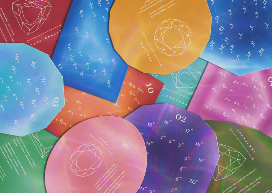
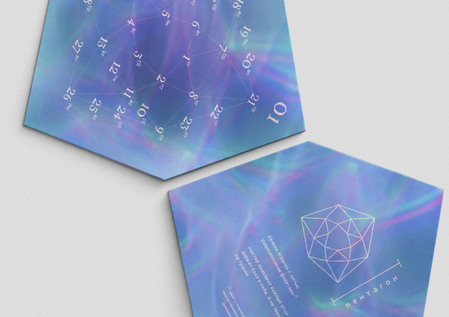
DESIGN APPROACH Technical diagrams of gemstone cuts define the card shapes and the arrangement of dates. Colour gradients evoke the play of light within gemstones, while fine lines and contrasting typography reflect the precision of jewellery making. The reverse of each card introduces the featured cut and explains key jewellery terms.
case 2
Pekarnaya Lavka
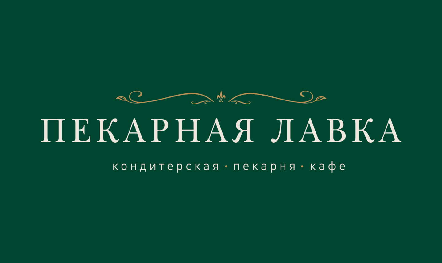
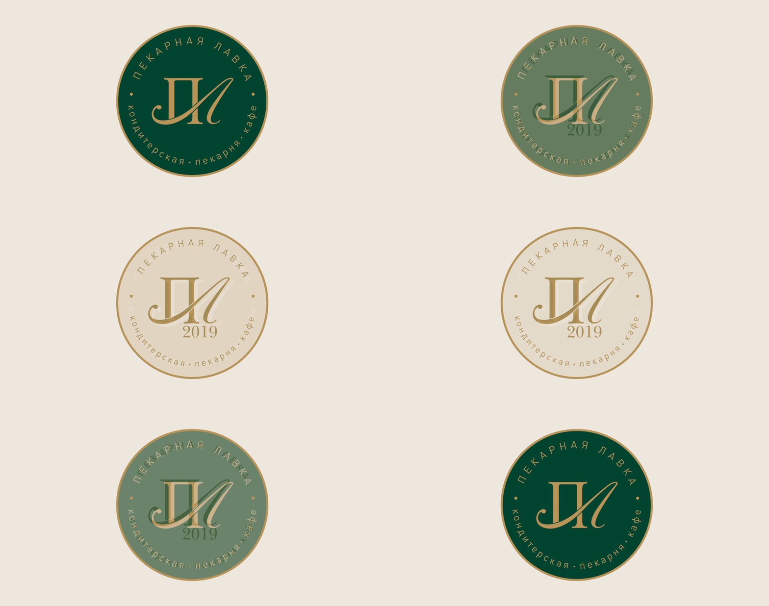
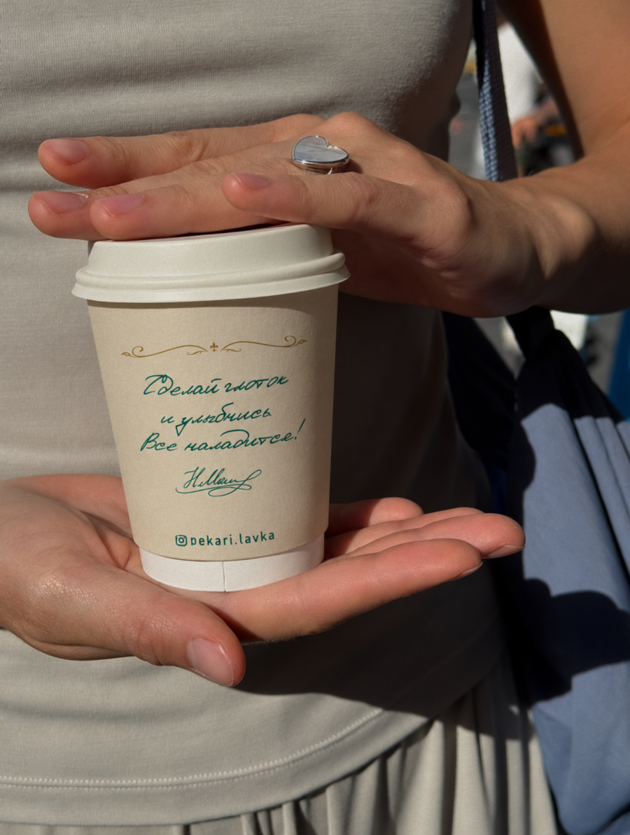
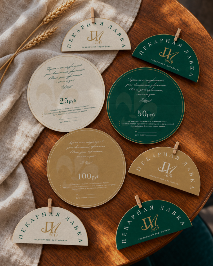
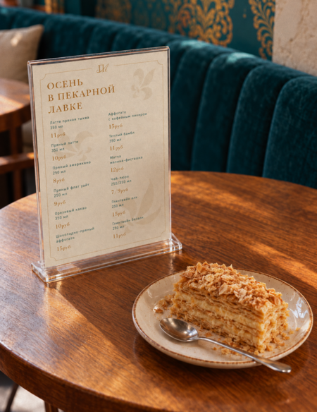
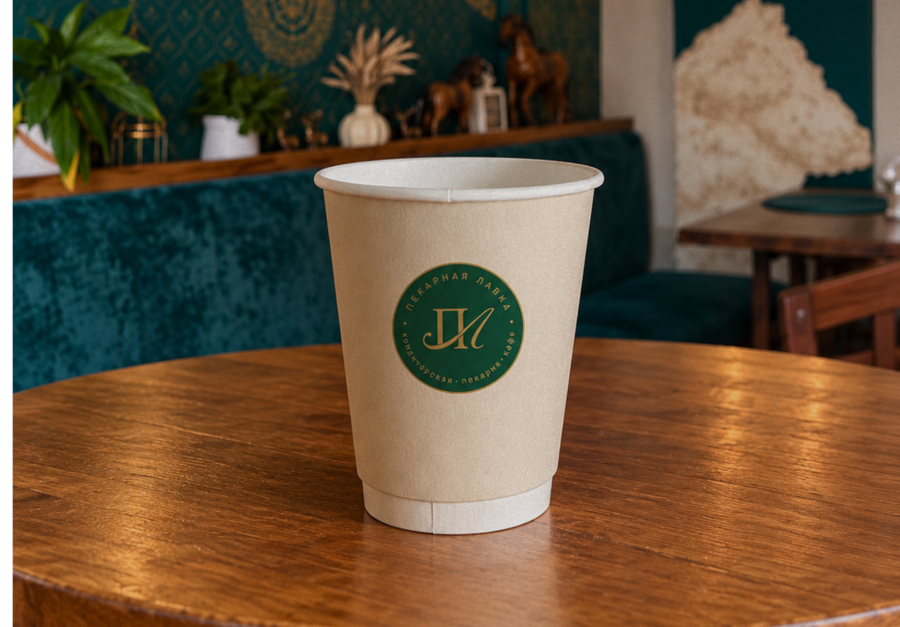
THE BRIEF Pekarnaya Lavka is a family-run bakery, patisserie and café in Minsk, inspired by the founder’s memories of her grandmother’s bread. The brief was to create an identity that brings together the charm of a traditional merchant’s shop, understated contemporary luxury and the warmth of home.THE CONCEPT A welcoming home built on personal care and pride in one’s name. The identity connects merchant traditions with the founder’s dedication to her craft and her guests.DESIGN APPROACH A flexible logo system combines a wordmark, a Cyrillic ПЛ monogram and a mark featuring the founding year. Classical typography, deep green and gold accents establish the identity’s character, while handwritten messages and the founder’s signature add a personal touch. The system extends across signage, printed materials and staff uniforms.
case 3
Winter Silence
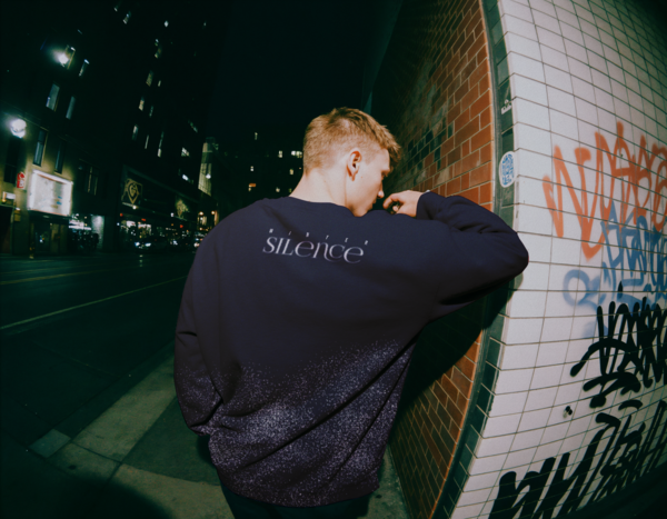
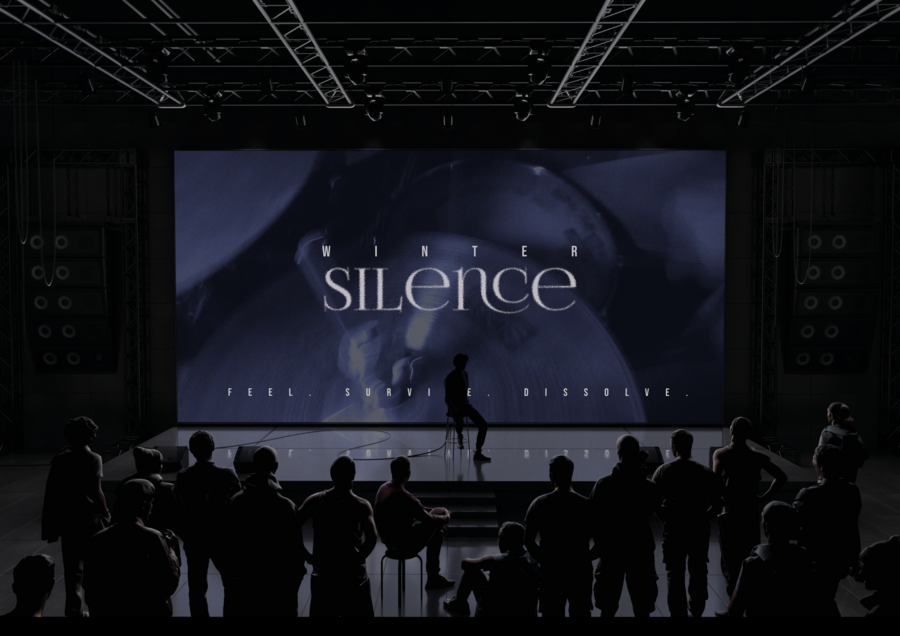
THE BRIEF Create a visual identity for Winter Silence, a Saint Petersburg band blending alternative metal with lyrical elements. Express the band’s character across posters, a vinyl release, clothing and stage visuals.THE CONCEPT The identity draws on radical sincerity and safe melancholy: a space for experiencing difficult emotions openly. It explores the contrast between an unassuming exterior and a mystical inner world, echoing the balance of heavy sound and lyrical sensitivity.DESIGN APPROACH A cool blue palette, grainy textures and diffused light evoke depth and mystery. A dissolving wordmark contrasts with crisp, widely spaced sans-serif typography. Typography, photography and texture form a cohesive system across the band’s releases and live communications.
case 4
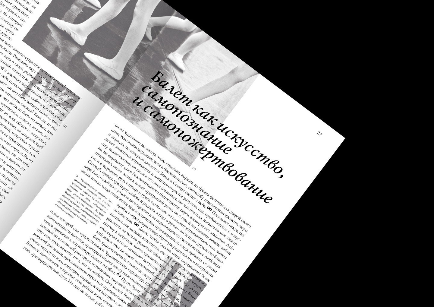
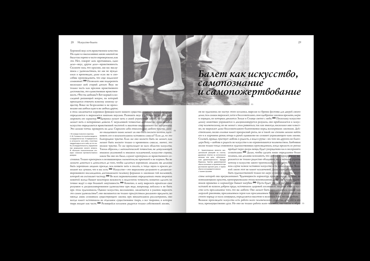
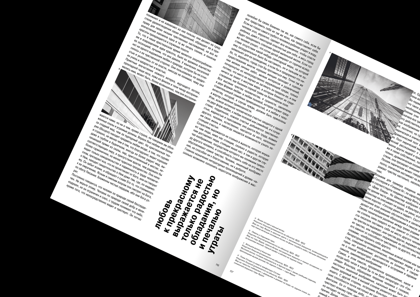
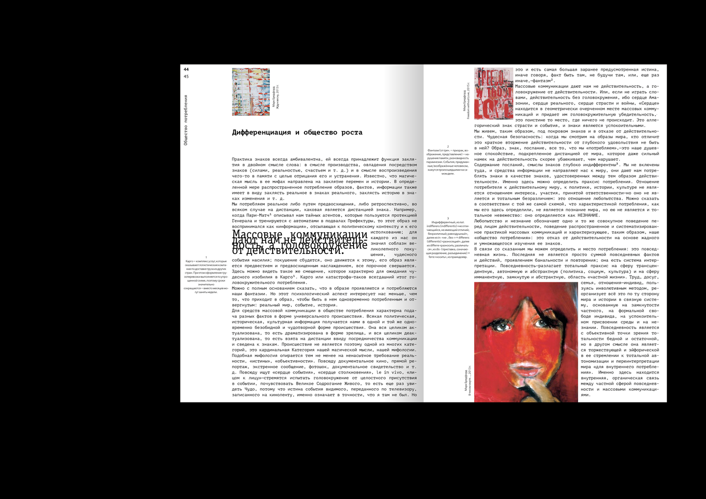
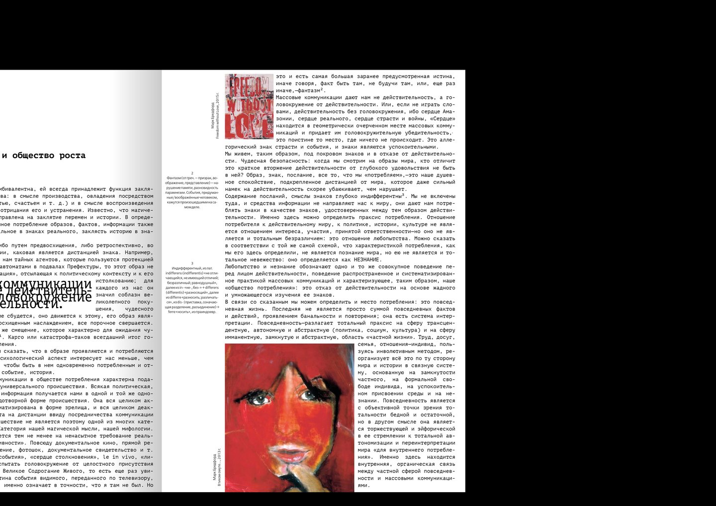
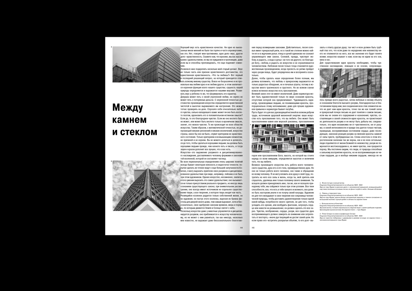
Selected Typography
THE BRIEF Explore the expressive potential of typography through a series of editorial exercises, focusing on hierarchy, rhythm and the relationship between text and image.APPROACH Each spread is an independent experiment, with its content shaping the composition—from restrained layouts to more expressive arrangements.DESIGN Changes in type scale, contrasting styles, grids and white space establish emphasis and guide the reader. Text functions both as a carrier of meaning and as a graphic element.