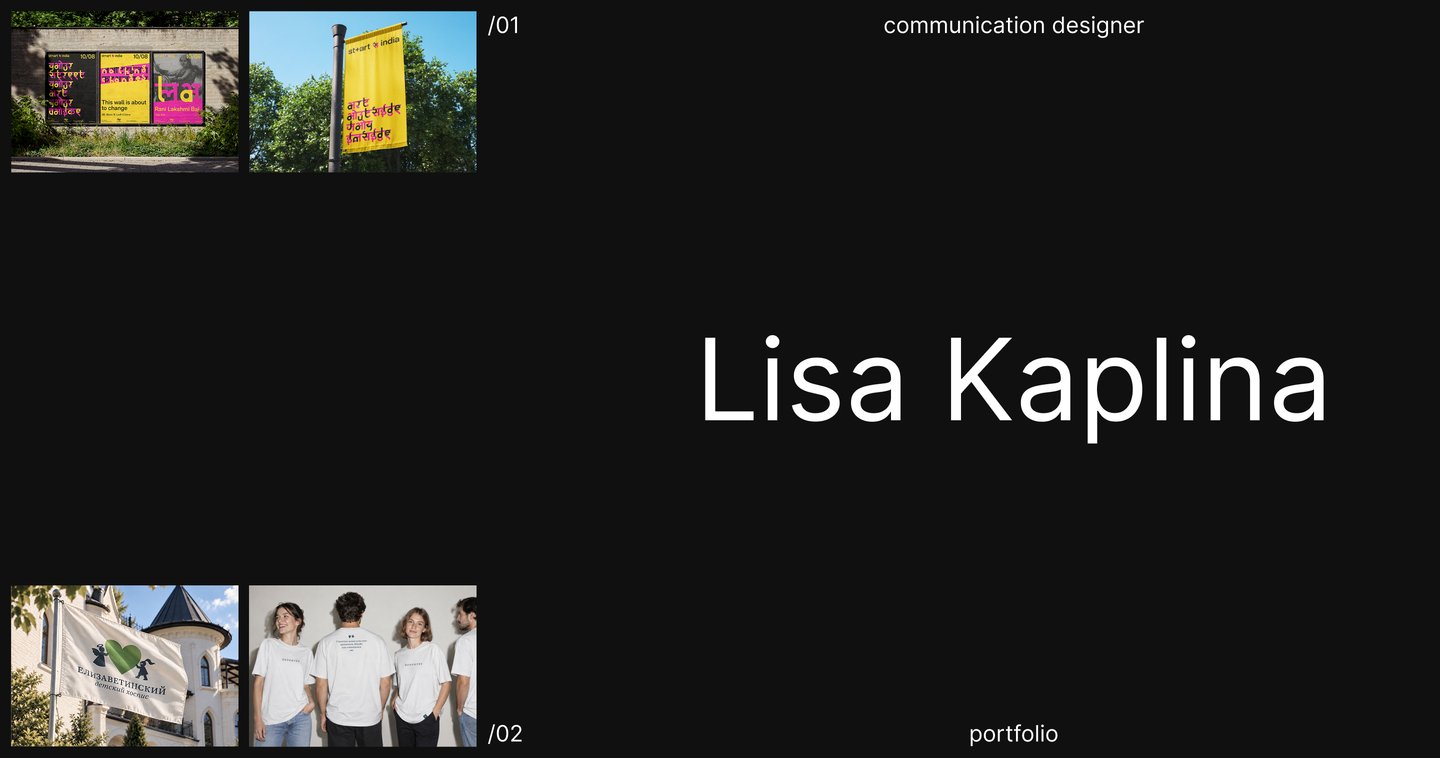
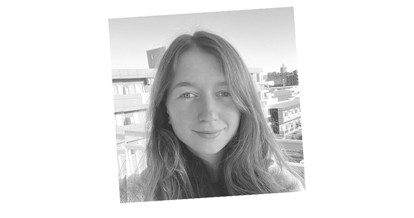
I’m Lisa Kaplina, a communication design student at HSE University and a designer at Yandex.
I focus on visual identity and rebranding. I’m particularly interested in working with non-profit organizations, where design can help communicate meaningful ideas, make their values more visible, and connect with people.In this portfolio, I present two projects that explore different approaches to rethinking visual identity.How do I approach projects?
01/ Problem02/ Research03/ Concept04/ Visual Development05/ Implementation
My process begins with identifying the problem and exploring the organization’s context, history, values, and audience. Through research, I look for meaningful connections and insights that can lead to a central idea or narrative.St+art India
St+art India is a non-profit organization that transforms urban spaces through street art. It brings together artists, local communities, and partners to make art more accessible and encourage public engagement.
Исходный размер 3500x2480
Problem
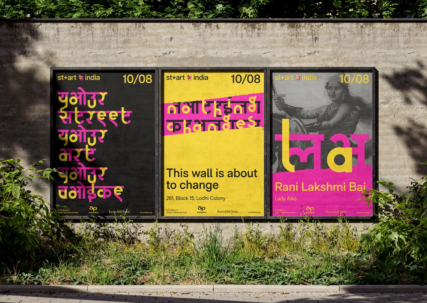
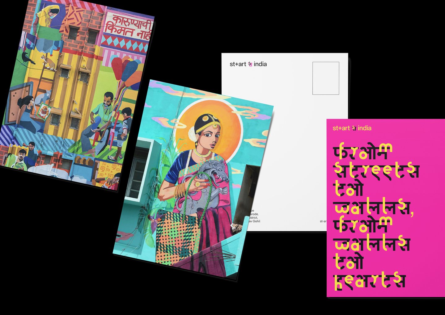
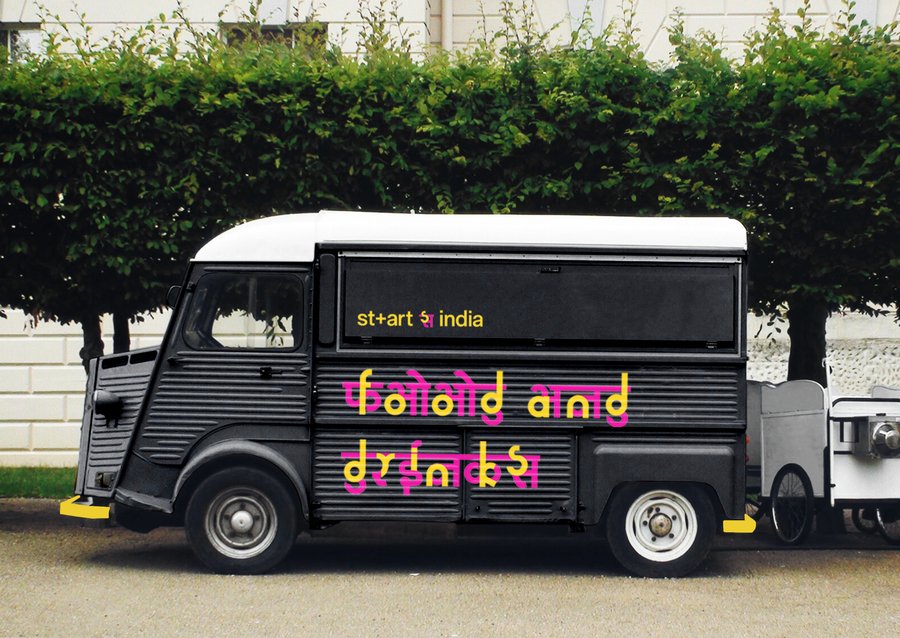
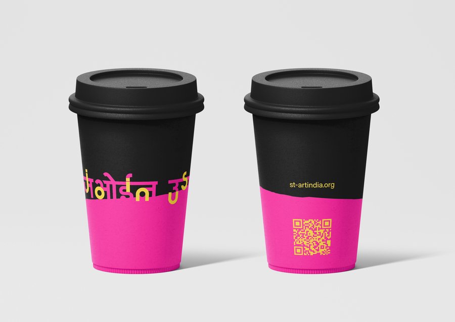
St+art India’s projects are often perceived as separate initiatives rather than parts of a larger cultural movement.Without a cohesive visual identity, the organization struggles to communicate the connection between its projects and build recognition. The challenge was to create a distinctive visual language that unites its initiatives and reflects its role in transforming urban spaces.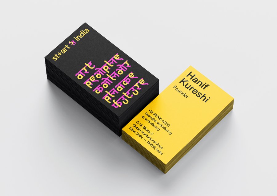
Исходный размер 3515x2480
Concept
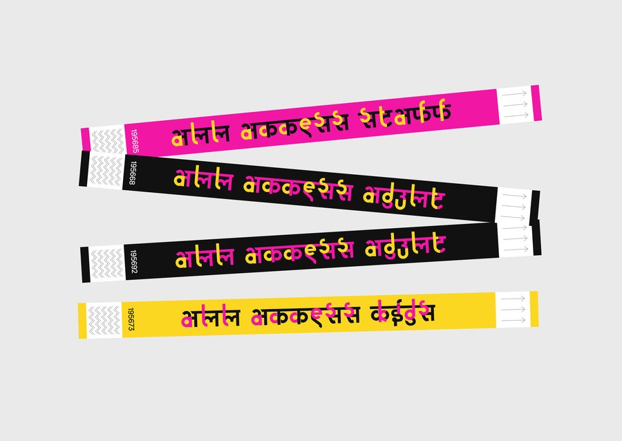
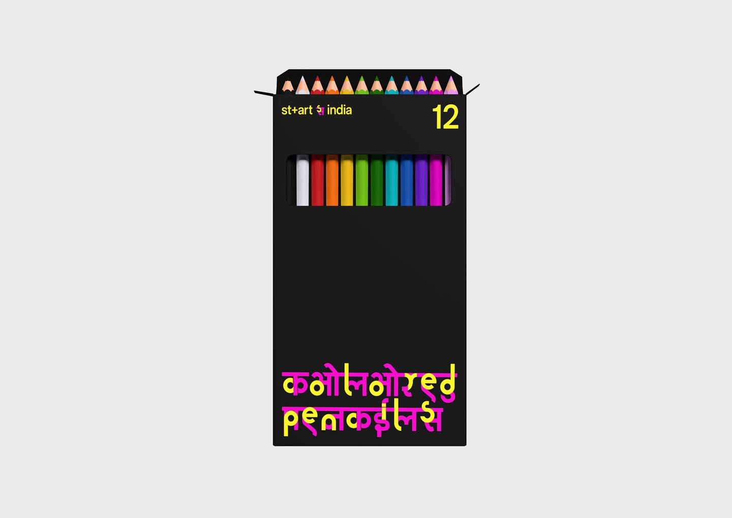
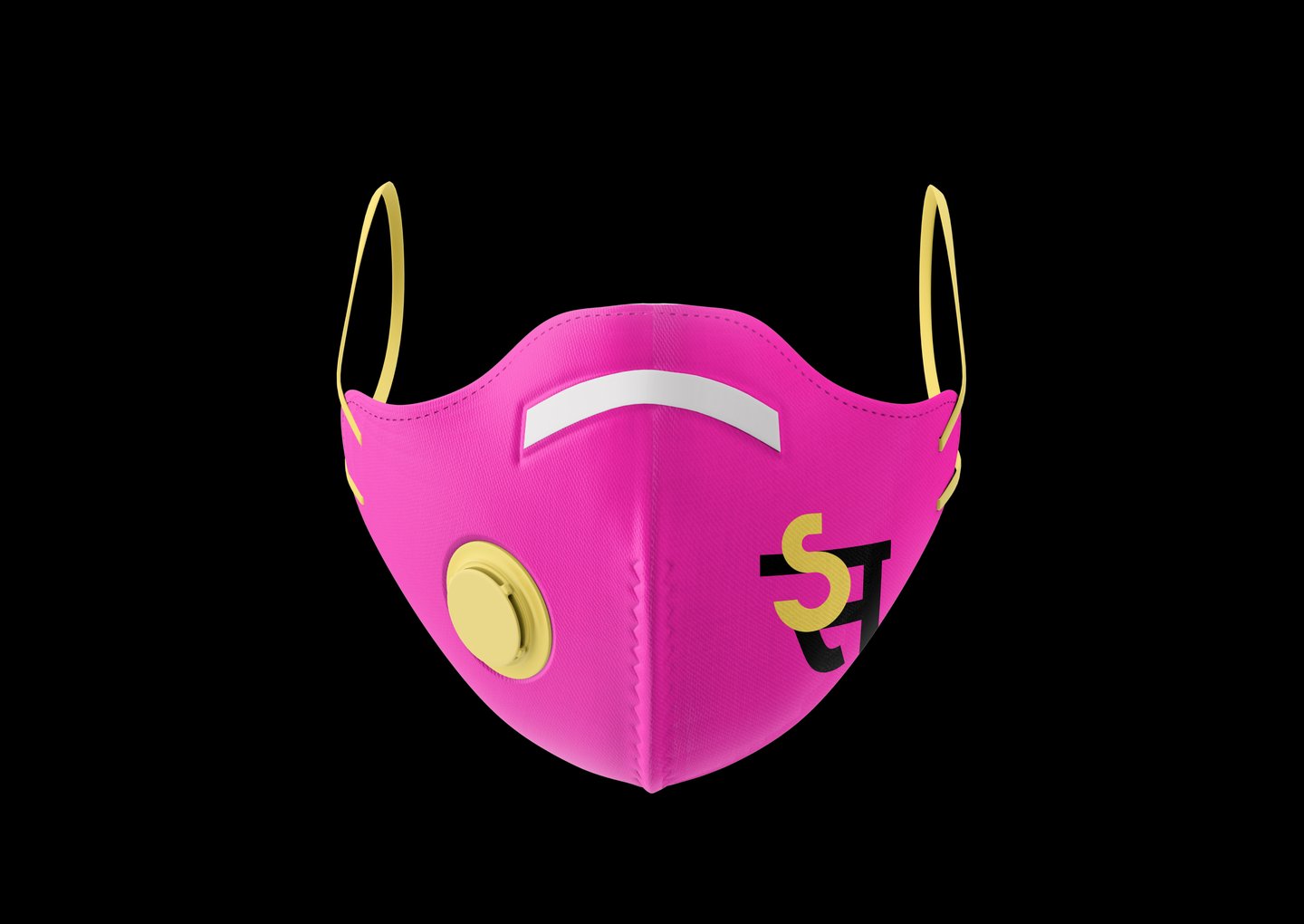
The concept is based on the idea of layers: layers of paint, layers of society.Just as artists build images by applying layers of paint, cities are shaped by the overlapping voices of artists, residents, and communities.Исходный размер 3500x2480
Исходный размер 3497x2467
1/3
Исходный размер 3500x2480
Исходный размер 3500x2480
Elizavetinsky Children’s Hospice
Elizavetinsky Children’s Hospice is a non-profit organization that provides medical, emotional, and social support to children with life-limiting illnesses and their families.
Исходный размер 3500x1748
Исходный размер 3500x2480
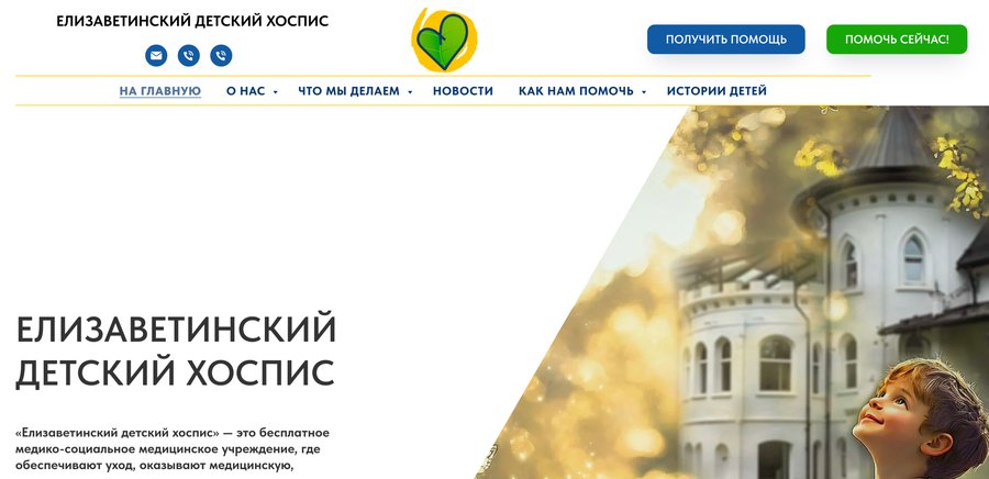
Before rebranding

Problem
Children’s hospices are often associated with illness, suffering, and death. This perception overlooks an important part of their mission: helping children enjoy life, play, and dream despite their illness.The existing identity relied on a familiar heart symbol that communicated care but did little to distinguish the hospice. The challenge was to create a more distinctive and positive visual language that reflects its values while preserving a connection to the original identity.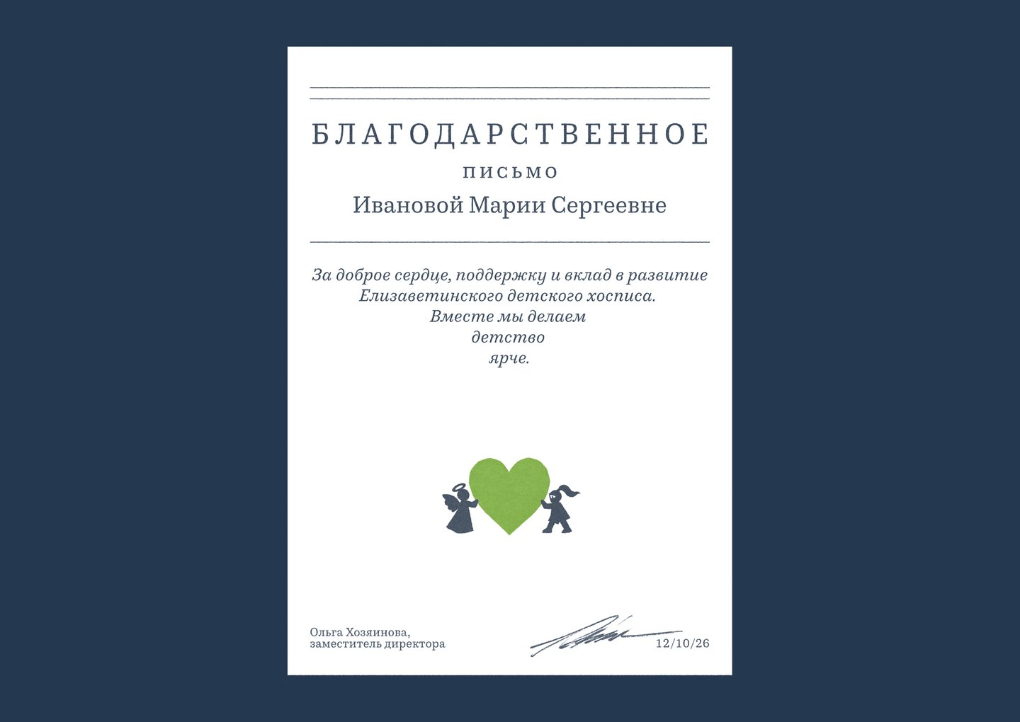
1/3
Concept
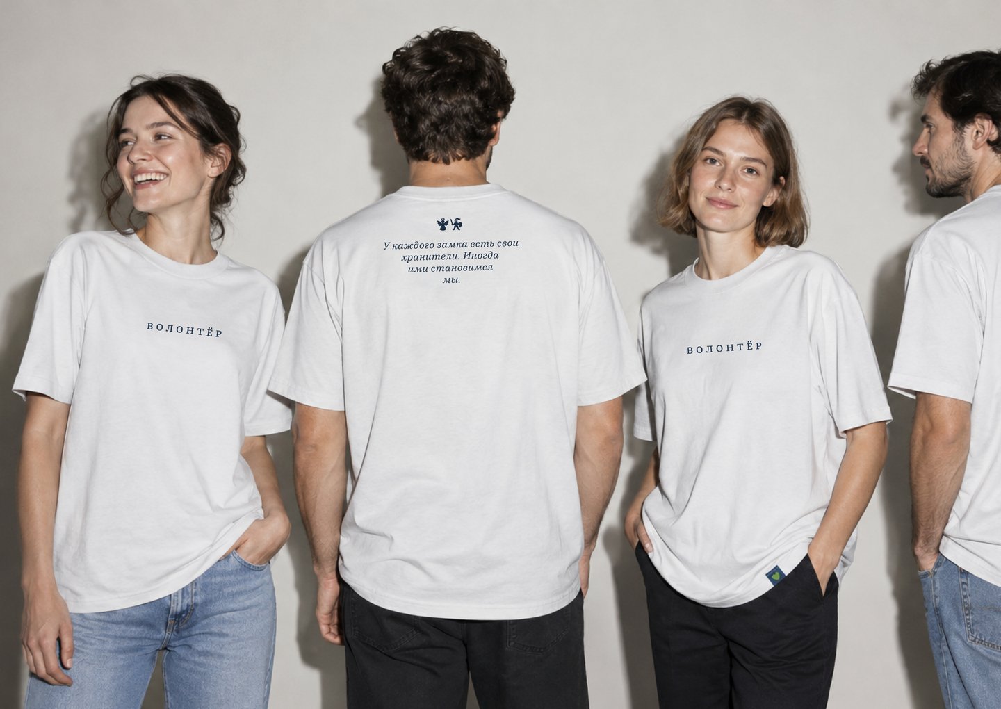
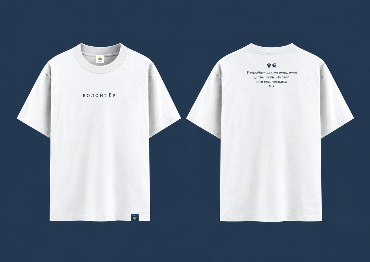
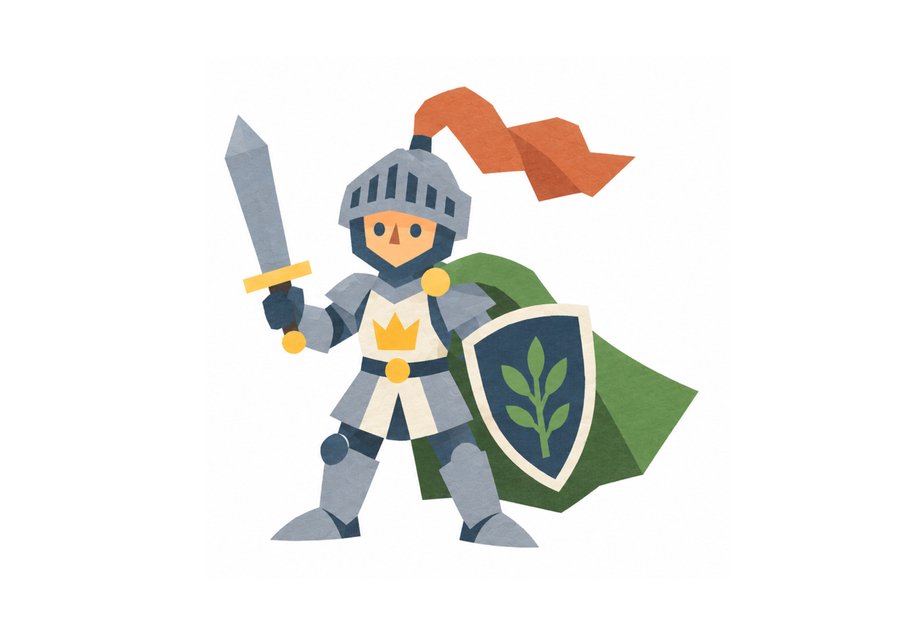
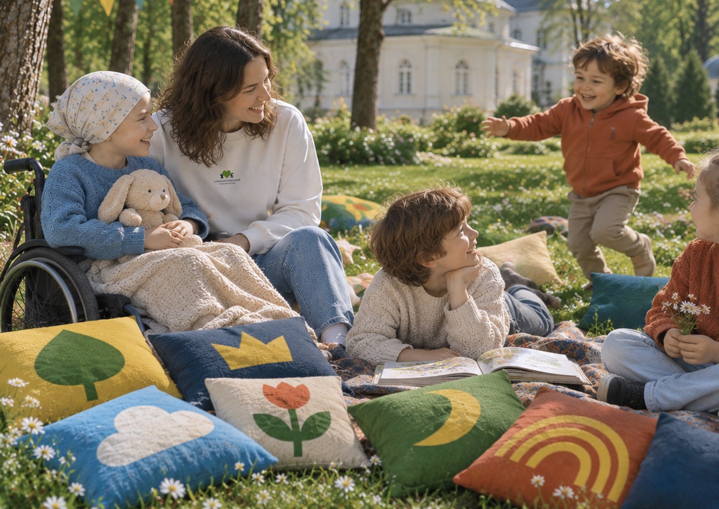
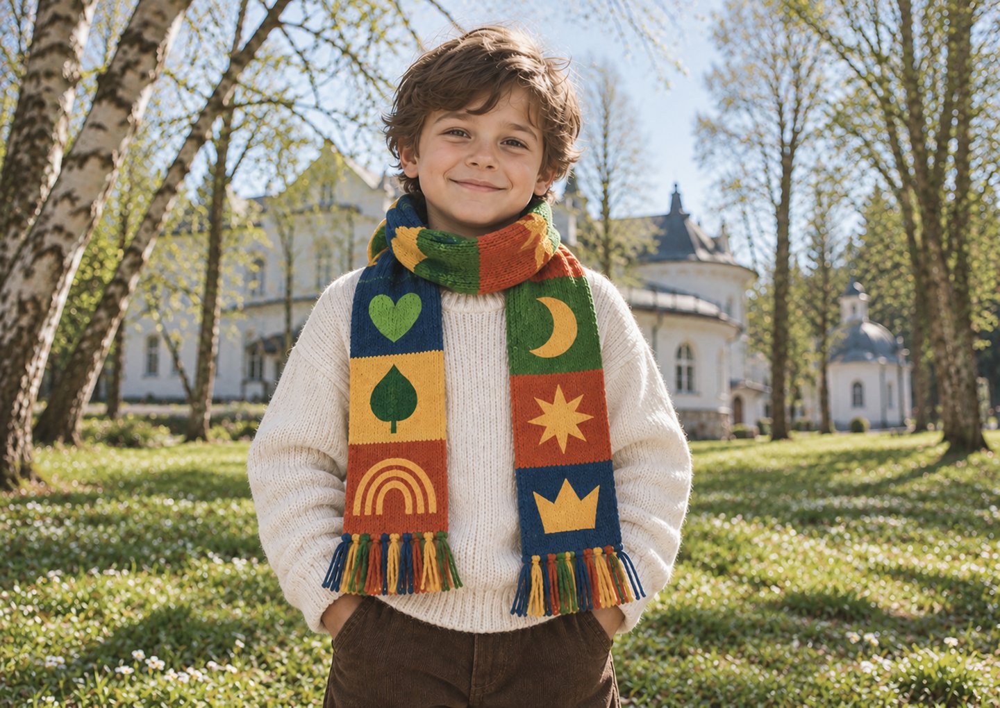
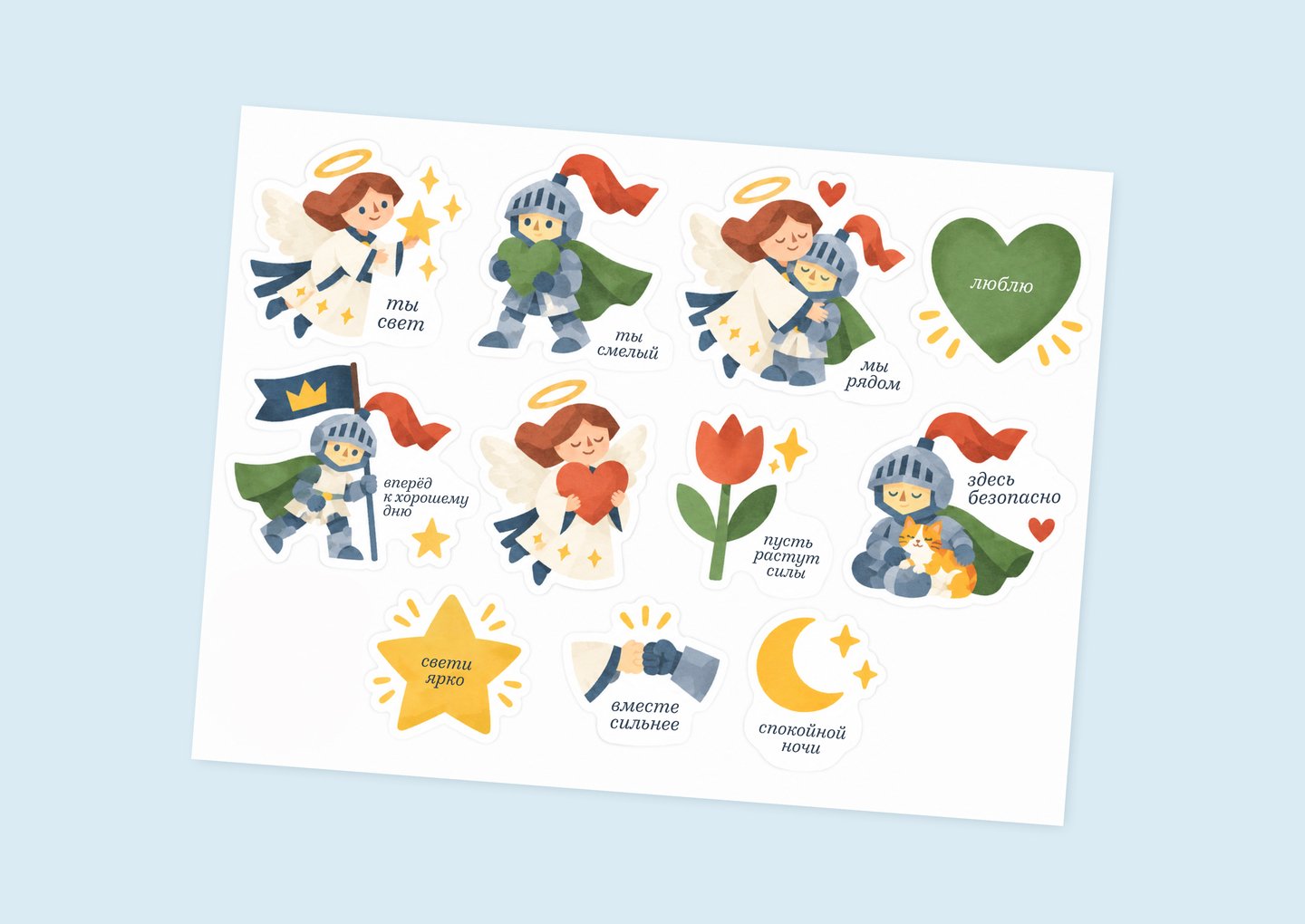
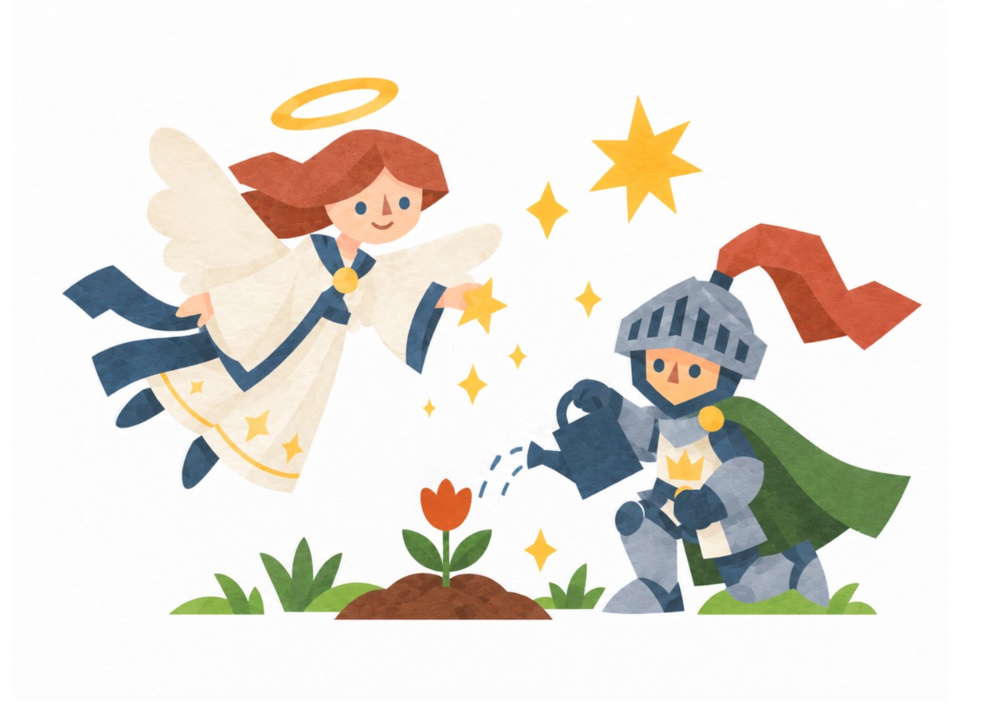
The hospice building resembles a castle, which became the starting point for the concept of a fairy-tale world.In this world, children are princes and princesses, while an angel and a knight become their guardians — symbols of care and protection.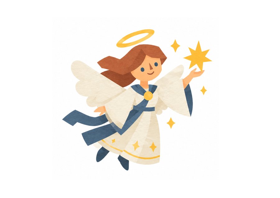

1/3

1/3