деловая презентация / business presentation
Visual Identities That Speak Before You Do
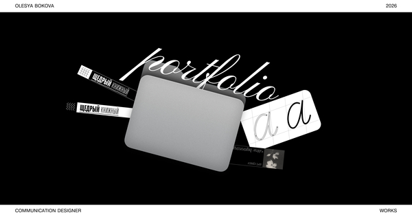
Brand Identity & Graphic Design Portfolio
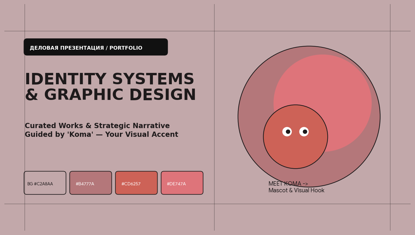
Welcome! Meet Koma, your visual guide — a living typographic accent that will lead you through my brand universes, modular grids, and design narratives.
Hi, I’m a 21-Year-Old Brand & Graphic Designer
I translate abstract business strategies into tactile, memorable visual systems.
As a specialist in corporate identity and graphic design, I unite bold contemporary aesthetics with strict Swiss typographic discipline.
Ready to give your brand an unmistakable voice?
Whether you are launching a new consumer product, rebranding a cultural platform, or scaling a design studio — I am available for full-cycle branding and art direction collaborations.
The Problem: Why Do Great Products Blend Into the Noise?
Modern shelves and digital feeds suffer from visual homogeneity. Ambitious brands invest years into product quality, yet dress their communication in safe, forgettable templates.
Koma’s Observation Without a unified graphic architecture, every touchpoint leaks trust. Mismatched fonts and voiceless packaging force businesses to fight for survival through discounts instead of brand equity.
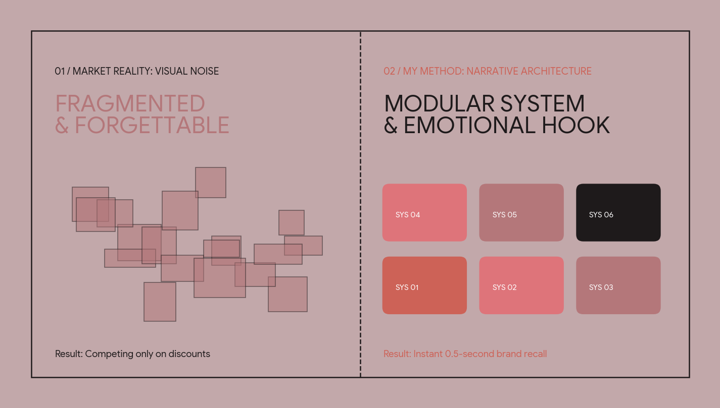
My Solution: Narrative-Driven Design Systems
I do not create isolated logos — I build scalable visual languages with clear rules and emotional hooks.
By combining custom metaphors + algorithmic grids, I turn every package, poster, and screen into an instant brand signature.
What I Deliver as a Brand Designer
• Visual Identity & Brandbooks: Logo systems, color codes, typographic scales, and layout grids.• Packaging & Tactile Print: Label architecture, structural graphics, and editorial layouts.• Event & Digital Key Visuals: Dynamic poster series, merch, and social media frameworks.
Who I Create For
I collaborate with FMCG startups, specialty coffee & wellness brands, cultural institutions, and design agencies seeking a fresh, systems-oriented visual voice.
Selected Works: Unified 4-Level Structure
Koma’s Navigation: To show how strategy becomes form, each project below unfolds across four strict levels: 01 Problem → 02 Idea → 03 Solution → 04 Results.
Flagship Case Study: VELVET SPORE
Brand Identity / Packaging System / Botanical Wellness
A complete sensory identity created for a modern brand of functional adaptogen elixirs and spiced botanical teas.
01 / The Problem: Escaping the Pharmacy Cliché
How do you position a functional mushroom and herb drink as a desirable lifestyle ritual rather than medicine?
Competitors in the wellness market either look like sterile clinical supplements or overuse craft-paper eco clichés, failing to attract young urban creatives.
02 / The Idea: Synesthesia & Botanical Frequency
The core metaphor is «Visible Taste Frequencies». Each botanical blend is represented by a custom rhythmic wave pattern and warm terracotta-rose tones that visualize calm energy and tactile warmth.
03 / The Solution: Swiss Grid Meets Organic Flow
I paired a strict 12-column pharmaceutical grid and numbered indexation (No. 01, No. 02) with expressive wave graphics and matte metallic tins. The contrast between structural order and fluid color creates instant shelf impact.
04 / The Results: A Scalable Brand Universe
Impact: A complete identity system spanning 6 SKU tin cans, tasting cards, shipping boxes, and social media templates — allowing the brand to launch new flavors in minutes using the modular grid.
Case Study #2: SYNTHESIS ’26 — Sound & Graphic Lab
01 Problem → 02 Idea How can static print posters convey live modular sound? I developed a generative bar-and-circle visual code where typographic tracking and geometric rhythm mirror acoustic waves.
03 Solution → 04 Results: Built on a unified four-color palette, the identity seamlessly adapts from city-format posters and vinyl sleeves to animated digital timetables without losing legibility.
My Design Theses & Professional Hypotheses
Thesis #1: Safe minimalism is no longer enough.
When every competitor uses the same clean sans-serif on a white background, tactile color and distinctive character become your strongest commercial advantage.
Thesis #2: A brand mascot is a bridge, not decoration.
Just as Koma guided you through this longread, a recurring graphic hook holds the viewer’s attention, controls scrolling tempo, and builds emotional recall.
Thesis #3: Micro-typography defines macro-quality.
Calibrated line lengths, deliberate letter-spacing, and clean ragging without hanging prepositions are what separate amateur layouts from professional brand architecture.
Let’s Create Your Brand’s Next Chapter
Thank you for scrolling through my portfolio with Koma! I am open to branding projects, studio roles, and collaborations.
Reach out via hse.space/pro — let’s turn your business vision into a living visual system.