The print publication SLAY is a platform for creative individuals full of life and the desire to create. In today’s world, it is easy to get lost in the stream of information, emotions, and states of being, and here you can find a sense of calm and stability, like in a book, while maintaining the relevance and engagement of the internet. Physical interaction with this magazine is an important part of your reading experience.
CONCEPT
A local journal dedicated to Moscow and art, divided into four sections. Exploration, Inspiration, Possibilities, Integration—four stages essential for any creative individual. The journal presents its content sequentially, gradually drawing the reader in. Inside, you will find articles on Moscow, design, architecture, art, exhibitions, notable figures in these fields, and on the individual who becomes not just an observer, but a part of a network—a part of something larger—by reading this journal.
MISSION
To create a useful and engaging publication to support youth in creative industries. To encourage readers to build a community around reading the journal. To foster a dialogue between young people and their surrounding environment. To increase interest in one’s own city from a cultural perspective, rather than purely for entertainment. To popularize the reading of print media over virtual media.
Target Audience
Young adults in creative industries or those pursuing creative hobbies. Age: 14–30 years. Residents of Moscow or tourists planning to visit.
CATEGORIES
— Research — Inspiration — Opportunities — Integration
IDENTITITY
The title conveys the depth of meaning and concepts that the journal will explore, dissecting the creation process layer by layer. Furthermore, the word alludes to the multi-page format of the publication, where every spread and every inset of a different format represents a new layer for the reader to encounter.
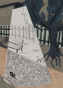
The cover of the first issue is a paper collage, and in principle, all subsequent issues will feature a collage on the cover. This technique also references the title—it is composed of layers that create something new through combination and interaction.


Logo: wordmark and monogram.
Both logo variations were hand-drawn. In the wordmark, the letters are based on the contrast in stroke weight. The shape of the monogram is derived from the «C» in the wordmark. Inside, the layers with the core in the center are depicted. The overall look of the logo is inspired by arches, an important architectural element of Moscow.
Fonts: — Spectral (12pt, 14pt) — Rockwell (12pt, 16pt, 28pt) — Kazimir-Black (12pt, 16pt, 18pt)
The first issue of the journal emerges directly from a stream of ideas. It is permeated by motifs and images of light, air, and a semi-transparency that wavers with a volatile quality, unsettling the structure.
This section features articles about Moscow, design, and other related fields that will be valuable to a young, creative audience.


In this section, we feature well-known and local artists, architects, designers, and other figures in the creative industries that you should know about. This includes interviews and analyses of styles and techniques.


A roundup of current exhibitions, open calls, events, and happenings—opportunities to showcase your talent or to visit, connect with creative work, and learn something new.


How to integrate various techniques into your creative work, review materials, and sometimes locations in Moscow where you can find interesting architecture, design, and history.