CONCEPT
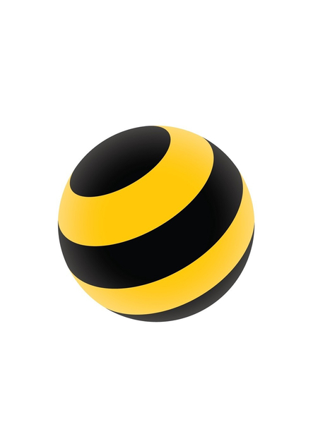
Try to remember the Beeline logo. You probably won’t recall the typeface, but you almost certainly remember the stripes on the sign at the subway station or on the promoter’s jacket. It surprised me that I remember the brand pattern better than its name.On October 14, 2021, Beeline changed almost everything: the capitalization in the name, the shape of the mark (the circle became a sphere), the typeface, and the slogan. Only the black, yellow, and stripes remained. Why did the company, which started from a blank slate, keep precisely those elements? Before 2005, a bee on a blue background occupied that space. The London agency Wolff Olins removed it, leaving only one color—the brand stopped depicting an insect and began to «be colored» by it. Its competitors' marks turned out to be less enduring: MTS dropped its egg in 2023, and Tele2 became t2 in 2024.
What does the viewer learn—the title of the byline or its black and yellow pattern?
The stripes became a «distinctive brand asset» in the terms of Jenny Romaniuk, bringing to mind Beeline without its name. They work through extreme contrast (Itten), the signaling color of a wasp and a road sign, and the law of closure, where we complete a form from a fragment (Arnheim). That is why they were not touched in 2021.
A strong code also has a flip side. The company itself admitted that without a new identity, «consumers would not soon understand or realize» the changes. It turns out that the familiar stripes also reminded people of old connectivity problems.
Whether a recognizable pattern can communicate something new remains an open question.
The study includes logos from 2005 and 2021, outdoor advertising, key frames from videos, salons, and branded apparel. For comparison, I also include the signs of MTS, MegaFon, and t2, as well as the bee and road markings. A separate group features advertisement fragments without a name or logo. I will show these to my classmates and present the literal answers, including incorrect ones. I am excluding frames that simply retell the plot of the videos.The order is not chronological: the work begins with 2021 and the unlabeled fragments, then returns to the bee and the 2005 rebranding, and subsequently analyzes color, shape, and advertising. Parallel to this is the trajectory of competitors whose logos changed more drastically. The final section details the weaknesses of the code and my suggestions.My concepts of contrast, figure and ground, and closure are drawn from Arnheim and Itten, while the notion of distinctive assets comes from Romanjuk and Byron Sharp. The facts regarding the rebrandings are sourced from Sostav, «Vedomosti,» Design Week, iXBT, and ComNews, cross-referenced for consistency. If the publications conflict (iXBT dates the launch to April 4, 2005, while New Retail dates it to May), I do not smooth over the discrepancy but note it in the caption.Back then, these stripes were newsworthy, but now they are two decades old, and I do not know if they have the same impact on those who grew up with them.
UNNAMED ADVERTISEMENT
Before continuing, please view the four billboards.
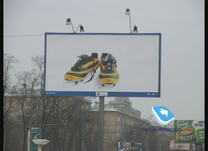
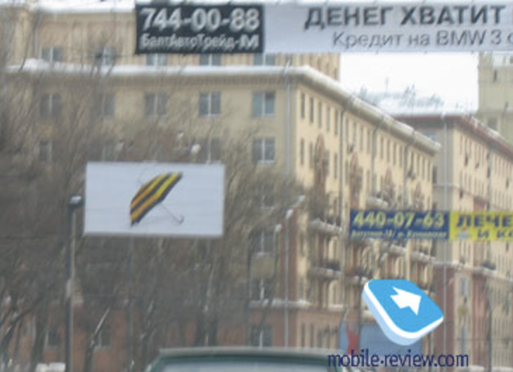
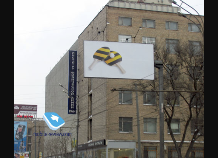
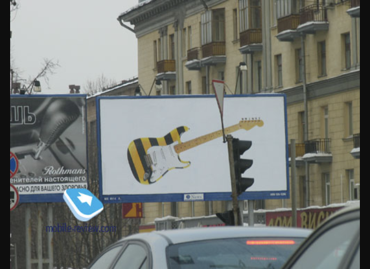
They have no name, logo, phone number, or website address. There is only the subject and two colors. Try to name the brand before you reveal the answer, and remember what gave you the clue: the color, the stripes, or something else.
BILAIN 2005
Mobile-review published these photographs on March 21, 2005, but the new corporate identity for «VympelCom» was only unveiled on April 4. For two weeks, the banners hung in the city without a name.
Logo for the byline with the slogan, «Live on the bright side.» Wolff Olins agency, 2005.
All four banners are the first stage of the advertising campaign for the new brand line.
Survey of Mobile-review.com readers: «What are your thoughts on Beeline’s image change?», March 15–21, 2005.
Mobile-review readers knew whose advertisement this was: the magazine explicitly stated that the billboards marked the start of the brand’s rebranding. Opinions were divided: 59% replied that they liked the new look, 30% said they did not, and 11% didn’t care. A passerby who had not read news about the mobile carrier simply saw a yellow-and-black umbrella.If you guessed the brand, you recognized it from an advertisement you saw twenty years ago. The viewer from 2005 did not have that kind of memory. I will return to this difference in the «Color» and «Form» sections.
REBRANDING 2021
On October 14, 2021, VimpelCom unveiled a new Beeline. The name was stylized in lowercase letters, the flat circle transformed into a three-dimensional sphere, a proprietary typeface—Beeline Sans—was introduced, and the slogan «Live on the bright side» was replaced with «On your side.» The identity was developed by the agency Contrapunto of the BBDO group, with the logo and typography handled by the studio Contrast Foundry, and advertising campaigns created by Leo Burnett Moscow.The company was open about the necessity of this change. In an interview with Sostav, they stated that the 2005 identity was significant, but in recent years, the company had encountered issues with service quality and connectivity. The new look was intended to demonstrate that changes had taken place internally within the company.The black, yellow, and stripes remained unchanged.
Byline marks before and after rebranding: the circle from 2005 and the sphere from 2021.
The flat circle with horizontal stripes transformed into a sphere, and the stripes on it spiral. The horizontal stripes remained static, while the diagonal ones created a sense of rotation. The yellow shifted to an orange gradient; the color became smoother and cooler.
Biline logo in two versions: 2005–2013 and 2013–2021. Excerpt from the diagram «Biline Logo History.»
Prior to 2021, the logo changed once, and almost imperceptibly. In the 2005 version, the circle was volumetric: it featured a highlight on top and a shadow underneath, resembling a glossy sphere. In 2013, the highlight and shadow were removed, making the circle flat, and the symbol itself became slightly larger relative to the text (some sources attribute this change to 2012). Since the transition from orange to yellow within the stripes, the capital 'B' in the «Beeline» name, and the font remained the same, the change is barely noticeable from the outside.
Logo for the byline with the slogan «On Your Side,» since 2021
Now, the word is key. «Beeline» is set in a large, bold grotesque typeface in lowercase, and the sphere is smaller relative to the text. The slogan is positioned on the right in two lines, using the same typeface. The logo now resembles a messenger signature: no capitalization and no spacing.
Key visual for the «On Your Side» campaign, 2021. Agency Leo Burnett Moscow.
The signature color here functions not as a pattern, but as a light within which people are situated.
The poster features three people of different ages, colored in yellow-orange. Yellow remains only as a banner beneath the word «your,» highlighted with a marker. There are no stripes on this poster whatsoever.
When placing the two logos side-by-side, it is clear that everything that can be read has been changed, while only the visual elements remain untouched. The letters, slogan, and typeface have been updated, but the coloration stayed the same. Furthermore, the main campaign poster no longer features stripes—only the yellow color remains.
LOGOS BEFORE 2005
Until 2005, Beeline literally depicted a bee. The name was divided into two syllables, «BI» and «LINE, ” and an insect sat between them: the English word „bee“ was turned into an image. The logo changed four times over twelve years, but the bee remained in place. The black and yellow stripes are not present in these versions.