Communication theory: Nizniy800
Communication theory in the field of design
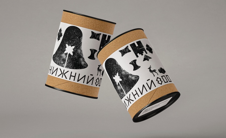
Creating specialized eco-products around a brand that cares about the environment.
Design plays a key role in shaping the quality of interaction between a brand and its consumer, directly impacting the success of the entire project. In this process of information exchange, design functions as a transmitter, using visual tools to convey brand values, while the audience acts as a recipient, processing the signals and making decisions accordingly. At the same time, design must adapt to the peculiarities of perception, cultural nuances, and psychological mechanisms that determine people’s choices.
Various communication models are deeply integrated into design as a method of conveying ideas. The concepts of rhetoric and persuasion analyze the ways in which communication shapes worldviews, beliefs, and actions. Design professionals develop solutions that not only fulfill their intended purpose but also convey messages that resonate with users' principles, thereby inspiring shifts in their attitudes or actions. This makes design more relevant and effective.
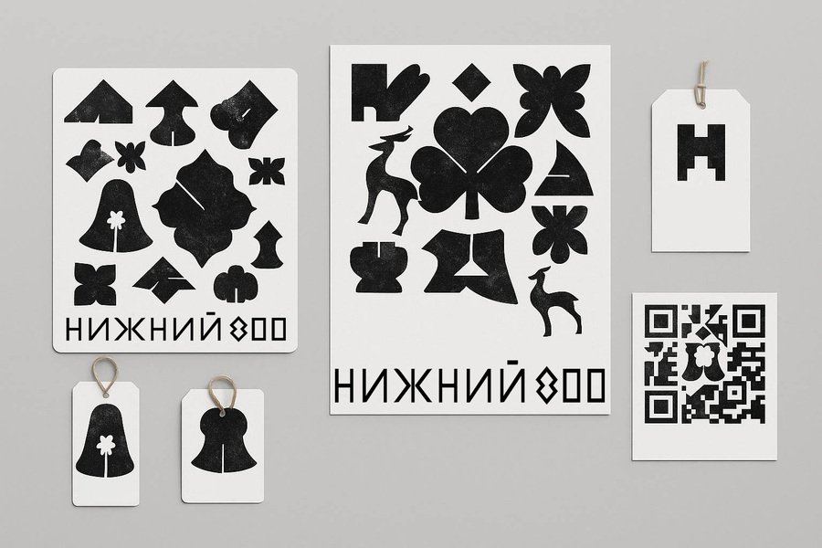
Printed brand information media emphasize the concept of hand-made
Through the lens of a narrative approach, we see that people are naturally drawn to storytelling, and the use of concise, rich stories strengthens connection and belief. Such narratives must be logical and compelling to feel authentic and meaningful. The concept of symbolic interaction illustrates how collective narratives and images foster group identity and unity. By integrating this principle, designers construct compelling brand narratives that evoke emotions and engage audiences. Combining a narrative approach with ideas of symbolic interaction is an effective lever for brand promotion.
Media ecological theory, including McLuhan’s thesis that the medium itself carries meaning, emphasizes the delivery platform: be it print, digital, or interactive. Designers must remember that the difference between «warm» and «cold» media radically alters the way audiences perceive and respond to content.
Creating specialized eco-products around a brand that cares about the environment.
Printed brand information media emphasize the concept of hand-made
Another essential aspect is the concept of affordances: an object must clearly demonstrate its intended use. Visual solutions, design, and interactive elements should guide the user through the process of use, building on their habits. Effective implementation of affordances ensures intuitive learning, eliminating the need for complex manuals. Communication theory serves four main functions:
— Description. Communication theory in design helps systematize knowledge and observations about the influence of visual images on consumer behavior and accurately describe phenomena, processes, or objects. — Explanation. Using communication theory, designers can explain why some elements work effectively while others create difficulties for consumers, and how to create successful visual communication between a brand and a customer. — Prediction. Using communication theory, designers predict the impact of visual style on consumer brand perception and the target audience’s reaction to a new product. — Transformation. Using communication theory, designers create designs that can transform the user experience of interacting with a product or environment. These transformations include improved usability, enhanced aesthetic appeal, and optimized functionality.
Communication theory helps designers better understand their target audience, anticipate consumer reactions, and create effective solutions that achieve their goals. The designer creates a message using elements such as silhouette, color, and texture as code carriers. The viewer deciphers these elements, drawing on their personal cultural background. This process involves the following key stages of communication: — Codification (development of the visual signal); — Carrier (method of presentation and format); — Decoding (the audience’s way of interpretation); — Conditions and obstacles (external circumstances that distort perception).
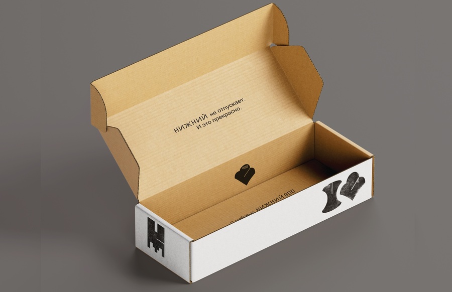
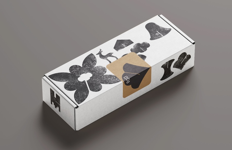
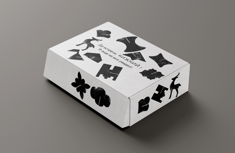
The basic universal eco-packaging
The basic universal eco-packaging
In today’s design, the interaction model is evolving into a bidirectional format: the consumer responds, and the brand adjusts its visual concept based on this feedback. Nizhniy 800 produces and sells souvenirs related to Nizhny Novgorod, each collection of which reveals the city’s unique code and its characteristics. In addition to standard products like magnets, postcards, and bags, the brand promotes local artists, some of whose works can command significant prices, potentially propelling the brand into the luxury goods category.
The brand communicates its values through design: each product is technically verified and safe to use, and only eco-friendly materials are used in production. The style is universal to emphasize the uniqueness of each product. Elements of the city’s architectural and cultural symbols serve as the basis. They are depicted with textures to convey the sculptured and vibrant architecture that the city cherishes. These symbols support the style’s immersion in the city’s history and culture, as well as the eco-friendly concept: packaging can be made from the cheapest and most basic materials, and textured icons convey a sense of handcrafted craftsmanship and the uniqueness of the products purchased.
The design logic of communication helps streamline the brand’s working methods. This includes: — Expressive logic: the designer conveys their vision of the architectural features. — Traditional logic: following standard rules in the souvenir industry, such as illustrating culture and appeal. — Rhetorical logic: tailoring the design to customer needs to offer them a personalized product.
Presentation for a general audience
Nizhny 800 captures the soul of Nizhny Novgorod in souvenirs imbued with its unique spirit. We invite you to put your daily routine aside, forget about the daily grind, and explore the places that shaped Nizhny Novgorod. The Nizhny 800 brand strives to offer you a magical immersion into the city’s historical past.
The posters as a way of brand outdoor communication
We are located in cozy corners of Nizhny Novgorod, often in popular spots. Our stores are decorated with elements of the city’s architectural symbols—from textured walls reminiscent of ancient buildings to an ambiance that immerses you in the past. Our selection includes products imbued with the spirit of Nizhny Novgorod. Ceramic mugs and plates with textured images of architecture and nature help you reminisce about your trip in the evenings; magnets and postcards, hand-sculpted and painted, convey a sense of authenticity and handcraftedness.
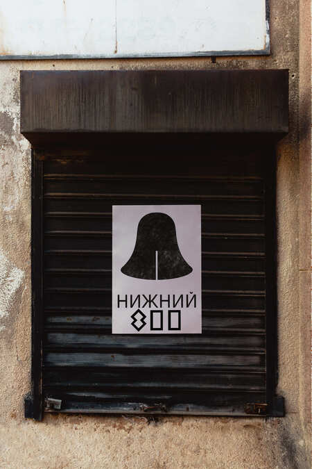
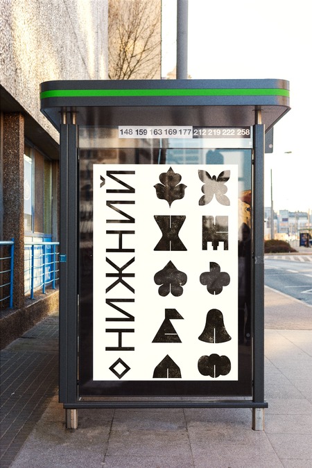
The posters as a way of brand outdoor communication
The posters as a way of brand outdoor communication
All souvenirs are packaged in convenient and eco-friendly packaging made from recycled materials. Shopping bags made from natural fabrics with textured prints strengthen your connection to the environment, promoting environmental stewardship in our region. Each product is designed with safety and sustainability in mind, so you can share a piece of Nizhny Novgorod with friends and family.
Presentation for a professional audience
The logo and basic style elements that convey handmade and eco-friendly values
The concept and corporate identity of the Nizhny 800 brand are based on the metaphor of the city as a hand-made creation: the architecture is a cultural treasure, and within its walls lies the history of Nizhny Novgorod, while within its residents lies the city’s unique spirit. The logo has a constructivist form, demonstrating the city’s character and respect for the masters of the past.
Printed brand information media emphasize the concept of hand-made
Integrating the brand into urban spaces where people are often in the mood to shop.
Integrating the brand into urban spaces where people are often in the mood to shop.
Integrating the brand into urban spaces where people are often in the mood to shop.
The posters as a way of brand outdoor communication
The primary colors are black, white, and various shades of recycled materials (wood, paper, and natural cardboard for eco-friendly packaging). A grotesque font based on the logo was chosen. This solution creates a recognizable, minimalist, and universal visual language that emphasizes the brand’s eco-friendly values.
The metaphor of the city as a hand-made creation
The label as additional universal eco-packaging
Furthermore, on some media, the logo or graphic elements are embossed. This tactile solution appeals to the human psyche, immersing the user in an atmosphere of authenticity and creating a sense of historical depth, while avoiding visual noise and emphasizing the handcrafted elements. The main graphic element is the logo, which interacts with the audience: like the store itself, it was established in the context of the city’s eight-hundredth anniversary, when many architectural landmarks were built and restored. Product packaging is made of cellulose cardboard, an environmentally friendly material. The front of the packaging features embossed icons imitating the textures of Nizhny Novgorod’s architectural symbols.
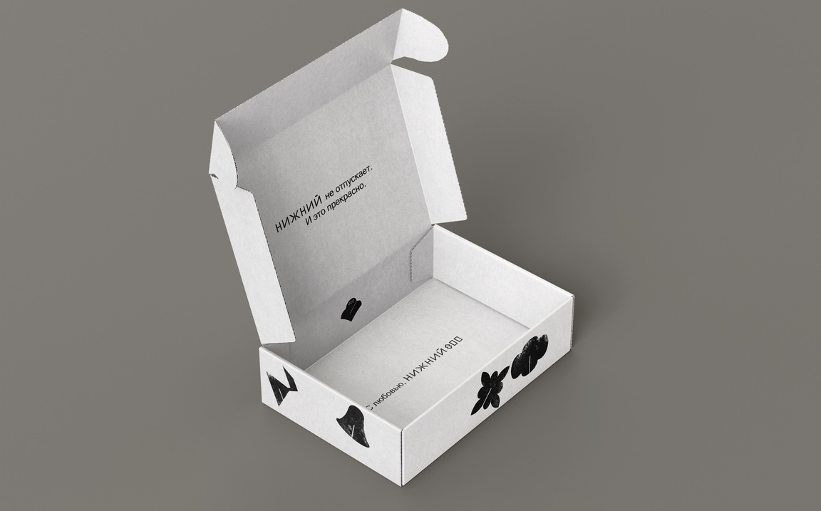
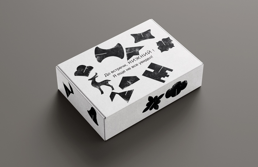
The additional universal eco-packaging
Advertising materials and POS materials are placed in locations where people are most likely to pass by the historical site. Special packaging was developed for the POS material, containing three «Nizhny 800» brand products: a magnet, a postcard, and an eco-friendly bag with a textured print. This allows the style to be presented as a universal way to package cultural souvenirs, highlighting their uniqueness.
The additional universal eco-packaging
Digital media as an integral communication channel in the modern world
Communication theory as basis for the presentations
Communication Strategies for the Nizhny 800 Brand
Messages aimed at a general audience emphasize emotional aspects, such as the atmosphere of a historic city, images of nature, and a sense of rich history. The emphasis here is on mood and environment rather than detailed analysis.
Messages aimed at a professional audience (designers, marketers, tour operators) use a structured approach. They explain the decisions made, such as the metaphor of handcraftedness as a symbol of the city, the choice of materials (natural cardboard, eco-friendly packaging), typography, and minimalism in design.
Message Design Logic
— Expressive Logic. The brand conveys the central idea: handcraftedness (history) is contained in the architecture, uniqueness is in the city’s historical space, and a special culture is found in every resident and guest who discovers the treasures of Nizhny Novgorod. — Traditional Logic. For a general audience, simple language is used (e.g., «slow down and discover the soul of the city»). For professionals, specialized terminology and arguments are used (e.g., «natural materials made from recycled cardboard and minimalism reduce visual noise and support environmental principles»). — Rhetorical logic. For a general audience, the emphasis is on emotional benefits (such as discovery and connection with the region’s natural and cultural beauty).
For professionals, compelling explanations are crucial (e.g., the use of environmentally friendly materials to harmonize with minimalist design and tactile elements like embossing).
Social Exchange Theory
Intangible values, such as education through immersion in the history and culture of Nizhny Novgorod, outweigh the material costs for consumers. By maximizing positive impressions from authentic souvenirs (e.g., magnets or eco-bags) and minimizing cognitive load through simple visual elements, the Nizhny 800 brand creates the foundation for long-term loyalty and tourism.
Craig’s Communication Traditions
Several theoretical approaches proposed by Craig helped shape the brand’s visual and verbal style: — Semiotic Tradition: The sculpted walls serve as a symbol, uniting urban space, souvenir packaging, and identity within the concept of protecting cultural heritage and self-determination. — Socio-Psychological Tradition: Emotional impact is paramount; elements such as natural imagery and varied material textures help enhance the experience. — Rhetorical Tradition: Each message is tailored to the audience: inspiring calls for tourists («breathe in the city’s history») and logical arguments for professionals based on sustainability and design. — Cybernetic Tradition: Design incorporates feedback tactile interaction with souvenirs (for example, embossed relief) and the perception of color shades from recycled materials transform the brand experience into a self-regulating immersive process.
Communication Theory: Bridging Academia and Practice // edu.hse.ru URL: https://edu.hse.ru/course/view.php?id=133853 (date of access: 14.12.2025). Piller, Frank T., et al. (2010). Mass Customization: Concepts and Tools. Springer. (date of access: 14.12.2025).
Kress, Gunther & van Leeuwen, Theo (1996). Reading Images: The Grammar of Visual Design. Routledge. (date of access: 14.12.2025).
Narrative paradigm // WikipediA URL: https://en.wikipedia.org/wiki/Narrative_paradigm (date of access: 14.12.2025.)
Marshall McLuhan’s Theory of «Hot» and «Cold» Media // Wikipedia URL: https://ru.wikipedia.org/wiki/Теория_«горячих»и«холодных»_медиа_Маршалла_Маклюэна (date of access: 14.12.2025).
Norman, Donald A. (2004). Emotional Design: Why We Love (or Hate) Everyday Things. Basic Books. (date of access: 14.12.2025).
Miller, Daniel (ed.) (1987). Material Culture and Mass Consumption. Basil Blackwell. (date of access: 14.12.2025).
All images are from or based on a project by Lydia Mirnaya: https://portfolio.hse.ru/Project/257425# (date of access: 14.12.2025).
Chat gpt for creating generation prompts
Recraft.ai and Krea.ai for image generation
Photoshop for image editing
