Content of the Presentation
— The General Theoretical part — Brand Presentation for a Broad Audience — Presentation for a Professional Audience — Course Concepts — Conclusion — Bibliography and Image Sources
The General Theoretical Part
Communication theory looks at how meaning is made, shared, and understood. In design and contemporary art, it helps explain how visuals, materials, and interactions communicate ideas. Designers and artists aren’t just making things look good — they’re creating messages and experiences that influence how people see and understand the world.
Today, meaning is not straight-forward, but contingent, emerging dynamically through interaction, interpretation, and participation. Creative works function less as fixed statements and more as platforms for engagement, where audiences actively co-construct understanding.
Color, typography, imagery, and spatial composition operate as cultural and emotional signs, carrying associations that are historically and socially conditioned. Encoding and decoding processes demonstrate that intention and reception rarely coincide — interpretation depends on context, background, and prior experience, making communication a negotiated, multi-layered process rather than a one-way transfer.
Design doesn’t happen in a vacuum — it sits inside social, cultural, and tech systems. Every choice in images, layout, or medium carries weight: it guides behavior, and shapes how people see things. Digital spaces make this even trickier — interactivity, algorithms, and user participation constantly change how meaning flows. Knowing this lets designers and artists work intentionally, creating pieces that actually resonate, provoke thought, and engage people beyond just looking nice.
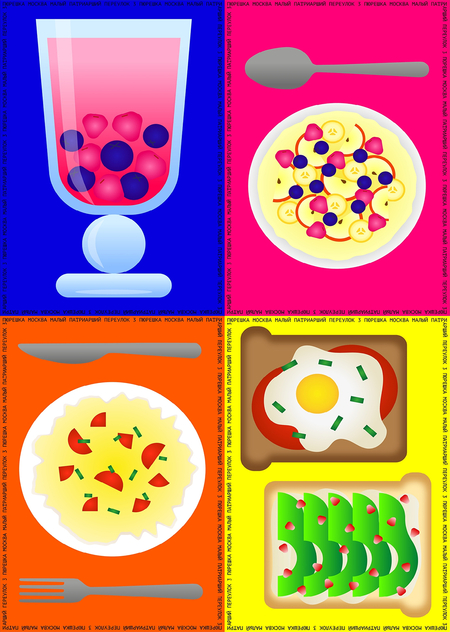
Brand Presentation for a Broad Audience
Create a space where nothing is required of you — just time, food, and ease.
Pureshka is a casual dining concept that combines the comfort of home cooking with a playful, contemporary interior. Its name subtly evokes the word «pure», reflecting the restaurant’s approach: food and space designed to feel simple, honest, and unpretentious. The menu offers comfort food dishes, reinterpreted without a strong nostalgic or historical emphasis, creating a space that feels familiar yet modern. The restaurant invites young adults to pause, socialize, or work casually, without the pressure of performance or self-presentation. The vibrant interior encourages relaxed presence rather than staged aesthetics, emphasizing ease, comfort, and light-heartedness over Instagram-ready moments.
Pureshka is a place to eat, hang out, or work without pressure. Think casual, playful, slightly off-trend — like home cooking met a contemporary interior. Nothing is staged, nothing pretentious. Just colorful, comfy, slightly funny, and easy!
For young creatives, it’s a calm corner away from the cluttered, over-stylized cafés. A place to pause, recharge, or grab a simple lunch without the pressure of performance.
For families with kids, it’s easy, approachable, and affordable — a space where everyone can feel at ease, with food that’s familiar yet fun.
For students and casual visitors, it’s straightforward, cheap, and enjoyable — a little pocket of playful comfort that doesn’t ask anything from you, but gives plenty of small joys.
Brand Presentation for Professionals
Key points
Pureshka communicates through bold colors, playful typography, and simple shapes, creating a system that is both unified and dynamic. Color organizes space, guides attention, and sets a joyful tone without clutter.
Repetition and abstraction structure the visual identity: food reminds ornamets, posters stand alone as graphic statements, and multiple layers of meaning coexist for different audiences. The result is a vibrant, energetic system that demonstrates how careful visual choices convey mood, personality, and engagement across touchpoints.
Copywright Style Guide
The communication strategy focuses on subtle framing rather than explicit storytelling. Meaning is constructed through small, almost unnoticeable signals: tone of voice, typographic decisions, restrained imagery, and short observational phrases. The project avoids loud metaphors or heavy narratives and instead relies on indirect communication that allows the audience to project their own experience onto the space.
Text plays a key role as a communicative layer rather than a descriptive one. Short phrases and small statements are used to set pace, mood, and emotional distance, often without immediate literal meaning. These texts function as soft communicative cues rather than slogans. The project is presented in English to maintain a neutral, contemporary format. This choice aligns the project with common design-portfolio practices and avoids excessive localization.
Identity Applications
The identity is designed to work across clear, familiar communication channels: menus, packaging, posters, merchandise, and in-space graphics. These touchpoints are chosen deliberately, as they are part of the everyday customer journey and require no additional explanation or learning from the audience.
The visual language remains intentionally laconic. A structured format based on text and image allows information to be read quickly and intuitively, aligning with the brand’s idea of ease and accessibility. This approach reflects a commercial logic: the identity does not demand interpretation but supports immediate recognition and comfort. Simplicity becomes a communicative strategy, reducing cognitive load and reinforcing the café as a space where nothing is expected from the visitor beyond being present.
Application of Course Concepts
The project is grounded in key concepts introduced in the communication theory course, which provided a framework for understanding how meaning is constructed, framed, and interpreted rather than simply transmitted. Instead of treating design as a neutral container for information, the course emphasizes communication as a process shaped by context, medium, audience, and cultural codes. This approach directly informed both the structure of the project and the way the brand is presented to different audiences.
Classical communication models, such as sender — message — channel — receiver, were used as a starting point to define how the brand operates across various touchpoints. However, the project deliberately moves beyond linear models toward a more interpretive understanding of communication, where meaning is not fixed but emerges through interaction. This is reflected in the open, non-prescriptive nature of the brand’s visual and verbal language, which allows audiences to engage with it without being guided toward a single «correct» reading.
Semiotic principles discussed in the course were applied to the development of the visual system. Color, typography, and imagery function as signs that carry emotional and cultural associations rather than explicit messages. These elements are repeated consistently across media, forming a recognizable system while remaining flexible. Such repetition supports coherence without overloading the viewer, aligning with the course’s focus on clarity and framing in visual communication.
The encoding and decoding model also played a role in shaping the presentations. While the designers encode certain values — ease, accessibility, and anti-performativity — the project acknowledges that audiences decode these signals differently depending on their background and expectations. This understanding informed the decision to create distinct presentations for a general and a professional audience, each emphasizing different aspects of the same communicative system.
Overall, the communication theory course functioned not as a source of visual inspiration but as an analytical tool. It helped structure decisions, justify design choices, and articulate how the brand communicates across contexts. Theory here operates as a method for aligning intention, medium, and interpretation, ensuring that the project communicates deliberately rather than relying solely on intuition.
Conslusion
This project demonstrates how communication theory can function as a practical design tool rather than an abstract framework. By aligning message, medium, and audience, the brand identity operates as a coherent communicative system instead of a collection of isolated visuals.
Through framing, repetition, and semiotic consistency, the project shows how meaning can remain open yet controlled, allowing different audiences to engage with the brand on their own terms. The result is an identity that communicates ease and accessibility while remaining visually expressive, proving that clarity and simplicity can be deliberate, strategic design choices.
Craig, R. T. (1999). Communication Theory as a Field. Communication Theory, 9(2), 119–161.
McLuhan, M. (1964). Understanding Media: The Extensions of Man. New York: McGraw-Hill.
Communication Theory: Bridging Academia and Practice. Online course materials.
AI-generated images created using Recraft AI
Anastasia Vakh, HSE Art and Design School. Available at: portfolio.hse.ru/Project/119788
Anastasia Vakh, HSE Art and Design School. Available at: portfolio.hse.ru/Project/127790


