Concept
The selection of the topic, «The Evolution of the Soviet Film Poster: From 1920s Constructivism to 1970s Psychologicalism, ” is driven by the necessity to investigate the radical transformation of visual design language under the influence of shifting ideological vectors, advancements in printing technology, and the nature of viewer perception. The 1920s represent an era of the avant-garde, where the film poster (works by the Steinberg brothers, Y. Ruklevsky) borrowed techniques from film editing, operating with rigid geometry, sharp angles, and dynamic energy. Conversely, the 1970s—a period of developed socialism—saw the replacement of slogans with deep psychologicalism, metaphorical depth, and pictorial quality (works by M. Lukyanov, I. Maistrovsky, V. Karakashev). Comparing these polarized decades allows us to trace a tectonic shift in design: from the poster as a „visual attraction“ to the poster as a „philosophical parable.“
The primary criterion for selecting material is its stylistic purity and representativeness. For the research, a corpus of 40 key film posters is assembled, divided into two sections: the first section (1920s) includes posters from the Constructivist movement for silent and early sound films, where graphic intensity, emphatic typography, a limited color palette, and the montage juxtaposition of elements of varying scale predominate; the second section (1970s) features posters for auteur and dramatic cinema, executed with complex painting and collage techniques, focusing on the hero’s internal state or metaphorical subtext. The research structure is built upon a comparative-analytical principle and is divided into three chapters, each examining a specific visual component. The first chapter, dedicated to compositional structure and spatial organization, analyzes how the rigid geometric grid and the «montage scalpel» of the 1920s give way to the central, spatial compositions of the 1970s, where frame depth plays a crucial role. The second chapter investigates typography and text as a visual agent: the transformation of typefaces from Constructivist sans-serif characters that were literally «inserted» into the image, to the expressive handwritten typography of the 1970s, which yields precedence to the image itself. The third chapter examines the plastic language and color choices—specifically, the transition from flat lithography and open local colors to nuanced painterly texture, the use of optical illusions, and psychological color contrasts.
The key research question explores how changes in the sociocultural context transformed the movie poster from an instrument of dynamic montage impact on the viewer (1920s) to a space of complex visual metaphor (1970s). The study hypothesizes that the evolution of the Soviet movie poster reflects a process of «individualization» in visual language. If the 1920s poster operated using external codes of movement and mass, aiming to capture the attention of a collective audience, the 1970s poster reoriented itself toward an intimate dialogue with the solitary viewer, consciously rejecting straightforward advertising in favor of easel painting metaphor.
Chapter 1. Compositional Strategies and Plane Organization
Editing Scalpel and the Geometry of the 1920s
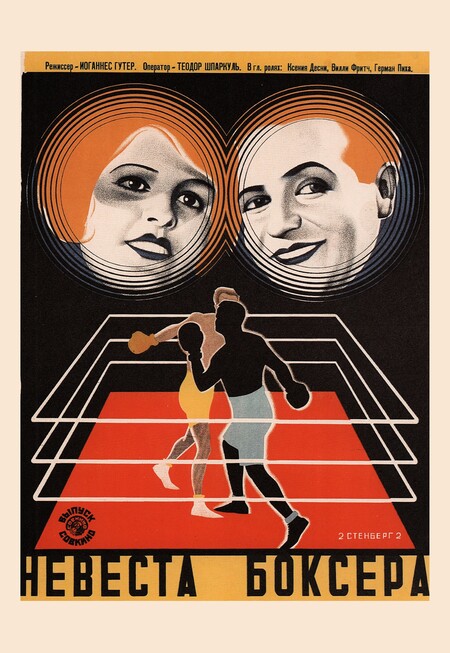
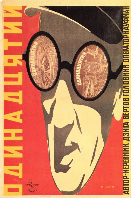
Stenberg Brothers — poster for the film «The Boxer’s Bride» (1929) // Stenberg Brothers — poster for the film «The Eleventh» (1928).
In the 1920s, Constructivists entirely abandoned academic perspective and proportion. The primary compositional technique became the shocking, large-scale contrast borrowed from film montage. Artists juxtaposed gigantic, monumental fragments of human faces (close-up) with tiny silhouettes of people, machinery, or buildings (wide shot) on a single plane. In the poster «The Boxer’s Bride,» this technique creates a physical sensation of dynamism: massive, floating heads dominate the distorted geometric ring, transforming the advertisement into a complex spatial attraction.
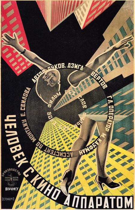
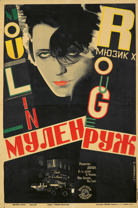
Stenberg Brothers — Movie Poster for «Man with a Movie Camera» (1929) // Stenberg Brothers — Poster for «Moulin Rouge» (1929)
Static composition was viewed by the avant-garde as antiquated. To activate the flatness of the page, artists of the 1920s arranged visual sequences along sharp diagonal axes, conveying speed and cinematic rhythm. In the Brothers Stenberg’s poster for the film Man with a Movie Camera, this technique is pushed to its extreme: a central female figure is twisted into a spiral, and tall buildings fall diagonally into the depth of the page, robbing the viewer of a stable point of reference. A similar principle is used in the poster for the painting Moulin Rouge. Here, the space is fractured by powerful slanted lines of typography. The text functions as a dynamic vector, cutting across the plane and making the static female face appear as part of swift urban motion. By submitting to the diagonal, the poster overcomes the two-dimensionality of the paper and transmits pure speed.
Yakov Ruklevsky — Movie Poster for the film «The Sixth Part of the World» (1926)
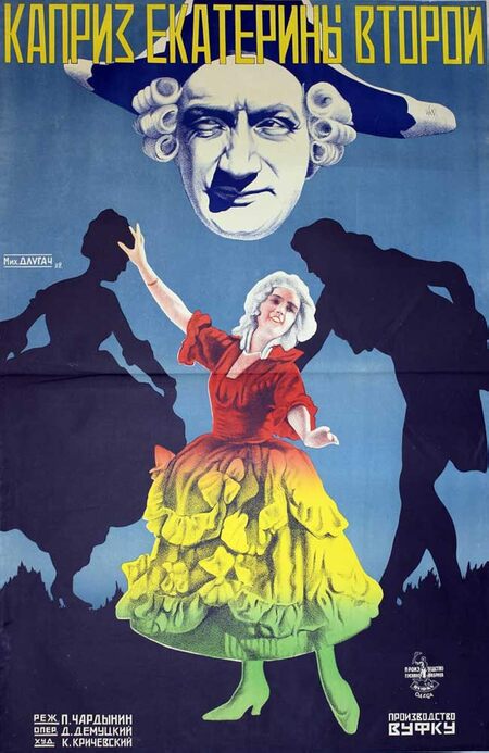
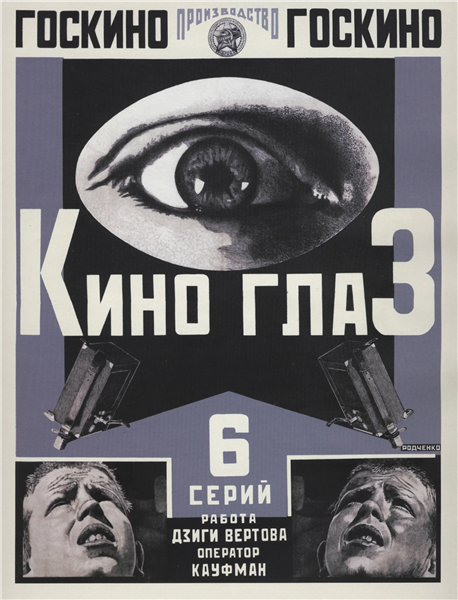
Nikolai Prusakov — Movie Poster for «Catherine II’s Whim» (1927) // Aleksandr Rodchenko — Movie Poster for «Kino-Glaz» (1924)
Instead of presenting a cohesive portrait, Constructivists employ fragmentation, stripping the face of psychological depth and transforming it into a geometric shape. The defining characteristic of these posters is radical cropping and extreme angles, borrowed from Vertov’s «cinema eye» theory. The principle of depersonalization reaches its absolute zenith in Rodchenko’s poster, «Cinema Eye.» The artist isolates the eye from the face, turning it into an independent optical device. Positioned at the bottom of the head, it is presented from a sharp low angle and is subjected to the sheet’s mechanical structure. Even in the poster for the film «Catherine II’s Whim, ” the creators resort to fragmentation: a cut-off mask-face floats separately from the body silhouettes. The avant-garde poster dismantles the biological integrity of the human being, turning their figure into a conventional sign and a montage element.
Spatial Metaphors and Centricity in the 1970s
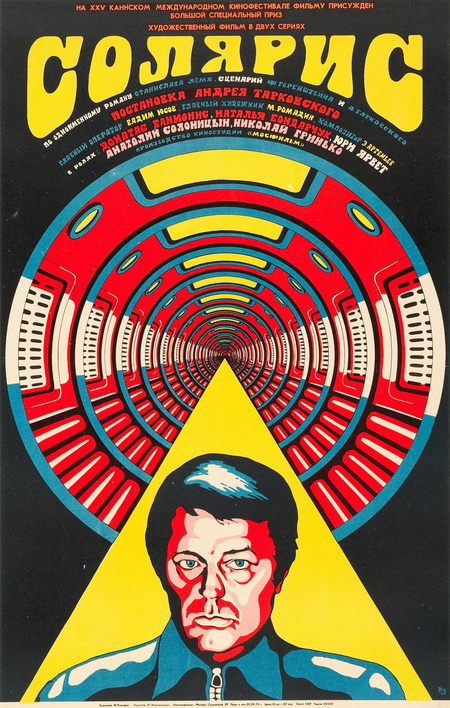
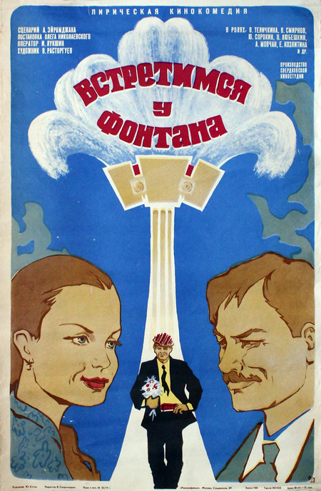
Miron Lukyanov — Movie Poster for Solaris (1972) // Yuri Petrovich Kotov — Movie Poster for Meet Us at the Fountain (1976)
In the 1970s, the propagandistic poster gave way to complex psychological metaphor. The defining technique of this era became the visual integration of various spaces into a single silhouette, allowing the transmission of the characters' mental processes, dreams, and memories rather than a mere documentation of external reality. A striking example is the poster for the film «Solaris,» where a hypnotic vortex of concentric circles emerges from the character’s head. The artist abandons rigid avant-garde montage and literally embeds the cosmic Ocean within the hero’s consciousness. This optical illusion fractures the plane of the paper, transforming the external environment into a projection of human thought and immersing the viewer in a state of contemplative observation.
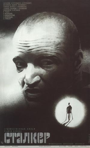
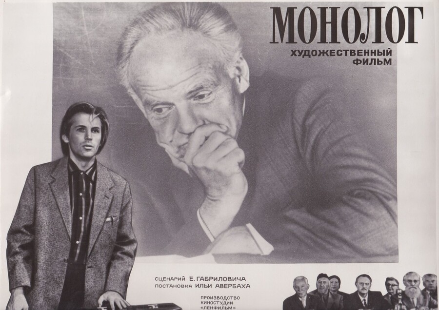
Igor Maistrovsky — Movie Poster for «Stalker» (1979) // Vasiliy Ostrovsky — Movie Poster for «Monologue» (1972)
During this period, poster art fully shifts toward exploring the inner fragmentation and reflection of the human psyche. Rather than the dynamic montage of the avant-garde, artists employed the technique of large-scale juxtaposition of two autonomous planes, where the deep emptiness of the background or a patch of light served to convey the existential solitude and psychological dualism of the characters. A striking example of this trend is Igor Maistrovsky’s poster for the film «Stalker.» The entire composition is built on sharp tonal contrast. The poster’s meaning unfolds through the juxtaposition of this portrait with a tiny silhouette of a man on crutches, trapped within a narrow circle of light. The artist completely abandons street-level sensationalism, transforming the poster sheet into a quiet, existential space that transmits a sense of anxiety and deep inner drama within the character to the viewer.
Unknown Artist — Movie Poster for the film «Pirates of the Twentieth Century» (1980)
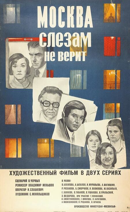
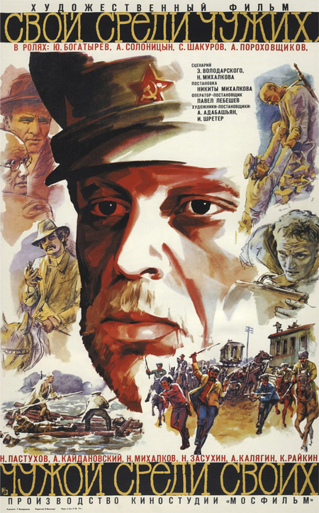
Gennadiy Illarionov — Movie Poster for the film «Own Among Strangers, Stranger Among Own» (1974) // Unknown Author — Movie Poster for the film «Moscow Does Not Believe in Tears» (1979)
At the turn of the 1970s and 1980s, the technique of multi-screen layering and multi-figure collage was established in poster art. Artists borrowed panoramic montage from cinema to combine key plotlines, dynamic mise-en-scènes, and portraits of various characters onto a single plane. Unlike the rigid geometric assembly of the 1920s, the collage here possesses a narrative and painterly quality. In the poster for the film «Pirates of the 20th Century, ” individual micro-narratives and the heroes’ faces intersect one another through the torn, expressive edges of color patches and bursts. A central close-up of the captain visually binds together a chaotic mosaic of action scenes surrounding him. This same compositional principle, but in a more restrained form, can be seen in the poster for „Moscow Does Not Believe in Tears.“ Instead of an isolated focus on one face, the artists divide the sheet’s space into numerous cells.
Comparative Analysis of Compositional Codes
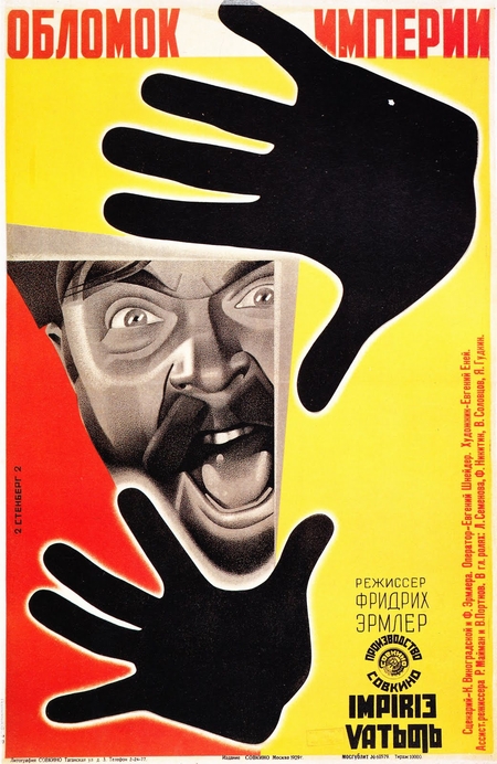
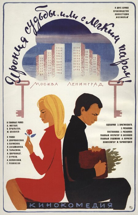
Stenberg Brothers — Movie Poster for «Fragment of the Empire» (1929) // Evgeny Grebenshchikov and Levon Khachatryan — Movie Poster for «The Irony of Fate, or When You Feel Like Steam!» (1975)
In the 1920s, the Constructivist code was built upon the principles of expressive montage, openness, and dynamic shock. The composition of this period aggressively challenged the viewer: massive contrasts, perspectival distortions, and sharp diagonal axes fractured the flat plane of the poster. The poster functioned as a visual «loudspeaker, ” intended to engage the collective Soviet individual in the dynamics of industrial transformation and convey the pure velocity of the new era. The human figure here was intentionally depersonalized, transforming into a rigid spatial sign and an element of montage assembly.
In the 1970s, however, the compositional code shifted toward intimacy, centralization, and enclosure. Aggressive juxtaposition was replaced by a complex psychological metaphor built upon optical illusions, layered planes, and multi-screen collage. Instead of constructing an external industrial reality, the poster began to explore internal schisms—the mental processes, dreams, and memories of the protagonists. Soviet graphic design evolved from a total agitprop manifesto to the creation of a quiet, intimate visual space focused on reflection.
Chapter 2. Typography and Text as a Constructive Agent
Block Typography and Architecture in Avant-Garde Posters
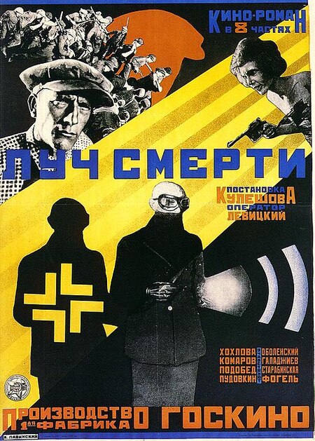
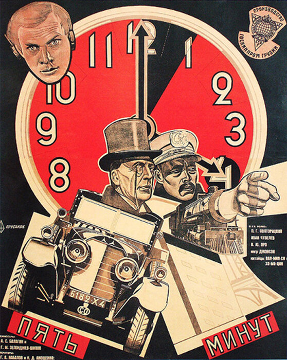
Anton Lavinsky — Movie Poster for «The Light of Death» (1925) // Nikolai Prusakov — Movie Poster for «Five Minutes» (1928).
In the 1920s, text transforms into an independent, constructive element of the page. Instead of a passive label, Constructivists employed a bold, blocky grotesque typeface that functioned as a building material. The primary technique became the architectural function of typography: letters imitated beams, crossbeams, and gears, establishing rigid compositional axes alongside the mechanical objects. The poster for the film «The Best of Death» serves as a striking example. The massive, geometric letters of the title cut across the page horizontally, becoming a monumental plinth. The typeface here is so material that the figures of soldiers are physically placed on it, just as they would be on a building’s roof.
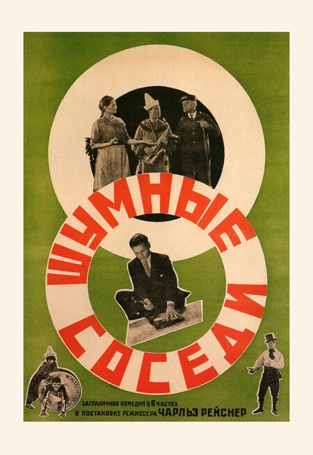
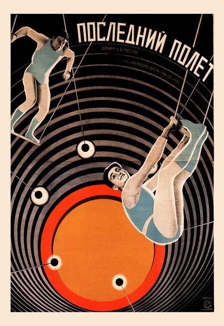
Unknown artist — Movie poster for «Noisy Neighbors» (1929) // Steinberg Brothers — Movie poster for «Last Flight» (1929).
In the avant-garde poster, the text also obeys the laws of physics and mechanics, transforming into a graphic marker of speed and rotation. The primary technique here is the deformation of the text line along a strict mathematical arc or circle, which allows for the fixation of object trajectories on the plane. In the poster for the film «The Last Flight, ” the white letters are arranged along an arc, precisely mirroring the trajectory of the gymnast’s fall and rhyming with the concentric circles of the target. The line functions as a graphic vector of physical acceleration, capturing the mechanical rhythm of the circus trick.