Navigation Menu
- Concept
- Main Body: — The image of threat in advertising — The viewer’s role in the advertising message — Familiar imagery in remake advertisements — From showing a threat to the call to purchase the game
- Conclusion
Concept
In horror advertising, danger becomes part of the promise made to the viewer. In print advertisements, it can be depicted through the antagonist’s face and mentioned in the slogan. A video conveys the sensation of an approaching threat, while an interactive ad prompts the viewer to decide what to do next. The main research question is how the advertising for the original and remakes of Resident Evil 2 and Resident Evil 3 transforms fear into a promise of gameplay experience and connects it to the offer to try, pre-order, or purchase the game.We compare the campaigns for the original Resident Evil 2 (1998) and its remake (2019), as well as Resident Evil 3: Nemesis (1999) and its remake (2020). Each pair shares a common basis for comparison: familiar characters, settings, and threats are presented to the audience. Against this backdrop, it is particularly noticeable how the appeal itself changes. In the advertising for Resident Evil 2, we can trace the role assigned to Leon and Claire, while in the advertising for Resident Evil 3, the audience is invited to imagine themselves in Jill’s position as she attempts to escape pursuit [3, 4].
Visual Material Selection Principle
The research includes magazine advertisements, the European promotional booklet for Resident Evil 2, and four promotional video clips. Materials are selected based on how clearly they connect the image of threat, the role of the hero, and the promise of the gameplay experience. The intended function of the material is considered during analysis. For instance, the pages of the European booklet are examined together, within the context of the press and trade kit it was part of [5].
Individual shots are used to analyze composition, lighting, text, and image scale. Short fragments demonstrate how the meaning of a frame changes within a sequence. For example, a dark corridor initially keeps the source of threat outside the frame, while the subsequent shot might reveal it or shift focus to the hero’s reaction. Each image is documented with the material title, year, and the creator or studio, if established. The shots are accompanied by time codes.
The Principle of Rubrication
Chapter One focuses on the image of threat. It compares visuals where the adversary dominates the frame with scenes where danger is signaled through lighting, camera angle, or limited visibility. Chapter Two examines the role of the viewer. Here, we analyze how advertisements present the hero’s escape, confrontation, or choice. Chapter Three compares the use of recognizable characters and staged filming in the advertisements for originals versus remakes. Chapter Four addresses how promotional material connects the depicted experience to a specific game release. To this end, we examine the placement of titles and release dates, the appearance of the final card, and the phrasing of purchase calls-to-action. Within each chapter, the material from the originals is compared with the material from the corresponding remakes.
Principle of Selecting and Analyzing Textual Sources
Roland Bartes' «Rhetoric of the Image» is used to analyze the connection between the slogan and the image. The concept of the fixation of meaning helps explain how the text directs the reading of an advertising image [1, p. 44]. The work of Edward McCurry and David Meek provides a theoretical foundation for analyzing the expressive techniques of advertising [2]. Case studies from the Biborg agency help reconstruct the objectives of specific campaigns. For the promotion of the Resident Evil 2 remake, the agency utilized the selection of a protagonist, whereas for the Resident Evil 3 remake, it highlighted the escape as the basis of the campaign [3; 4]. This information is compared with how the selection and the escape are presented in the commercials themselves.
Research Question
How does the advertising of the original and remake versions of Resident Evil 2 and Resident Evil 3 present fear as part of an appealing gaming experience for the buyer?
Hypothesis
It is proposed that advertising integrates fear into the narrative by linking a threat to an action available to the player. Composition, lighting, and editing determine what danger the viewer perceives, while the slogan, the hero’s behavior, or the interactive choice suggest what should be done about it. In the selected remake materials, this promise can be expressed more explicitly—through the character selection in the Resident Evil 2 advertisement and through the escape as the declared objective in the Resident Evil 3 advertisement. The hypothesis is tested by examining how the image of the threat and the proposed action are related in the advertising for each original and its remake.
The Image of Threat in Advertising
Magazine advertisement spread for the game Resident Evil 3: Nemesis. 1999. Official PlayStation magazine in the U.S., Vol. 3, No. 1, pp. 45–46.
How does the advertising for a horror game transform a threat into a promise of gameplay experience? In the spread for Resident Evil 3: Nemesis, Nemesis’s face occupies almost the entire left page. To the right, white letters spell out «No Fear, ” but the red K and W change the reading to „Know Fear.“ In Roland Barthes’s terms, the text directs the interpretation of the image [1, p. 44]. The slogan invites players to experience fear, and the close-up immediately connects this promise to a specific adversary.
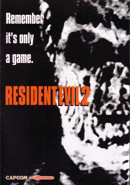
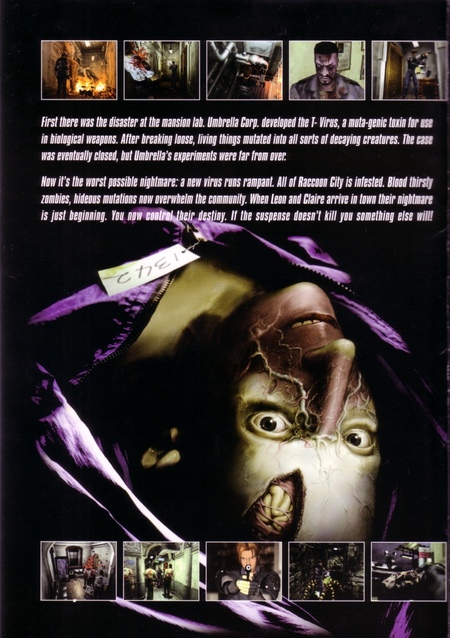
1. European promotional brochure for the game Resident Evil 2, cover. 1998. 2. European promotional brochure for the game Resident Evil 2, interior page. 1998.
The cover features a face cropped by the right edge, and the stark contrast renders parts of the features indistinct. The phrase, «Remember, it’s just a game, ” sets the framework within which the frightening image promises a fabricated experience. On the interior page, a large face continues to occupy the central space. Rows of small gameplay stills above and below illustrate where the threat emerges and how the protagonist can act. Thus, the booklet adds an idea of specific situations to the overall promise of fear. The booklet was included in press kits or for trade partners [5].
German spread featuring a virus image—Artist unknown. Advertisement for the game Resident Evil 2 in Mega Fun magazine, No. 8. 1998.
The German spread of Resident Evil 2 features a circular, vibrant illustration on the left, resembling a microscope slide. On the right, text frames the reading of this form through the theme of the virus. Small in-game screenshots at the bottom connect the conceptual scientific imagery with the marketed game. This is an independent promotional tactic for that particular installment in the series. It portrays the source of danger as an object of examination and prompts the reader to imagine the consequences of infection.
Advertisement «You Are Alone”—Author unknown. Advertisement for the game Resident Evil 3: Nemesis in Video Games magazine, April 2000.
In German advertising for Resident Evil 3: Nemesis, the address «You are alone» dominates. The headline spans nearly the entire dark spread. The product name is placed in the bottom right corner and yields in scale to the phrase. The reader first encounters a message about their own situation and then gets the opportunity to connect it to the game. The absence of a large figure on the spread transfers the pressure to the address and the empty space surrounding it.
George A. Romero. Commercial trailer for the video game Resident Evil 2. 1998.
In George A. Romero’s video for Resident Evil 2, only the illuminated part of the protagonist’s face is visible at first. The next shot shows him armed, and then a shadow of a hand appears on the wall. The viewer perceives the threat through the hero’s reaction and the shadow. Thus, the video builds anticipation for encountering the antagonist even before the viewer can see them.
Television commercial for the game Resident Evil 3: Nemesis. 1999.
In the trailer for Resident Evil 3: Nemesis, a wide shot shows a street filled with figures. It is difficult to imagine a clear path on this street. In subsequent shots, the camera zooms in on the faces, focusing closely on Nemesis. The editing conveys to the viewer that danger surrounds the heroine on all sides, and that among these threats, she has a specific pursuer.
SpecialGun Productions. Promotional video for the release of the Resident Evil 2 remake. 2019. Gamereactor version.
Claire’s flashlight in the Resident Evil 2 remake video sequence sequentially illuminates the wall, the doorway, and the floor. At each moment, the viewer sees only what is caught in the beam, compelling them to explore the dark space alongside the heroine. In the Romero version, the viewer noticed the threat via a shadow on the wall. Here, the anticipation of danger depends on what the flashlight beam reveals.
Biborg Agency. Commercial for the release of the Resident Evil 3 remake. 2020.