Hypothesis:
A photobook does not merely record existing ideals of beauty; it creates, solidifies, and disseminates them.
The photobook format, its spread composition, image scale, sequence of frames, and visual hierarchy—these elements have the power to amplify an author’s conception of beauty and transform it into aesthetic standards perceivable by the reader.
Research subject:
A photobook as a graphic design tool that shapes and reinforces perceptions of ideal human appearance.
Sections:
- Format and Materiality.
- Layout and Visual Hierarchy.
- Image Sequencing.
- Authorship and Responsibility.
- Historical Influence.
How does book design transform individual images into a cohesive system of visual cues?We examine the page sequence, the contrast between images, spread composition, color and black-and-white photography usage, typography, the cover, and the physical qualities of the book.
1. Format and Materiality. How do the book’s size, paper, binding, and print quality influence the perception of the depicted person?
2. Layout and Visual Hierarchy. How does the placement of photographs, negative space, and the scale of portraits define a particular look as ideal?
The images already found allow us to identify an interesting principle: the alternation of small photographs set against broad white fields and large images that take up almost the entire page. This is precisely what can be used as the first argument regarding the influence of layout on the perception of the ideal body.
Level 1. CoverWho becomes the face of the book? How does the cover form expectations and set a sense of beauty before the pages are even viewed?
Level 2. LayoutHow do scale, photo placement, and the ratio of image to negative space affect the model’s status?
Level 3. SequenceHow does the juxtaposition and repetition of portraits form a unified visual language, and what does this suggest about which appearances warrant attention?
A large, spread image lends a sense of significance and visual authority to a subject. The ideal of beauty is created not only in front of the camera lens but also on the pages of a book.
3. Image Sequencing. How does the repetition of similar faces, bodies, poses, and angles establish a consistent standard of beauty?
4. Authorship and Responsibility. Who determines the ideal most significantly: the photographer, the model, the art director, the graphic designer, or the publisher?
5. Historical Influence. During which periods did the photobook become particularly authoritative, and how did its design contribute to the dissemination of aesthetic ideals?
Helmut Newton, «White Women, ” 1976 Graphic Design: Bea Feitler, Stonehill Publishing, New York
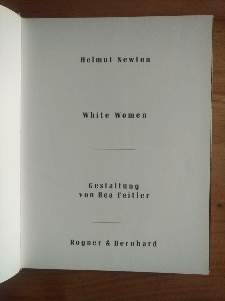
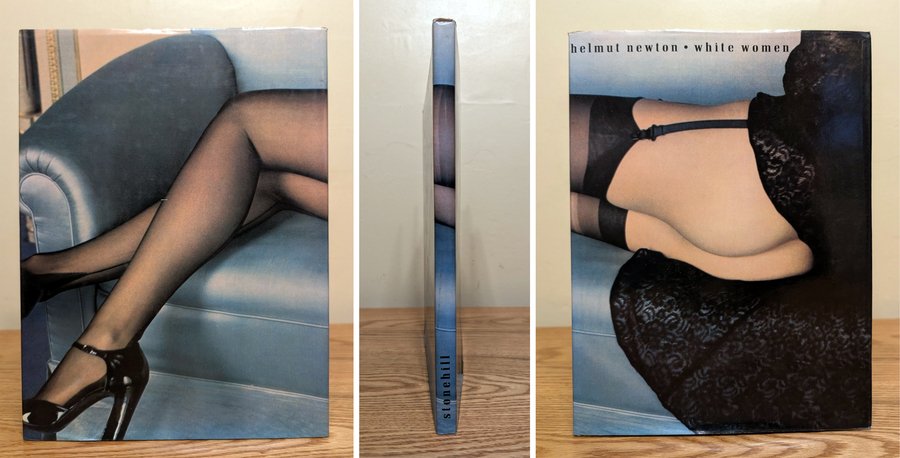
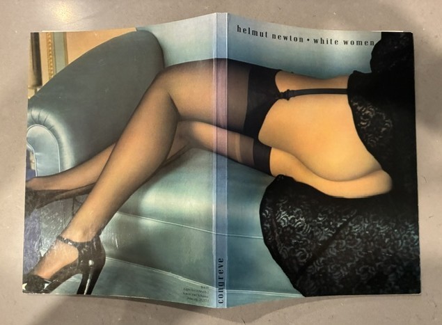
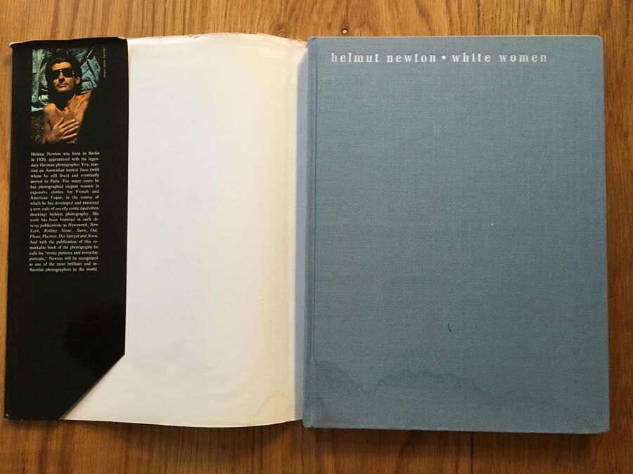
The contrast between the provocative content and the book’s reserved exterior appearance.
The photographic dust jacket functions as a standalone visual statement. Instead of offering an objective portrayal of feminine beauty, the viewer is presented with the author’s version of the ideal woman. The typography is restrained, not competing with the photography. The hardback binding is made from fabric in a muted blue-gray shade, lending the book the status of fine art. Thanks to the cover design, the viewer perceives the photographs not as a random collection of attractive women, but as an authorial concept of beauty.
We will examine Helmut Newton’s photobook, «White Women,» published in 1976. The collection features over 80 black-and-white and color images. Newton fused fashion, eroticism, and theatricality within them. The focus is women. https://vimeo.com/108143365
The full-bleed, large-scale images contrast with the «quiet» strips of white space where the photograph occupies only a portion of the page. The reader never adjusts to the scale; the tension between «large vs. small» and «dense vs. empty» keeps the page-turning rhythmically engaged, almost like film editing.
Faitler thinks not in terms of the page, but the spread: the photographs are arranged in pairs—according to the contrast of light and tone, according to the model’s direction of gaze (a gaze that «escapes» the frame—and the reader turns the page to «catch up»), or according to the repetition of a motif. The concept and the layout align with the essence of photography: Newton captured nuanced eroticism, where pose, gaze, and distance decide everything. Faitler did not try to «embellish» the shots—she organized them into a sequence where each page prepares the next. The combination of aestheticism, technical perfection, and «bourgeois decadence» takes form: the cool white page, the dark duotone, the disciplined typography—but inside the frame lies freedom and provocation.
In the photobook White Women (1976), graphic design functions as a tool for constructing an aesthetic ideal of womanhood. The contrast in scale, alternating large images with photographs set against broad white margins, regulates the visual distance between the viewer and the model. As a result, the female body is perceived alternately as an object of observation, an artistic representation, and a symbol of confidence. Thus, the photobook does not merely present photographs; it organizes them into a sequence that reinforces a specific notion of female beauty.
How is the ideal woman constructed? The primary technique is altering the visual status of the model through scale.
On the left, the figure is perceived as part of the surrounding space. On the right, she becomes the central subject, almost completely dominating the page.
The reader first observes the woman from a distance, then encounters her more immediate presence.
This sequence of images creates a feeling of confidence, self-reliance, and significance in the female body.
Conclusion for research: A graphic designer can amplify the image of feminine power by managing the scale and sequence of photographs without altering the images themselves.
Lindberg aims to convey the individuality, character, and emotional state of the woman.
Conclusion:
The photobook constructs perceptions of the ideal human not through explicit directives, but through visual selection, repetition, and artistic interpretation. The photographer decides who and how to present, the designer lends structure and significance to the image, and the publisher and cultural institutions ensure its distribution and recognition. As a result, an author’s conception of beauty can become a societal benchmark. However, the photobook’s influence is not unilateral—it simultaneously reflects existing ideals, reinforces them, and proposes alternatives.
The Photobook: A History — Martin Parr, Jerry Badger, 2004–2014. The history of the photobook as an independent visual medium.
On Photography — Susan Sontag, 1977. On the influence of photography on the perception of reality.
Ways of Seeing — John Berger, 1972. On visual culture, gaze, and modes of representing the human being.
Camera Lucida — Roland Barthes, 1980. On the perception of the photographic image.