Communication Theory in the Design of Digital Products
Theory defines communication as a systemic exchange of verbal and nonverbal symbols between sender and receiver to create meaning in a specific context. In communication design for digital products (UX/UI and app branding), this manifests through interfaces where the designer encodes the message (UI elements), and the user decodes it as a response (actions or emotions).
The course emphasizes key characteristics: process continuity, presence of feedback, and context’s influence on interpretation.
Craig’s 7 Traditions in Digital Design
Cybernetic tradition Focuses on information flows through channels like swipes and notifications, using feedback loops (match alerts) to minimize noise such as loading delays. This supports goal-oriented user interactions.
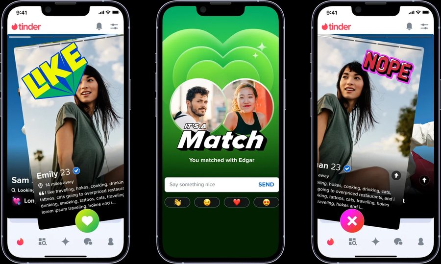
Tinder’s right swipe as a channel for intent transmission with instant feedback (match animation), reducing uncertainty noise.
Socio-psychological tradition Explains how stimuli such as the color of buttons influence user behavior through cause-and-effect relationships (higher percentage of clicks), predicting interpersonal responses within the app.
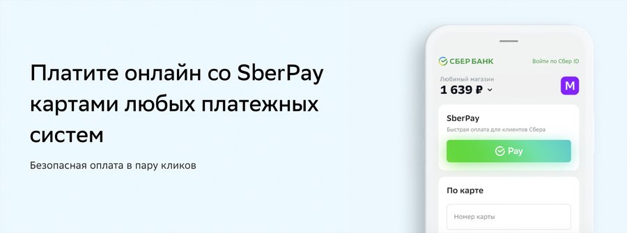
SberBank Online highlights the «Pay» actions with a contrasting green button, which attracts the user’s attention and increases the clicking on this option compared to neutral-colored controls.
Semiotic tradition Uses symbols (heart icons, brand gradients) to convey meaning like trust and joy, interpreted by users through cultural codes to build brand identity.
The Duolingo Green colour as a symbol of growth and friendliness, which is interpreted worldwide as positive reinforcement
Objective vs Interpretive Approaches
Objective approach This kind of approach uses quantitative methods to predict design success, identifying variable dependencies. For example, streaming apps could experiment with the size of the play button based on data from user surveys. It has also been found that an increase in the area where the button is located leads to a noticeable increase in the number of clicks and overall user engagement.
Interpretive approach It analyzes qualitative data (interviews, usability tests) to uncover subjective meanings and cultural barriers. For example, research on social apps like TikTok shows young users experience anxiety from endless scrolling and want usage time control.
TikTok has added «Screen Time Management» reminders and daily limits, which has increased user retention by providing control over content consumption.
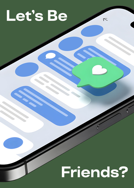
Brand Presentation «Let’s Be Friends?» for a General Audience
Link to the project
Let’s Be Friends? —
A digital platform for interpersonal communication.
Project Idea
«Let’s Be Friends?» offers a different model:
— priority of dialogue,
— rejection of public ratings,
— absence of competitive elements,
— focus on interaction between people.
The project aims to create an environment in which communication becomes the core function.
The platform includes: — user profiles, — private and group chats, — thematic communities, — moderation and safety mechanisms.
The project does not focus on: — displaying status, — quantitative popularity metrics, — public evaluation of users.
Brand Purpose. The brand serves several purposes: — testing a new model of digital communication, — developing an alternative communication environment, — emphasizing the quality of dialogue.
Relevance of the Topic

Today, digital technologies provide constant opportunities for communication. However, many users report: — a decline in the quality of social connections, — difficulties in building stable relationships, — fatigue from the format of mass social networks.
The project «Let’s Be Friends?» aims to explore an alternative model of digital communication.
Effective communication includes: — exchange of messages, — interpretation of meaning, — consideration of context, — influence of the environment.

The Role of Environment in Communication
The environment influences user behavior: — interface design shapes communication style, — interaction rules define communication boundaries, — visual structure affects attention. The project «Let’s Be Friends?» treats the environment as an active element of communication, not merely a technical layer.
The platform is intended for users who:
— seek communication without public evaluation,
— are looking for a space for dialogue,
— are not interested in the «social showcase» format.
The Problem of Digital Communication
Many existing platforms focus on: — profile showcasing, — quick reactions (likes, comments), — visual activity, — content promotion algorithms.
This creates an environment in which: — self-presentation dominates, — social comparison intensifies, — dialogue is often replaced by content consumption.
Design Principles
Core principles include: — simplicity of the interface, — predictable navigation, — absence of competition, — neutral visual environment, — communication as the main priority.The project proposes a change in the format of interaction.
This approach is based on the assumption that changing the environment can influence the nature of communication.
The «Let’s Be Friends?» project represents a conceptual model of a digital platform focused on dialogue and reducing communicative pressure. Its goal is to offer a communication format in which interaction between people is more important than public self-presentation.
Brand Presentation for a Professional Audience
This section will be devoted to the relationship of communication theory with various aspects of creating applications.
Theory of social exchange in application practice
The principle of "Rewards» — «Costs»» is embedded in the mechanics:
Rewards: new acquaintances, emotions, sense of belonging
Costs: time, possible discomfort, paid content
Comparison with alternatives (CLalt): The user evaluates whether it is easier to find friends through us than through other applications or offline.
Users weigh the rewards (friends, emotions) minus the costs (time, chance of awkwardness).
Potential techniques: micro-animations of swipes reduce costs, gamification (match badges) increases rewards; comparison with alternatives motivates the user’ s choice.
The result: A well-thought-out system of free start and step-by-step monetization.
The theory of optimal distinctiveness in function design
The need for affiliation: Group chats by interests (5-7 people)
The need for uniqueness: Personal recommendations based on a deep profile
A balance of «belonging» (group chats based on interests) and „uniqueness» (personal recommendations).
Potential techniques: visual highlighting of common hobbies (color tags) and private settings; group chats with in-group emojis.
Results: enhances cohesion vs out-group (singles). The user feels like a part of the community, but retains his individuality.
Example of visual highlighting of common hobbies (color tags) and private settings
ELM in onboarding and communication
The central path (for the motivated):
i. Detailed profiles ii. Clear selection algorithms iii. The reasoned benefits of a subscription
Peripheral path (for new users):
i. Visual design ii. Social proof (reviews, number of users) iii. Emotional Triggers («Find your people»)
The central path (motivated: clear algorithms) and peripheral (visuals, reviews).
Potential techniques: green gradient (trust), emotional triggers (emotions from the match), hints in chats.
The result: minimizes FTAs (bounces), increases the level of subscription.
Example of proper use of green gradient and emotional trigger
IPC Theory
Each 5-minute meeting is a double transaction in which the sender and recipient exchange symbols (words, gestures in Telegram), creating a general idea of a potential friendship.
Politeness strategies minimize FTAs (for example, rejecting a meeting as negative politeness: «Sorry, it a 0; t work a 1;) a 2; increasing retention; the app encourages positive politeness.
SIT enhances cohesion: users form a 3; in-group (a 4; are friendly Muscovites 18-35), comparing themselves with a 5; groups (singles), which motivates repeated matches.
Every meeting is like a transaction of symbols (words/emojis in Telegram).
Potential techniques: logos (match statistics), ethos (verification), pathos (empathy in hints); Symbolic Convergence in the chats.
Result: creates a community identity.
Example of empathy in hints to reduce anxiety levels, especially for beginners
Practical recommendations for designers
i. The interface should support both ways of information processing (ELM): clarity and emotionality
ii. Profile design — a balance between self-expression and comparability
iii. Group chats — visually highlight common interests to enhance a sense of belonging
iv. Micro-animations and gamification to reduce the perceived «costs» of communication
Practical recommendations for developers
i. The selection algorithm should take into account both the interests and the stage of social exchange.
ii. The moderation system should minimize the «costs» of negative experiences.
iii. Flexible privacy settings to support optimal distinctiveness.
«Communication Theory: Bridging Academia and Practice», HSE University Course (date of request: 06.12.2025).
Furlong J. Investing in our community’s digital well-being [Electronic resource] // TikTok Newsroom. — URL: https://newsroom.tiktok.com/investing-in-our-communitys-digital-well-being?lang=en (date of request: 07.12.2025).
Laninstar Marketing. The Hidden Truth About Button Size in Mobile CTAs That Can Boost Your Conversion Rates [Электронный ресурс]. 07.12.2025. URL: https://laninstarmarketing.blog/2024/11/25/the-hidden-truth-about-button-size-in-mobile-ctas-that-can-boost-your-conversion-rates/ (date of request: 08.12.2025).
Kryssanov, V.V., Okabe, M., Kakusho, K., Minoh, M. (2003). A theory of communication for user interface design. In: Gazendam, H.W.M., Jorna, R.J., Cijsouw, R.S. (eds) Dynamics and Change in Organizations. Springer, Dordrecht. — URL: https://doi.org/10.1007/978-94-010-0161-8_3 (date of request: 07.12.2025).
Mary A. Keeler, Susan M. Denning, The challenge of interface design for communication theory: from interaction metaphor to contexts of discovery, Interacting with Computers, Volume 3, Issue 3, 1991, Pages 283-301. — URL: https://www.sciencedirect.com/science/article/abs/pii/095354389190018W (date of request: 06.12.2025).
Juliana Salles, M.Cecı́lia C. Baranauskas, Roberto S. Bigonha, Towards a communication model applied to the interface design process, Knowledge-Based Systems, Volume 14, Issue 8, 2001, Pages 455-459. — URL: https://www.sciencedirect.com/science/article/abs/pii/S0950705101001411 (date of request: 09.12.2025).
Tinder’s right swipe https://tinder.com/static/build/build-ssg-next/out/optimized-images/swipe.07d72ab6-opt-1920.WEBP (date of request: 07.12.2025)
SberBank Online «Pay» button https://www.sberbank.ru/images/6410/1701434739299.jpeg (date of request: 07.12.2025)
Duolingo green colour. App Screenshots
TikTok «Screen Time Management» https://p16-va-tiktok.ibyteimg.com/obj/musically-maliva-obj/512f6069dce75b59f1a3209aa173a880.png (date of request: 07.12.2025)
Relevance of the topic images: created by ChatGPT
Example of visual highlighting of common hobbies and private settings: created with Leonardo.ai
Example of proper use of green gradient and emotional trigger: created with Ideogram
Example of empathy in hints to reduce anxiety levels: created with Ideogram


