— Concept
— 1. The anatomical code of the Armenian alphabet: why is it unique?
1.1 Evolution of letterforms
1.2 Mesrop Mashtots’s alphabet as a design system
1.3 The phenomenon of rhythm, proportion, and asymmetry
— 2. Analysis of modern brands: how do letters transform into a brand identity?
— Conclusion
Concept
Topic Selection
Topic selection is heavily influenced by national identity, but as a researcher and designer, I see a profound professional challenge here. Today, the global market exhibits a phenomenon that could be called «visual typographic blindness.» Due to the widespread use of standard font solutions and trend replication, brands are losing their individuality, blending into a generic mass. In this context, the graphic system of the Armenian alphabet offers fundamentally new possibilities for visual distinctiveness. Using Armenian letters as the primary formative element of identity allows brands to create a truly unique and memorable style. What is particularly important is that this approach helps convey the value of authenticity and cultural roots directly, without resorting to tired ethno-illustrations—be they images of mountains, pomegranates, or traditional ornaments. The cultural context is communicated not through cliché pictures, but through the plasticity, geometry, and silhouette of the signs themselves.Material Selection Principle
Visual materials were selected based on the principle of direct graphic proof of a hypothesis. For the first chapter, historical manuscripts, typeface samples, and proprietary analytical diagrams were chosen to vividly demonstrate the modularity, asymmetry, and dense vertical rhythm of Armenian script. The second chapter exclusively features projects from various fields whose logos contain no Latin characters. The primary selection criterion was the rejection of stereotypical ethnic illustrations in favor of pure geometry and the plasticity of the Armenian grapheme itself as the core carrier of identity.Structuring Principle
The structure of this work is organized by the logic of progressing from the anatomy of the sign to its practical application in branding. The first chapter sequentially unpacks the constructive foundation of the Armenian alphabet—from the historical evolution of writing styles and the modular principle of construction to optical proportions and the rhythm of continuous typesetting. The second chapter builds upon these findings, demonstrating how the identified graphic properties function within real identity systems through geometric ligatures, compositional asymmetry, and the transformation of a word into an ornamental pattern. This two-tiered composition allows for a direct tracing of the connection between the historical form of a letter and contemporary design code.Principles of Selecting and Analyzing Textual Sources
For the written portion of this research, we consulted scientific works on the history of writing and articles written by practicing type designers. To understand the origin and structure of letters, we incorporated books by linguists and paleographers (G. A. Acharyan, A. G. Abramyan, A. Meie), as well as research by typographer R. Akopyan (Tarumyan). For analyzing contemporary typefaces and logos, we relied on interviews and notes from designers (Kh. Apelian, A. Bogaryan, A. Arutyunyan) published in the specialized magazine type.today. This approach allowed us to bridge academic theory with the real-world practice of modern design.The Key Question
How can the geometry and rhythm of the Armenian alphabet be transformed into modern brand identity, and what graphic methodologies allow the letter to function as the primary visual brand marker?
Hypothesis
Integrating the unique anatomical structure, vertical rhythm, and asymmetry of the Armenian alphabet into the core of a brand identity allows brands to forge a strong, recognizable visual language on the global market. The graphic form of the Armenian grapheme can function as a self-sufficient, modern brand code that conveys national identity directly through pure form and geometry, bypassing the need for stereotypical narrative associations.1. THE ANATOMICAL CODE OF THE ARMENIAN ALPHABET: WHY IS IT UNIQUE?
Uppercase and lowercase letters of the modern Armenian alphabet.
1.1 Evolution of Letterforms
The historical development of Armenian graphic arts is a trajectory moving from strict architectural geometry to fluid, dynamic calligraphy. Depending on the writing instrument and material, four primary typographic styles have emerged, each laying the groundwork for contemporary design solutions.
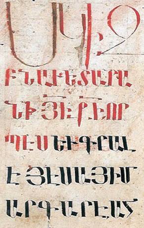
1. Yerkatagir — «The Iron Letter»
Iron Inscription on Stone. Armenia, 13th Century.
Distinguishing Features
— Absolute monumentality and symmetry. — The basic forms are the pure circle, semicircle, and strict vertical lines. — Virtually no inclination. — Heavy, dense strokes with expressive serifs.The principal script created by Mesrop Mashtots. It was used for stone carving (epigraphy on temple walls) and in early manuscripts. It was carved with a chisel into stone or written with a broad bird quill on parchment.2. Grachagir (Գրչագիր) — «Manuscript Lettering»
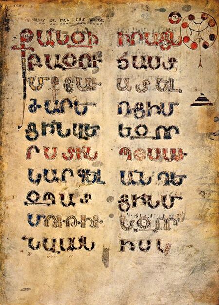
Distinctive Features
— The letters lose their rigid stone quality and become rounded. — Proportions become more vertically elongated. — A slight rightward tilt appears, making the typography feel more «alive» and handwritten, while still maintaining a formal character.The development of bookmaking required a faster method for copying manuscripts. Fine reed pens were used on parchment or early paper.
3. Bolorgir — «Round Lettering»
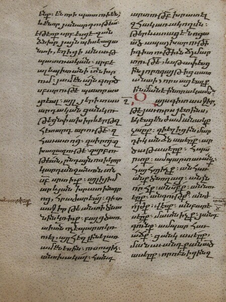
Distinctive Features
— Full distinction between uppercase and lowercase letters. — Small, rounded, rhythmic design. — A pronounced slant and long vertical ascenders and descenders (letter tails pointing up and down) emerge. — The line transforms into a dense, lace-like pattern, where individual graphemes merge into a single graphic mass.The official script of the Cilician Armenian Kingdom. It became the basis for the first Armenian printing (Akop Megap’art, 1512). The graphic style was adapted for maximum space economy and writing speed.4. Shaghir (Շղագիր) — «Slanted/Slanted Script»
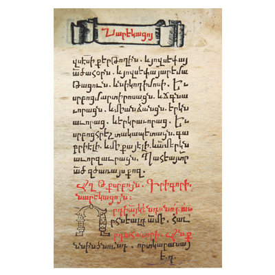
Distinguishing Features
— Maximum plasticity and freedom of lines. — Letters are often connected to one another (ligatures). — The shape of the grapheme is greatly simplified; circles transform into ovals and loops.Late cursive, which was used for official paperwork, letters, and documents. It was adapted for fast, continuous penmanship.
Previously, «shkagir» was used only for complex shorthand from manuscripts, but today it refers to any standard handwritten font or cursive style.
1.2 Mesrop Mashtots' Alphabet as a Design System
Monument to Mesrop Mashtots at Matenadaran. Yerevan, 1962.
In 405, Mesrop Mashtots undertook not just a linguistic but a complex graphic design challenge. He needed to create a system of signs that could precisely convey the rich phonetics of the Armenian language while visually distinguishing itself from Greek and Syriac scripts.
When viewed through the lens of a contemporary type designer, the Mesropian alphabet presents itself as a rigorous modular system.
Unified Graphic Builder
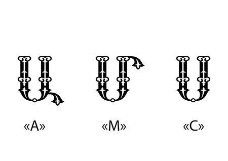
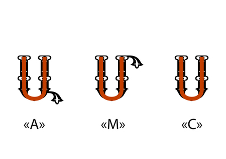
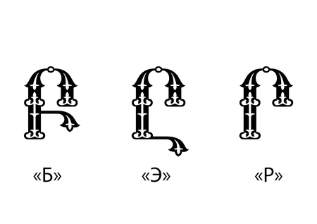
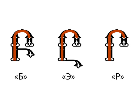
At the core of most graphemes lie basic arcs and vertical strokes (for example, the recurring U-shaped module in the letters Ա, Մ, Ս or the arc in Ր in the signs Բ, Ը, Ր).Letters were not drawn chaotically; rather, they were composed of recurring elements augmented with serifs, loops, or crossbars.
Diacritic Removal