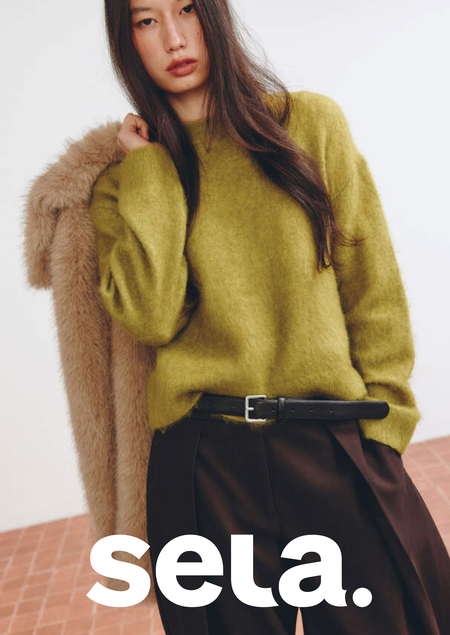
I am completing my industrial practice at the brand Sela, where I work as a packaging designer. Over September and October, I prepared 12 collaborations and over 80 mockups for printing: hang tags, labels, packaging for socks, lingerie, shoes, and home goods. For sela.home, I designed 8 structures from scratch—from presentation boxes to shoe boxes and coaster packaging.

1. About the Brand
Sela
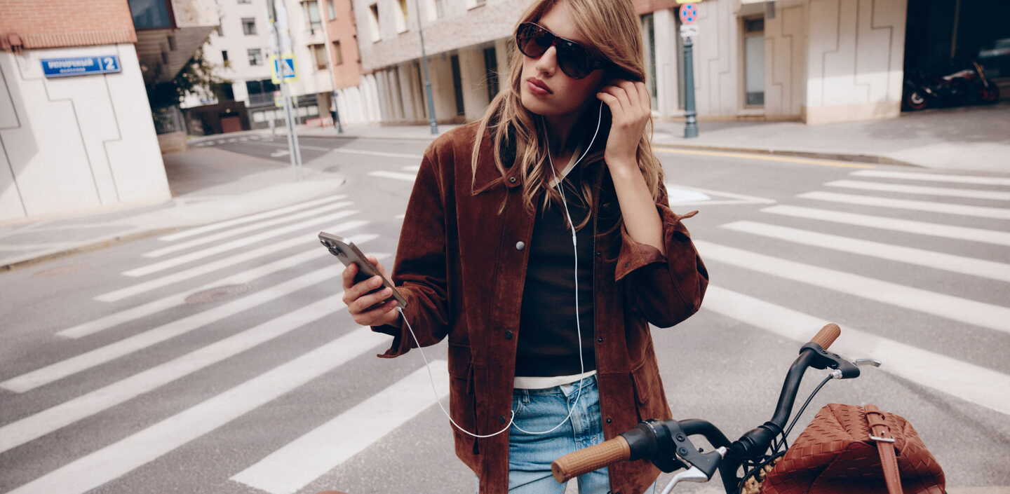
Sela is a Russian clothing chain for women, men, and children. The brand was founded in St. Petersburg in 1991 and is part of the Melon Fashion Group. Sela positions itself as a lifestyle brand for the whole family and heavily utilizes licenses; therefore, the packaging for every collaboration must adhere to both the Sela guide and the licensor’s guide.
2. My Goals
I manage packaging across every stage: from concept in Figma, to alignment with the brand and licensor, adaptation in Illustrator, pre-press, and final file delivery to production. For sela.home, I develop the packaging entirely from scratch; for other collaborations, I adapt the design according to licensor guidelines.
3. Key Case Studies
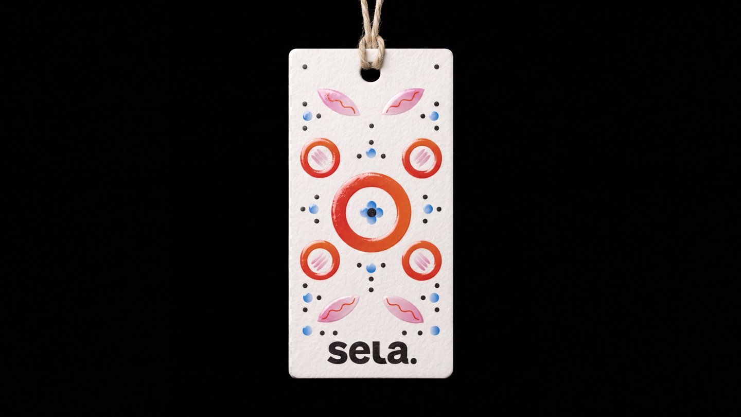
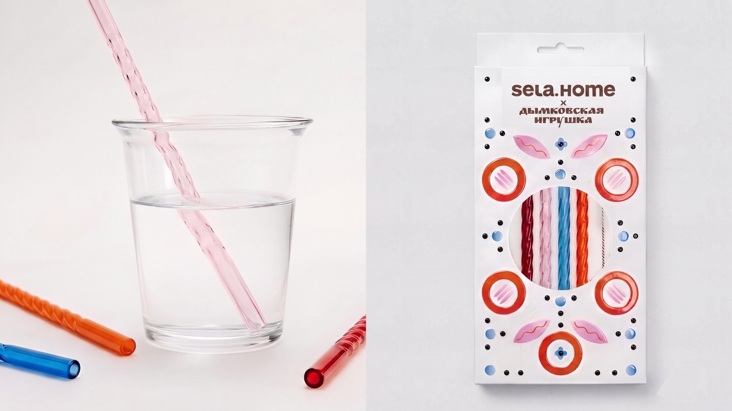
This was my test assignment: three concepts for hangtag and packaging for a set of glass straws. In each, I sought a way to translate a folk craft into the language of a modern brand.
Concept 1. Painting as Sign The pattern of a Dymkovo toy is simplified into pure graphics: circles, dots, and waves. The design rests on a white field because every Dymkovo toy begins with a white base coat.
Concept 2. Characters
Each character embodies a specific meaning: the landlady represents prosperity, and the bird signifies well-being. Only a fragment of the illustration is visible on the packaging, and it interacts with the window through which the straws can be seen.
Concept 3. Texture Color is absent: the spiral and circle patterns are conveyed through blind embossing. The packaging becomes tactile, and the only color remains that of the product visible through the window.
The bulk of the work involved adapting licensed graphic assets to Sela formats. I worked according to the guidelines of five different licensors. Precision is crucial here: matching colors for print versus fabric, ensuring proper safety margins around logos, and including all required legal disclaimers.
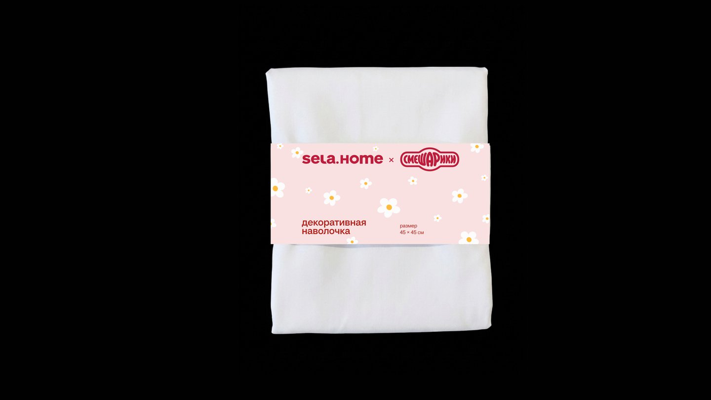
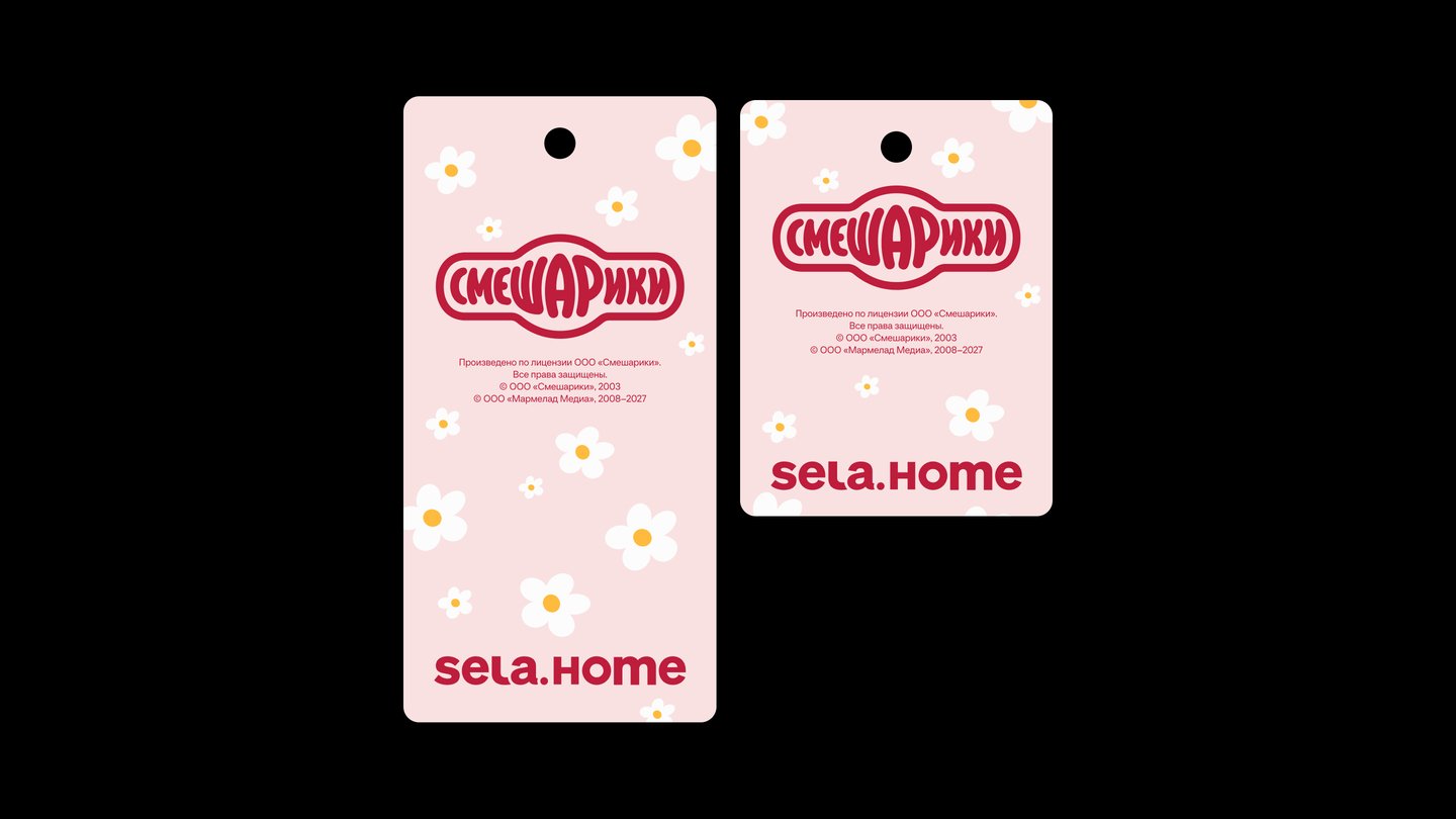
Licensor Guide Collaboration Concept: Final Version Shown. The daisy pattern is a reference to the drawings on Nyusha’s house. The system includes two types of hangtags—one for a decorative pillowcase and one for woven labels on bedding. The powder-pink background and the Smurfs logo’s crimson color tie the materials together.
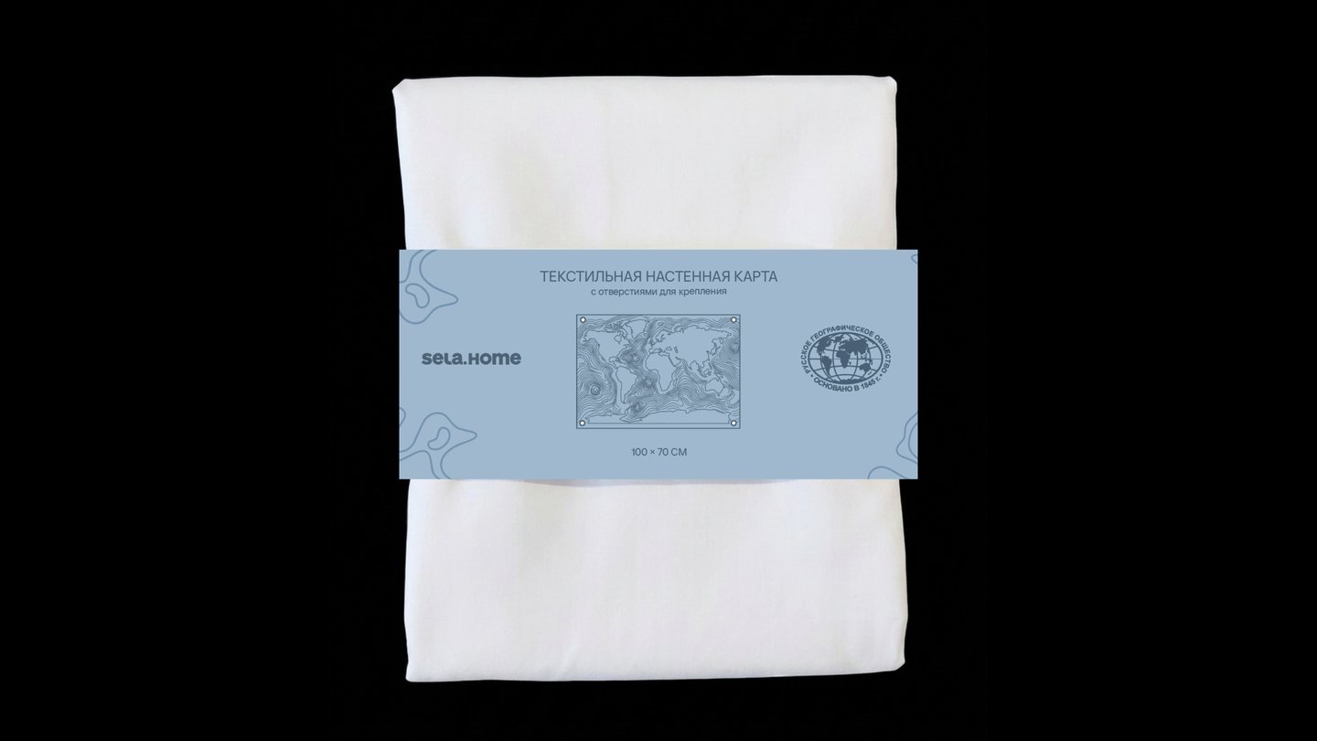
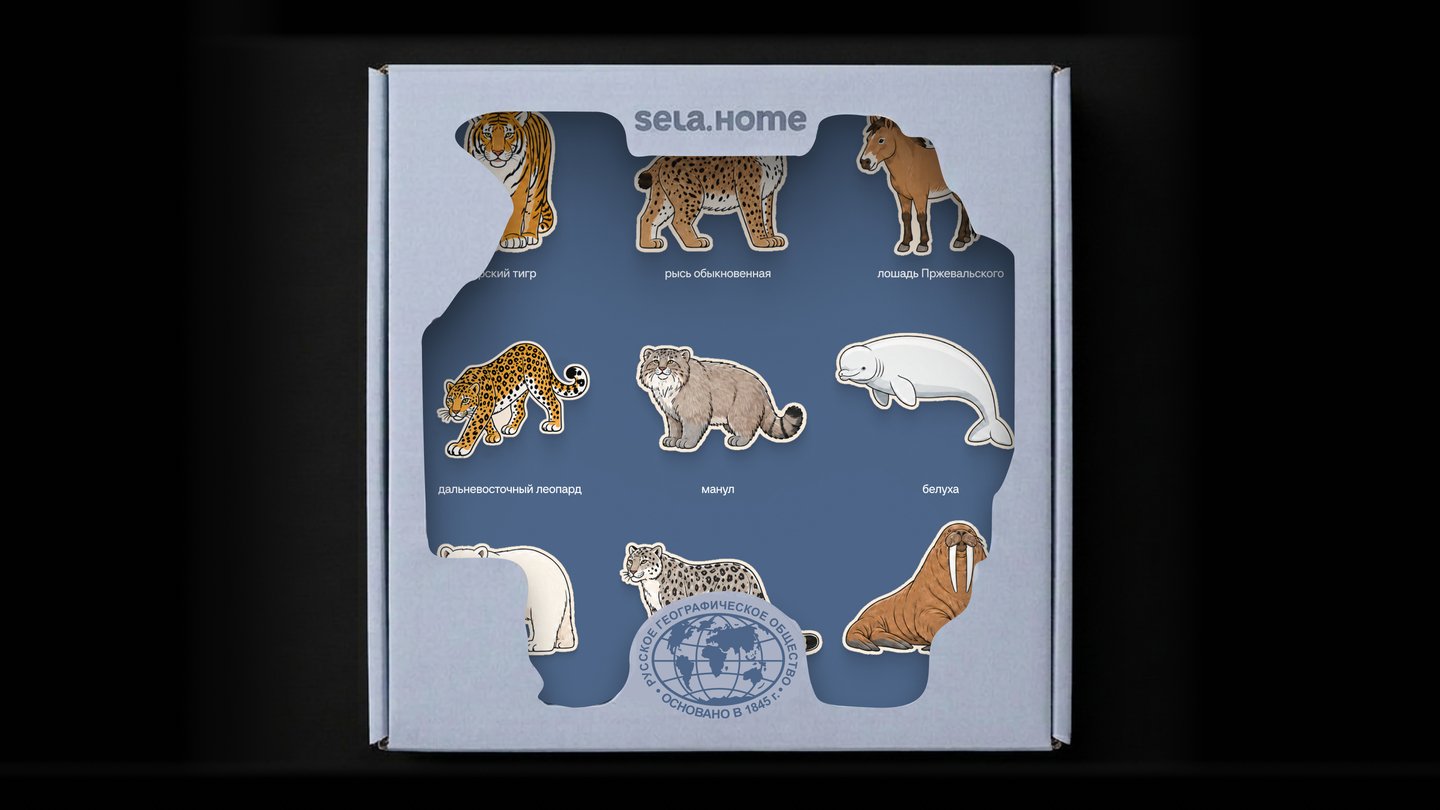
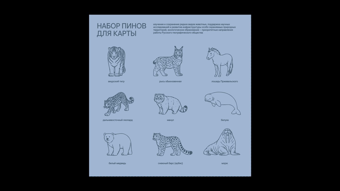
My task was to design packaging from scratch for a set of nine pins featuring rare Russian animals. I created a box with a die-cut window showcasing the silhouettes of the animals, allowing viewers to see the pins even before opening the packaging. Inside, there is a tray that secures each pin in place. The back features linear illustrations of all nine animals, complete with captions, and text detailing how the Russian Geographical Society studies and preserves endangered species. For a textile wall map measuring 100×70 cm, I created a similar design using the same graphics.
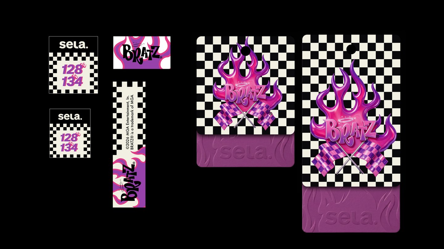
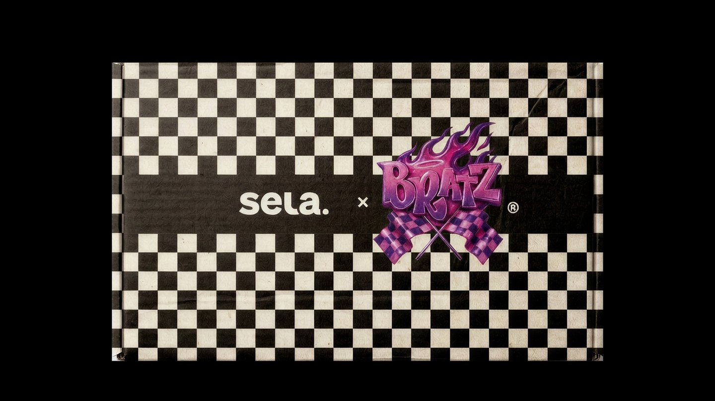
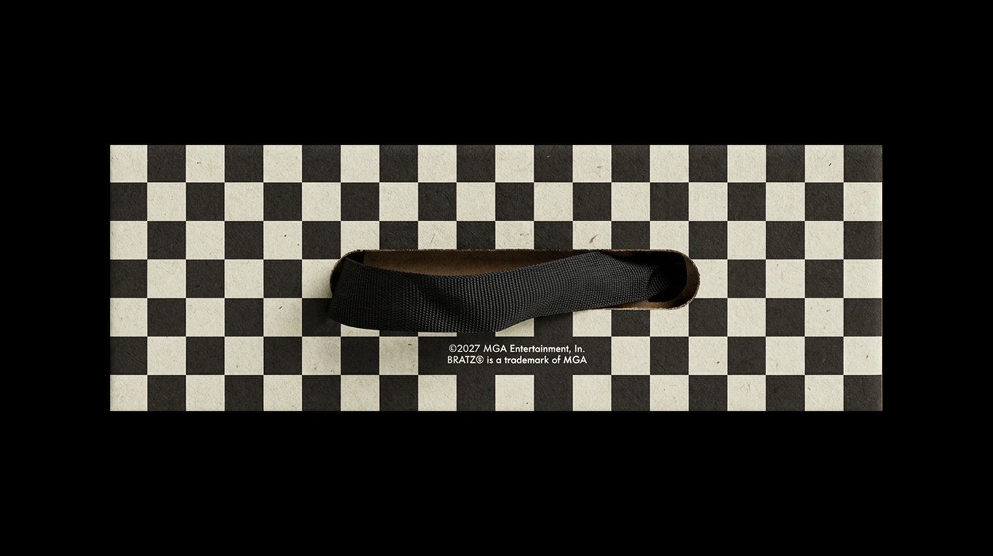
Adapting the MGA guide for the kids' collection: size tags, hangtags, and shoebox. I transferred the chessboard pattern and flame from the guide onto the box. On the hangtag, the Bratz graphic is at the top, and the sela logo is embossed on the purple section.