Author’s reasoning
In the field of design and contemporary art, communication theory provides a framework for understanding creative practice as a process of meaning-making rather than mere form production. Every designed object or artwork functions as a communicative act: meaning is encoded by the creator through form, material, and medium, and decoded by audiences within specific social, cultural, and experiential contexts. This explains why the same visual or conceptual work can generate multiple interpretations and why communication in design and art is never fully fixed or universal.
Branding and design rest on the idea that communication is fundamentally a process of creating shared meaning through symbols. Semiotics — «the study of signs and symbols» — shows that every image, shape or color in design carries culturally derived meaning. In fact, researchers note that «semiotics provides the theoretical framework for understanding the signs and symbols… in visual communication» [1]: designers and artists consciously use logos, icons and motifs knowing that audiences will decode these against cultural codes. Communication is thus interactive, not just one-way: people interpret each element (from typography to iconography) in context. Importantly, the decoded meaning does not always fully align with the original intent. Audiences may interpret the same message in different ways depending on their background and experience. This highlights the need for brand designers to anticipate multiple readings and to work carefully with cultural codes.
Walter Fisher’s paradigm insists that humans are innate storytellers and that story is the currency of communication. In design and art, this translates to the idea that works often embed or imply a story. For example, an exhibition, product line, or public art piece may unfold a narrative arc or mythic theme. Strong narratives make designs more persuasive and memorable.
Art and design today serve as vessels of global cultural exchange. Artists from diverse regions engage in dialogue through their work, and platforms like art fairs and online spaces allow ideas to spread rapidly across borders. Meaning-making in this context is inherently intercultural: designers draw on international influences and negotiate cultural symbols, often producing hybrid works—such as products blending Eastern and Western motifs or installations combining urban tech imagery with indigenous patterns. By adapting designs to multiple contexts, creators promote multicultural dialogue, innovating aesthetically while fostering mutual understanding.
Storytelling is central to creative practice. In branding and product design, compelling narratives provide deep meaning and help audiences connect emotionally. Iconic brands create «identity myths» that allow consumers to see themselves in the brand story, elevating products beyond features and fostering loyalty. Similarly, in contemporary art, narrative elements guide meaning: installations, gallery storytelling, and multimedia campaigns allow audiences to experience and interpret complex ideas. Narrative structures organize identity at both individual and societal levels, making design and art vehicles for shared cultural understanding.
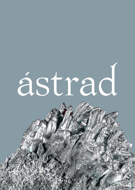
ÁSTRAD exemplifies communicative design. Using Nordic mythology, its products embed symbolic worlds that audiences interpret personally. Its cohesive narratives bridge past and present, local and global, showing how modern design relies on storytelling, meaning-making, and cultural dialogue.
Brand presentation for a general audience
A modern shield — the story you wear.
ÁSTRAD is a contemporary accessories brand inspired by Nordic sagas. If ancient sagas were stories about the heroes of the past, today every person becomes the main character of their own saga.
Our accessories act as modern-day protective symbols, designed to give the wearer confidence, focus, and inner balance in everyday life. Each piece is both aesthetic and symbolic — a quiet talisman with a clear meaning.
color palette
In Nordic tradition, symbols were not just decorative — they protected, guided, and reminded the hero of their path. ÁSTRAD reinterprets this logic in a modern context:
—A rune becomes a minimalist geometric form. —A myth becomes a metaphor for real contemporary challenges. —An accessory becomes a supportive message you carry with you.
mood board
Where do the stories come from?
ÁSTRAD is inspired not by viking aesthetics, but by the logic of sagas: the hero’s path: a person becomes themselves through actions, not words; the trial: a test of character (fear, duty, solitude, risk); honor and oath: words and deeds carry a price; the threshold and exile: stepping «outside the familiar world» changes you; law and reckoning: decisions set off a chain of consequences.
Nodebind: ear cuff featuring a small metallic knot symbolizing a fate-binding node
Wrapbuard: bracelet with wrapped ends, symbolizing held strength.
Turnfold: subtly wrapped earrings marking a moment of inner shift.
Stilline: a linear pin acting as a quiet anchor
Knottrace: ornament reflecting connections that shape destiny.
package
limeted edition package
card
Brand presentation for a professional audience
ÁSTRAD is a conceptual accessories brand operating at the intersection of design, narrative, and symbolic communication.
The brand uses Nordic mythology not as decoration, but as a semiotic system — a structured language of symbols, archetypes, and stories. Runes and sagas are translated into contemporary, reduced forms that remain open to interpretation.
Positioning. Scandinavian-inspired jewelry. System of identity.
The product is built in two layers: a base layer of wearable, functional pieces (capsule drops, compatibility across pieces, durable construction), and an additional meaning layer (symbols, engravings, and collection narratives).
The meaning layer is optional: the jewelry should remain easy to wear and understand even for people who aren’t into mythology, while still delivering a sense of grounding and composure.
Custom Ravens of Odin Ring | 925 Silver Norse Jewelry // Unique Viking ravens ring with blue gem, handcrafted norse ornament jewelry (Nordic/Viking-style jewelry brands)
The competitive landscape can be grouped into several clusters: Nordic/Viking-style jewelry brands (often leaning into literal references and «merch» cues), trend-driven fashion jewelry (fast drops, novelty, limited continuity), minimalist jewelry (form-led, often meaning-neutral), heritage/craft jewelry (materials, craftsmanship, longevity), and narrative/luxury jewelry (myth, rarity, collectible storytelling).
Within this field, ÁSTRAD occupies a niche at the intersection of craft/utility + narrative + semiotics.
Its differentiation is not «the North» as a theme, but the way inspiration is translated into an operating system: collections are designed as chapters, symbols function as a language, and personalization is framed as a choice of meaning, not decoration.
Harvey Bracelet by Sophie Buhai (minimalist jewelry) // 2.5 mm Micro Tennis Bracelet by Cernucci (trend-driven fashion jewelry)
Anatomic Heart Silver Medium Necklace 45 cm Silver by Bjørg Jewellery (heritage/craft jewelry) // Dior Joaillerie — Rose des Vents (narrative/luxury jewelry)
The brand’s differentiation rests on four pillars: narrative product architecture (chapters and story arcs, seriality), semantic design (the logic «form → sign → meaning → chapter»), meaningful personalization (engraving or symbol selection as «my sign right now»), and a modern shield as a wearable function (the metaphor is supported by comfort, durability, and everyday practicality).
To make the positioning provable, key RTBs are defined: a symbol glossary, a modular design system (one set of forms scales from subtle marks to bold motifs), and capsule continuity across chapters (pieces that layer and combine with recurring «anchors»).
Key risks include being perceived as «Viking merch/cosplay, ” potential controversial associations around runes, and the risk of pretension or pseudo-mysticism. These are addressed through modern, wearable silhouettes (avoiding theatrical tropes), a careful symbol policy (an abstract rune module + glossary), and a tone that frames myth as metaphor, not magic, consistently grounded in craftsmanship and real-world wear.
Target Audience (segments, insights, behavior) — shortened for a jewelry brand.
ÁSTRAD’s segmentation is not based on style, but on motivations. The brand has two core values that combine in different proportions across people: support (shield: boundaries, composure, quiet strength) and identity (saga: meaning, story, a personal sign). Now these meanings are expressed through jewelry: pieces become «artifacts» and symbols worn close to the body.
(1) Meaning-seekers / Identity builders — Persona «New Chapter» (24–35):
mostly women (but mixed), based in big cities and often relocating. Works in marketing/HR/management/analytics/education/psychology/coaching or early-stage entrepreneurship, with mid-to-upper income. Going through change and pressure, they want jewelry as a psychological anchor—a discreet symbol of «my current chapter.» They buy thoughtfully, read and compare, and value clear, non-mystical explanations (glossary, chapter story, meaning card, «choose your sign now»). They return when the brand offers continuity and story arcs. Triggers: new beginnings, stress, major events. Barriers: fear of pretension/esotericism and anything that might look like cosplay.
(2) Aesthetic-driven creatives — Persona «Visual Author» (20–34):
gender-mixed, working in graphic design, motion, photo/video, music, tattoo/illustration, fashion/styling, or art management. Income ranges from mid to unstable (project-based), but they’ll invest in «their aesthetic.» They’re highly sensitive to visual languages and «code, ” drawn to a coherent symbol system, modular forms, strong graphic logic, limited chapters, and collaborations. They buy impulsively if the system hooks them, and value jewelry for its proportions, clean design, and styling versatility (layering, modular pieces). They live on Instagram/TikTok/Pinterest, moodboards, pop-ups and shoots—creating lots of UGC as they treat the symbol as an authorial signature. Triggers: new chapter drops, artist/musician collabs, rare editions. Barriers: overly literal Viking styling and weak visual discipline.
(3) Utility urban / techwear adjacent — Persona «Urban Gear» (23–38):
mostly male (but mixed), based in big cities and working in IT/engineering, product, logistics, architecture, or other technical roles. Mid-to-upper income. They want jewelry that functions like everyday gear: minimal, comfortable, durable, and distraction-free—a «shield» as comfort + strength + nothing extra. They buy rationally, evaluating materials (silver/steel/titanium), finish durability, clasps, wear resistance, warranty, and service/repair. Ideal pieces never snag, use reliable closures, and keep symbolism ultra-subtle (thin line or micro-engraving) so it never feels like costume. They discover through reviews, forums (Reddit), technical product pages, and short product videos. Triggers: needing one dependable everyday piece, seasonal transitions, or a self-reward milestone. Barriers: flashy/decorative symbols and any value claim without proof of quality.
(4) Myth/fantasy culture community (not cosplay) — Persona «Modern Mythologist» (18–35):
gender-mixed students and early-career creatives/IT/humanities. Drawn to myths and archetypes, they want a modern, wearable language—inner meaning, not costume. They use jewelry as a personal sign of story and belonging, value respectful context and careful, «safe» symbol use, and expect a clear glossary and consistent canon (chapters/arcs). They discover via communities, niche media, Discord/forums, and artist/music collabs, and tend to collect chapters. Triggers: new arcs, chapters about choice/oaths/thresholds, and interactive sign selection. Barriers: cliché «Viking merch, ” unclear/controversial symbols, and aggressive aesthetics.
Behaviorally, the brand should guide people through a funnel: discovery via a quick visual entry (chapter + symbol), consideration through a glossary and system explanation (what the sign means, why the form/material), conversion through a choice ritual (chapter + symbol/engraving), retention through continuing story arcs and piece compatibility, and advocacy through shareable stories—“why I chose this sign”—which are easier to post than a simple jewelry photo.
Visual system, use cases, and interactive scenarios.
ÁSTRAD’s visual system should be defined as a strict set of rules, because the brand is built around the idea of structure and fate. The foundation is a modular 4/8/12 grid for digital and print. The «thread» acts as a guiding path (leading the eye), while «knots» serve as meaning points where headlines, symbols, and key information are placed. Generous negative space and disciplined composition create a sense of quiet strength.
The graphic language relies on systematic patterns: weaves/knots (cycle), trajectories (movement/topography), and a rune module as a form-building toolkit. Variability follows an intensity principle: the same sign can appear as an almost invisible line, as tactile texture/engraving, or as a dense pattern—depending on the medium and audience. The logo is secondary within the system: it signals authorship without competing with symbols. Production-ready versions matter (mono, embossing, compact mark), as well as the lockup logic «ÁSTRAD / SAGA: …», which reinforces chapters as core brand units.
In application (including B2B), the brand can operate as a collaboration platform, where partners receive a «shared chapter”—a plot, symbols, and artifacts integrated into the canon (not just a logo on a product). Retail and POS should support the „library“ idea: chapters as „volumes“ with nearby glossary cards; posters function like „pages“ (chapter title + symbol + one strong line). Physical spaces can be „routed“ with the thread as navigation. Presentation materials must be system-led: a symbol brand book, a lookbook-as-volume, a line sheet, and a press kit explaining the core (shield/saga/symbol language).
Digital scenarios strengthen the brand when symbols become an experience. The key interactive is the Saga Library (choose a chapter → meaning → artifacts → sign). Additional layers include a Symbol Selector (match a sign to your current life stage) and a personalization configurator (sign/placement/intensity/preview) to reduce uncertainty and lift conversion. In media, the brand runs on seriality: chapters drop like seasons, with recurring formats («1 symbol — 1 meaning, ” „artifact of the week, ” „people’s stories“). UGC is supported through templates („my sign and why“), standardizing the community language and boosting recognition.
Theory Applied to Practice
Among communication theories, Walter Fisher’s Narrative Paradigm is especially resonant for ÁSTRAD. Fisher argues that humans are essentially storytellers: «all meaningful communication occurs via storytelling or reporting of events.» People naturally seek coherence and shared values in messages. As Fisher notes, individuals «see the world as a set of stories» and are more likely to accept narratives that align with their own beliefs and experiences.
ÁSTRAD is constructed precisely in this way: its identity functions as a personal modern myth. Drawing on Nordic sagas, the brand positions the individual as the central hero of their own story. Accessories operate as contemporary talismans—modern shields—that support confidence, focus, and inner stability in everyday life. By presenting the brand as an ongoing narrative that users can enter, interpret, and personalize, ÁSTRAD activates the full potential of narrative communication.
This myth-based strategy reflects Fisher’s claim that people are persuaded not by abstract arguments, but by «good reasons» embedded in stories. Through narrative coherence and symbolic consistency, ÁSTRAD aligns every design decision—from form and material to symbolism and presentation—with its overarching story. As a result, the brand’s identity emerges as holistic, emotionally engaging, and culturally meaningful, functioning not only as a fashion statement but as a communicative system of values.
Travere, A. The Interplay of Signs and Visuals: Unveiling the Symbiotic Relationship Between Semiotics and Visual Communication / A. Travere // Journal of Linguistics and Communication Studies. — 2023. — Vol. 2, No. 3. — September. — ISSN 2958-0412. — Available at: https://www.pioneerpublisher.com/jlcs
Sudarsan, S. The Semiotics of Brand Building [Electronic resource] / S. Sudarsan. — 2015. — February 4. — Available at: https://brandingmag.com/2015/02/04/the-semiotics-of-brand-building/
Krea — image generation
Nano banana — image edition


