Concept
Non-alphabetic signs emerged at different times and initially served various purposes. Some developed from abbreviations and letter combinations, while others were used as notations, counters, punctuation marks, or indicators. Over time, they were incorporated into typesetting and became a permanent part of the typeface, alongside letters and numbers.
However, its form gradually evolved. The handwritten sign could look different, but the printed typesetting required a more stable and repeatable construction. Later, the logo needed to function within a specific typeface. Its size, stroke weight, proportions, placement, and internal spacing began to depend on the overall font design.
This research aims to trace how non-alphabetic signs transitioned from individual graphic symbols into elements of a typeface system and what changes occurred in their form and function.
The relevance of this topic stems from the fact that today, any typeface is not composed of a single alphabet. It includes numerals, punctuation, mathematical, currency, and functional symbols. All of these are constantly used in text, interfaces, navigation, tables, and digital communication. Therefore, every such character must visually harmonize with the other symbols in the typeface. The same character can look different in an antique, a grotesque, or an italic. Its proportions, contrast, line character, and placement change, but the character continues to fulfill its function.
Examining these changes allows one to understand how a typeface becomes a cohesive system and how elements of disparate origins begin to function together.
For the contemporary designer, this is important because the quality of typography also depends on the characters that are often noticed less than the letters.
Research Objective: To trace how non-alphabetic signs of various origins entered the typographic system and how their form and function evolved in the process.
Key question: How did non-alphabetic characters change when transitioning from handwritten to printed and digital typography, and which constructional features were preserved during this process?
Hypothesis: When transitioning into a typographic system, the form of a non-alphabetic sign becomes more stable and reproducible. Concurrently, the sign continues to evolve depending on the technology, language, and specific typeface. Its proportions, stroke character, size, and placement may vary, but the core structural features are maintained, allowing the sign to be recognizable across different typefaces.
Material Selection Principle
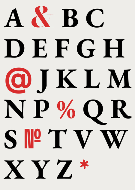
For the study, signs with diverse origins and a clearly traceable history of form have been selected: & @ % № *
Each case is examined based on several parameters: — original function; — early form; — structural evolution; — functional change; — the sign’s form across various typefaces; — contemporary digital form.
Sources: scholarly articles, university publications, digital libraries, and museum and archival collections available in the public domain.
The Principle of Rubrication
&: from a combination of letters to an independent symbol.@: from a special designation to a digital character.%: from an abbreviation to a fixed form.№: a symbol within the national typographical tradition.*: from a handwritten note to a typeset symbol.
This division allows us to compare the different paths through which non-alphabetic characters entered a typeface and became part of a single typographic system.
Sign &
Ampersand & is a symbol that replaces the conjunction «and.» Today, it can be found in company and brand names—such as H&M, Procter & Gamble, and Dolce & Gabbana—as well as in texts and typography.
The symbol appeared long before its modern name. Its form originates from the Latin word et, which translates to «and.» During rapid writing, the letters 'e' and 't' began to join together, gradually evolving into a single ligature.
Yana Tschichold has gathered early variations of this form. The earliest of these bear little resemblance to the modern one—they consist of separate, intersecting strokes. Over time, the elements connect more closely, loops begin to appear, and the overall silhouette becomes more compact. In the 6th-century variation (6), the form of two connected loops is already noticeable. Its silhouette resembles an eight and moves closer to the familiar ampersand.
Jan Tschichold. Form Transformations of the Ampersand. 1953.
The term «ampersand» appeared much later than the symbol itself. In 19th-century English dictionaries, it was often placed after the letter Z, meaning it was perceived almost as another letter of the alphabet. When reading such a sequence, the symbol was pronounced as «and per se,» meaning «& itself means and.» Over time, this phrase was shortened to the word ampersand.
John P. Carter. My Own Primer, or First Lessons in Spelling and Reading. 1857.
By the late 18th and 19th centuries, the ampersand existed in numerous typographic variations.
In Baskerville (265–266), the glyph features a fine, contrasting stroke and generous internal counterforms. In Bell Italic (268) and the Bodoni variant (269), a similar general structure is retained: an elongated glyph with a pronounced upper loop and delicate terminals. The differences become apparent in the finer details, primarily in the stroke contrast and the character of the terminals.
In Bodoni (271), the stroke contrast becomes more pronounced, and the structure appears more refined. Similar evolutions can be seen in Walbaum (272–273) and Didot (274).
The decorative forms of the 19th century exhibit much greater variation. Thorne Shaded (275) gains a volumetric effect, Fette Italienne (276) becomes heavy and dense, and Clarendon (280) is built upon massive strokes.
In Condensed Sans (284), the structure noticeably simplifies and compresses in width. Forms 285–288 demonstrate even more unrestrained decorative solutions.
Jan Tschichold. Transformations of the Hyphen. 1953.
Decorative variations of the 19th century show even greater freedom: the ampersand can be volumetric, ornamental, elongated, or almost geometric.
In modern typefaces, the ampersand retains its recognizable structure, but its design adapts to the typeface’s character. In antiqua styles, the contrast between strokes and calligraphic plasticity is more noticeable. In grotesque styles, the shape becomes simpler and more uniform in weight. In monospaced fonts, the fixed width of the character further influences its construction. Thus, the same ampersand can look different while remaining part of the typeface’s overall system.
Ksenia Abrosimova. Comparison of the ampersand form in EB Garamond Regular, Bodoni Moda Regular, Inter Regular, and IBM Plex Mono Regular. 2026.
The ampersand has evolved from a letter ligature to a standalone typographic mark. Its form has changed alongside writing, typesetting technology, and font style, yet its meaning and core structure have remained consistent.
@ symbol