Perfume packaging represents a specific domain within product and graphic design, where functionality, decorative appeal, and visual representation of the product converge. The shape of the bottle, the glass material and finishing, the cap design, and the decoration of the label and box collectively form the overall image of the fragrance. In Soviet perfumery, packaging was not only a means of storing and selling products but also an independent work of art that reflected the aesthetic preferences of its era.
This visual study is dedicated to the evolution of Soviet perfume packaging design from the 1920s through the 1980s. This period allows us to trace the development of Soviet industrial and graphic design over several decades—from early forms that maintained ties with pre-revolutionary perfumery traditions to the diverse mass-market and gift solutions of the late Soviet era. Special attention is paid to the shifts in artistic language, manufacturing technologies, and methods of visual product positioning.
The core research question addresses how the product and graphic design of Soviet perfume packaging changed and how these shifts reflected artistic trends, the development of mass production, and the perceptions of beauty and consumption in the USSR. The study is based on the hypothesis that the evolution of industrial production and changes in consumer culture encouraged the adoption of simpler, more functional designs, though this did not lead to the complete disappearance of ornamentation. It is posited that various design approaches coexisted, enabling manufacturers to create a unique visual identity for their products based on their purpose, cost, and target audience.
The research is based on the chronological and comparative analysis of historical examples of men’s and women’s perfumery from various Soviet manufacturers. The primary objects of study include perfume and cologne bottles, labels, cardboard boxes, decorative cases, and gift sets. The analysis covers the form and proportions of the items, color schemes, typography, ornamentation, illustration, materials, and structural features of the packaging. Comparing different editions of the same fragrance allows for tracing changes in its design, while comparing products from a single period reveals the diversity of artistic approaches.
The structure of the research is organized according to historical periods. We systematically examine the legacy of early Soviet perfumery, the development of gift packaging in the 1950s, artistic explorations of the 1960s, the combination of mass production and diversity in the 1970s, and the features of late Soviet design in the 1980s. The final section compares the changes in bottle shapes and graphic packaging designs within a unified chronology. This approach allows us to view evolution not as a linear progression from complex to simple, but as a process of interaction between artistic traditions, production capabilities, and consumer perceptions.
The goal of this research is to identify the main directions in the development of Soviet perfumery packaging and to determine which design solutions were preserved, transformed, or replaced by new ones. Based on specific historical artifacts, the study aims to demonstrate how, under the conditions of mass production, packaging continued to serve not only a practical but also an aesthetic function, shaping the recognizability and artistic individuality of the perfumery products.
Perfume Packaging as an Object of Soviet Design
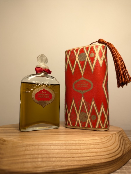
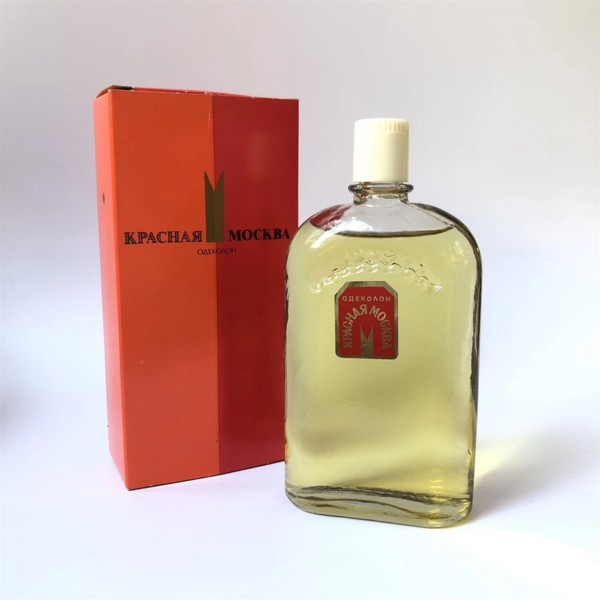
Until the late 1950s. «Krasnaya Moskva» perfume. Novaya Zarya Factory, Moscow. 1970s–1980s. «Krasnaya Moskva» perfume. Novaya Zarya Factory, Moscow.
Perfume packaging integrates several elements of product and graphic design: the bottle’s form, its closure mechanism, the label, and the outer box. Changes to these elements can be traced using the example of the «Krasnaya Moskva» perfume, produced by the «Novaya Zarya» factory. The early bottle design, created by artist Andrey Evseev, featured embossed glass with a sawtooth arch motif, a molded stopper, and a red-and-gold label. The design combines architectural associations with the Moscow Kremlin and decorative techniques from traditional perfume packaging. The complex silhouette, relief, and golden accents make even a small bottle visually expressive, transforming it from a mere container into a standalone object associated with the capital city’s image.In the 1970s–1980s variants, some of these decorative elements were retained, though their design and construction changed. The shaped label was replaced by a small rectangular one, and along with the molded glass stoppers, bottles with screw-on Bakelite caps became common. The outer packaging evolved into a rectangular cardboard box featuring a combination of scarlet and orange hues. Instead of the elaborate white-and-gold ornamentation, a small geometric symbol was used, reminiscent of a Kremlin wall crenellation. Due to the reduction in detail, the composition appeared more concise, while the bright color fields ensured product recognizability without complex decorative finishing.This comparison demonstrates that the evolution of Soviet perfume packaging was not simply a replacement of decorative design with functional design. «Krasnaya Moskva» maintained the architectural motif, the red-and-gold color association, and the recognizable shape of the glass body, while adapting individual elements to new mass-production versions. It is noteworthy that during the 1970s–1980s, both molded and screw-cap bottles existed concurrently. Thus, the changes reflected not a break from the previous aesthetic, but a synthesis of a stable visual identity with updates to the structure and graphics.
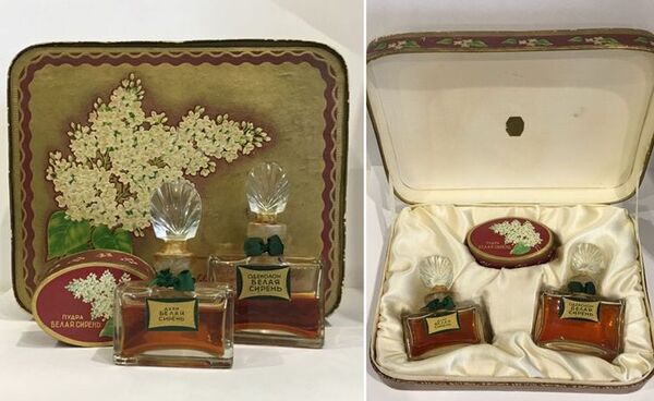
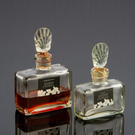
1947 — early 1960s. Perfume set «White Lilac.» Severnoe Siyanie Factory, Leningrad. Early 1970s — mid-1980s. Perfume set «White Lilac.» Severnoe Siyanie Factory, Leningrad.
The changes in the packaging design for the «White Lilac» perfume illustrate how perfume packaging could convey a sense of value and festivity while maintaining a connection to the aroma’s recognizable identity. In versions released from 1947 through the early 1960s, the emphasis was heavily placed on the gift presentation. The set, which included the perfume, cologne, and powder, was housed in a decorative case lined with satin. The rectangular glass bottles featured heavy, molded, fan-shaped stoppers, and the design was enhanced with golden labels and green ribbons. The box incorporated an image of blooming lilacs, linking the scent’s name to a natural motif. The arrangement within the case suggested not only storage but also a dramatic unveiling of the gift—each item occupied its own space and was perceived as part of a unified ensemble.In the packaging design from the early 1970s to the mid-1980s, the recognizable shape of the glass bottles remained, but the nature of their graphic presentation changed. The rectangular labels adopted a more subdued color palette, and the floral imagery was transferred to the front surface of the packaging as a photograph. Instead of a decorative imitation bouquet, a more direct and recognizable natural image was used. The box became vertical and structurally simpler. Despite this, the fan-shaped stoppers continued to be used, indicating that functional and decorative changes did not occur simultaneously. Some elements retained continuity with the previous design, while others aligned with the new principles of mass packaging.Comparing the two editions demonstrates that Soviet perfume design evolved not only in materials and construction but also in the methods used to create an appealing product image. The early gift set highlighted the perfume’s value through the complex organization of internal space, textile finishes, and decorative details. The later packaging made the photograph of the lilac the primary conveyor of the visual image, while retaining the traditional bottle shape. Thus, the shift toward a more streamlined design did not signal the disappearance of aesthetic quality; rather, it gradually moved from object-based ornamentation to graphic representation and the composition of the packaging surface.
From Pre-Revolutionary Heritage to Soviet Visual Language
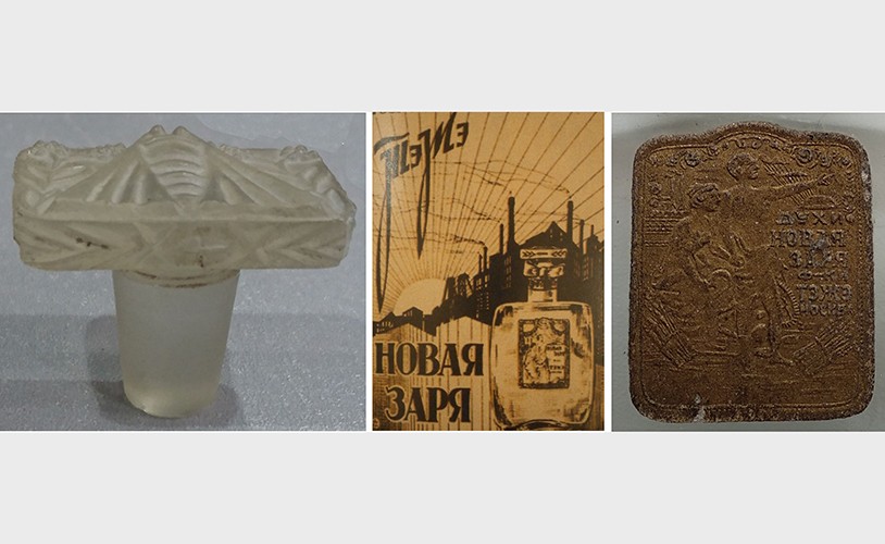
Конец 1920-х годов. Духи «Новая заря». Московская парфюмерная фабрика «Новая заря». Слева — декоративная стеклянная пробка, в центре — историческая реклама, справа — этикетка с золотистым оформлением.
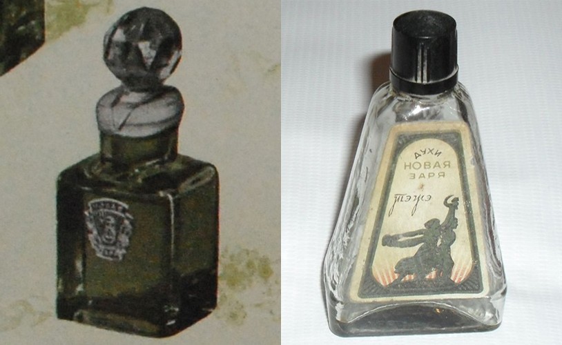
In the late 1920s, the packaging for «Novaya Zarya» perfumes retained characteristics of pre-revolutionary perfumery aesthetics, despite the enterprise’s transformation and the emergence of a new Soviet brand. The expressiveness of the early design derived not so much from the shape of the glass vessel itself as from its decorative elements. The cork, featuring relief carvings of moths and flowers, continued the artistic traditions of the Brokar factory, while the gold-stamped label emphasized the product’s value. Concurrently, the advertising graphics introduced a different visual context: an image of an industrial landscape and a dynamic composition connected the fragrance’s name with concepts of a new society. Thus, the packaging of a single product showcased a coexistence of traditional ornamentation and modern Soviet imagery.During the 1940s and 1950s, the packaging adopted a more restrained character. The expressive molded cork was replaced by a faceted glass stopper, and the bottle took on a simple quadrangular form. A compact label featuring the factory’s emblem substituted the intricate decorative embellishments. In the mid-1950s, a different variation emerged—a triangular glass bottle with a screw-on cap. Its shape was not unique; the factory used similar containers for several fragrances. This indicates the proliferation of standard designs, which allowed products to be distinguished primarily by their labels and names. Instead of creating an individual object image for every scent, the graphic design of the standard bottle gained increasing importance.A comparison reveals that the development of Soviet perfume design was accompanied by a gradual reallocation of expressive functions among the packaging elements. In early designs, the decorative cork and label conveyed an impression of sophistication, whereas later product recognition was ensured by the vessel’s simpler shape and the factory’s graphics. However, these changes did not mean the complete disappearance of artistically complex solutions: standard bottles coexisted with elaborate gift editions. The history of «Novaya Zarya» demonstrates how the traditions of perfume presentation adapted to the conditions of mass production while maintaining a link to the previous culture of consumption.