Concept
Stained glass art prior to the 14th century represents a complexly organized work utilizing fragile materials and unusual color combinations. This study focuses on the evolution of religious motifs, moving from early Romanesque examples to High Gothic, where the stained glass becomes a central medium for visualizing the Holy Scriptures and theological doctrines. The visual analysis covers key monuments from the 12th and 13th centuries and earlier periods. Special attention is paid to the semantics of color and light as symbolic categories: the saturated blue and red hues characteristic of 12th–13th-century glass create a «heavenly» atmosphere and emphasize the sacredness of the images, while radiant light is examined as a metaphor for divine presence. The concept also includes an analysis of narrative cycles and their compositional organization, where the movement of the viewer’s gaze builds a multilayered narrative. The visual research methodology is based on analysis and a comparative study of the techniques and stylistic approaches characteristic of various pre-14th-century schools.
«…we do not possess the secrets of the old glass. It is impossible to choose the right color. Especially that blue, which still captivates the eye in the church choir. It is a blue of such purity that a stray sunbeam, passing through the glass, is colored with the hues of paradise. The windows in the west aisle, recently replaced, are of much poorer quality, and it is noticeable in the summer.» — «The Name of the Rose» by Umberto Eco
The research topic involves comparing stained glass art from before the 14th century, identifying common ideological and compositional solutions related to the use of religious motifs. This period of medieval art must be examined through the lens of the symbolism of color and light.
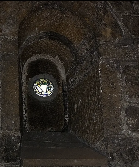
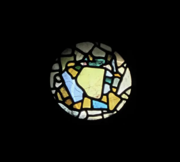
Patterned stained glass, dated to the 7th century, St. Paul’s Monastery (Jarrow, England)
The aim of the research is to study religious motifs in stained glass windows and hypothesize why stained glass windows were specifically chosen to promote these religious themes.
The Middle Ages, an era dominated by a religious worldview, was characterized by humanity’s pursuit to comprehend divine intention and adapt the surrounding world to spiritual needs. During this period, the Church began actively employing art as an instrument of enlightenment—leading to the emergence of the stained-glass window as a «Bible for the illiterate.» This phenomenon was also reflected in the architecture of the time: the development of skeletal structures, the increase in window openings, and the transition to pointed arches helped transform the stained-glass window into the primary source of light and color within the sanctuary. The advancement of stained-glass art monuments fostered the appearance of complex multi-figure medallions, extensive narrative cycles, and monumental compositions in cathedrals.
New glass staining techniques and the application of lead came allowed artisans to develop new compositional solutions. Artists gradually moved away from conveying earthly naturalism, beginning to create abstract theological schemas, and saturating images with strict geometry and symbolism. Before the 14th century, in stained glass, the metaphysics of light and color symbolism held precedence over a faithful depiction of reality. Biblical figures were highly schematic; the human form was stripped of natural proportions because the sacred meaning, iconographic accuracy, and significance imbued in the images were emphasized.
It can be posited that religious themes were incorporated into medieval stained glass so that the common people, lacking the ability to read, could understand what was described in the holy scriptures. It is immediately apparent that medieval masters imbued every religious scene and stained glass color with profound sacred meaning, utilizing them not just for architectural necessity or aesthetic appeal, but also for deep doctrinal symbolism.
«The Life of Saint Eustace, ” early 13th century, Chartres Cathedral, France
1. The Symbolism of Light and the «Divine» Palette
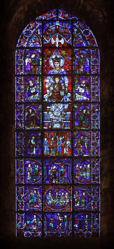
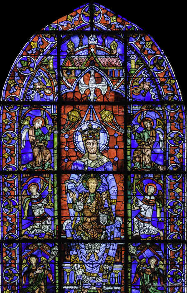
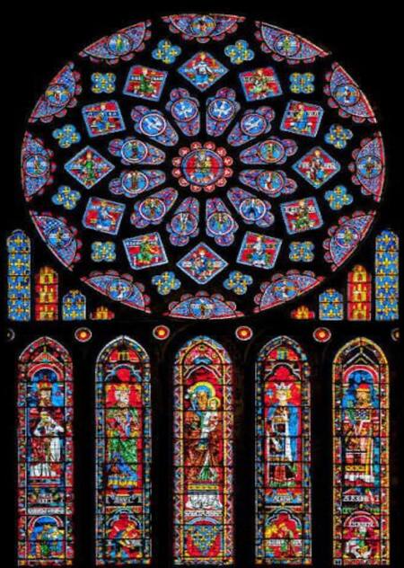
«The Mother of God from the Beautiful Window, ” circa 1180, Chartres Cathedral, France
In the Middle Ages, light was not perceived as a physical phenomenon but as a primal divine substance. Drawing upon the works of Pseudo-Dionysius the Areopagite, Abbot Suger developed the concept of «lux continua”—continuous light. Stained glass was understood as a material barrier that transforms coarse, earthly light into an immaterial, colored radiance, drawing the believer closer to God.
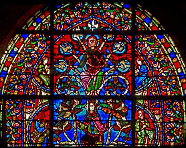
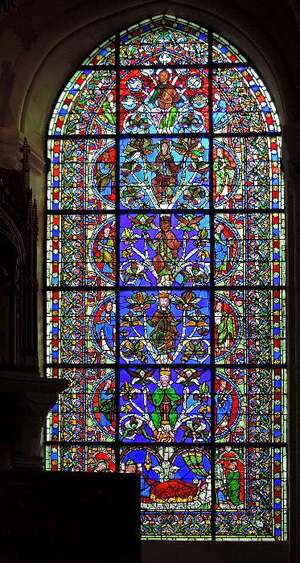
«Jesse Tree, ” 1144, Basilica of Saint-Denis, France
In 12th–13th century stained glass, a striking unity of color palette is observable. These pigments were quite unusual in their color, derivation, and significance.
«Chartreuse Blue»: The most expensive and complex pigment to produce. It symbolized heavenly wisdom, divine infinity, purity, and the Virgin Mary. The depth of the blue background created the effect of a «window to another world.» Ruby Red: Achieved by adding copper. It symbolized the blood of Christ, sacrifice, the martyrdom of saints, and the flame of the Holy Spirit. Gold/Yellow: A symbol of divine light and sanctity. Green and Purple: Used less frequently, typically for the clothing of secondary characters or natural elements.
Ornamental panel of foliage, 12th century, Saint-Denis, Victoria and Albert Museum
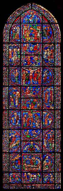
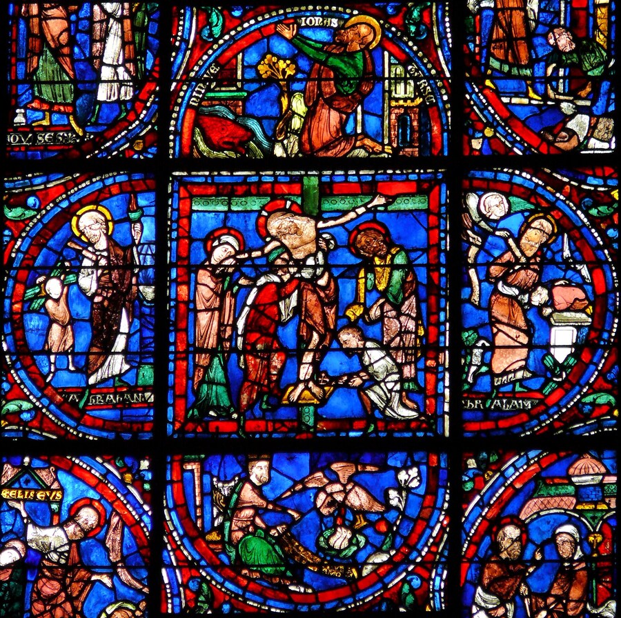
«The Passion of Christ, ” 1205–1215, Chartres Cathedral, France
Until the 14th century, glass was made using a special process that involved adding metal oxides to the molten mass. The resulting glass was uneven, featuring bubbles, variations in thickness, and iridescence. This was precisely what created the shimmering effect and a sense of inner life. Paint was applied only to define facial features and folds, leaving large areas of pure, unpainted color.
2. Medallion Structure and Typological Narrative Method
In an era of widespread illiteracy, stained glass windows were a powerful tool for propaganda and education. They didn’t just decorate the church; they told stories. To prevent the viewer from becoming confused by the narratives, a strict system of organizing the window’s space—medallions—was employed.
Medieval thinking was typological. This meant that Old Testament events were viewed as «prefigurations» of New Testament events. An example of visual comparison: Medallions could be placed side-by-side—one depicting Abraham sacrificing Isaac, and the other depicting the Virgin Mary holding the infant Christ. The viewer was expected to make this parallel: the sacrifice of the son in the Old Testament foreshadows the sacrifice of Christ.
The medallions were arranged in vertical columns and read from bottom to top or in a spiral, creating a comic-strip effect. The main image of the saint was always in the center of the window, and his story or life was unfolded in the medallions surrounding it. If the medallions in the 12th century were small and multi-figure, resembling a mosaic, by the 13th century the medallions became larger, the figures more monumental, and the narrative lines became straighter and clearer.
The structure of the stained glass conformed to the architecture of the cathedral. Circular windows necessitated a radial composition, where all lines converge toward or diverge from the center. Elongated windows dictated a vertical rhythm. The medallion structure fit perfectly into this geometry, creating an ordered vision of the world, where everything was subject to divine design.
3. Scale Hierarchy and Figure Schematism
In medieval art, the scale of the figure was determined not by the laws of perspective or the distance from the viewer, but by theological significance. Christ, the Theotokos, or a patron saint was always depicted as a giant compared to others. On some stained-glass windows in the lower registers, one can see tiny kneeling artisans, merchants, and kings who are literally «huddling» at the feet of the saints. This is a visual demonstration of earthly humility before the divine.
Figures in stained glass windows before the 14th century appear to us as «flat» and disproportionate. This was intentional. The absence of chiaroscuro is related to the fact that this is a light-transmitting art form. An artist could not render shadows on glass as one would on canvas, or the light would not have passed through. Therefore, volume was conveyed conditionally and linearly. Furthermore, the faces of the saints lack portrait likeness or emotion. They express a state of divine serenity—a detachment from the world. Emotions are replaced by canonical gestures, such as the blessing gesture with the right hand, holding a book, or holding a staff.
The clothing on the stained-glass figures does not adhere to the laws of gravity. The masters utilized so-called «V-shaped» or «forked» folds. These resemble graphic broken lines and serve to emphasize the silhouette and dynamics or static quality of the figure. Later, in the Gothic period, the folds become smoother, reminiscent of ancient drapery, yet they retain their decorative quality.
The color of clothing in a stained glass window was always conventional. If a character was depicted in blue, it did not mean they were wearing that dress. Blue signified their celestial essence or affiliation with a particular «rank.» For instance, apostles were often depicted in blue, and martyrs in red.
Conclusion